Reference to Colin Berry – originator of the medieval flour-imprinted model for Turin Shroud

I, moi, Colin Berry, was asked not so long ago to state his credentials as a scientist. That I tried to do (see under the somewhat inconspicuous “About” tab, top left ) albeit reluctantly (not wishing to go blowing my own trumpet!)

However, today while clearing out a drawer at home I came across a reference/testimonial that was written on my behalf way back in 1978 when I was just 33 years old. It was from Prof. Geoffrey Dutton at Dundee University to fellow Professor Brian Spencer, head of the (then) Flour Milling and Baking Research Association at Chorleywood, UK. (In applying for a senior position at FMBRA I had given Prof. Geoffrey Dutton, among others, as a referee.)

Late Insertion (added June 24, 2022)

Here’s my re-typed version of the testimonial you see below. I’ve incorporated it for ‘internet reasons’!

———————————————————————————————-

The University Department of Biochemistry

Dundee DD1 4HN Medical Sciences Institute

Professor Brian Spencer
Director General
Flour Milling and Baking Research Association
Chorleywood
RICKMANSWORTH
Hertfordshire, WD3 5SH 23 March, 1978

Dear Brian


Dr.C.S.Berry
Biochemist/Nutritionist


I am very happy to act as referee for Dr. Berry. I have been familiar with his work for many years, and examined his Ph.D. Thesis. Dr.Berry is one of the keenest minds I have come across, of great critical acumen.


His research record, in collaboration with Dr. Terence Hallinan, is distinguished, and these two have made great contributions to glucuronidation studies, particularly by demonstrating ‘transglucuronidation’ .
His enthusiasm and practical flair enabled solution of the many tricky experimental problems involved. His thesis is a brilliant summary of a very complex problem, the phospholipid dependency of a microsomal enzyme, and his occasional contributions as a referee to the Biochemical Journal are agreed to be outstanding, one of them being singled out for praise by the Chairman: so his communication on paper is of high standard. Communication verbally is good. His initiative is strong, and he is an obvious future leader of a research team. That is precisely what he has been looking for.


I consider he could adapt himself readily to a new field, and one with so many practical problems and responsibility for long-term planning would suit him well. I very strongly recommend him for the post.


Yours sincerely
Geoffrey (signature)


G.J. DUTTON
PROFESSOR OF PHARMACOLOGICAL BIOCHEMISTRY

Here be the original document – correct – a photocopy thereof – one that came to me immediately after I took over from my immediate boss on the latter’s retirement.

I think it’s worth flagging it up right now (but forgive me if I stay silent as to reasons – though some may guess why if they try entering “shroud of turin” into the (shhh…) G**gle search engine – nuff said methinks …).

The interview that followed was successful, btw. (It landed me with my 12 year stint at FMBRA. initially as Head of Biochemistry in the Nutrition/Toxicology Division, later promoted to Head of Nutrition and Food Safety.).

Here btw is a link to a recent paper (2017) by Liu and Coughtrie :

https://www.mdpi.com/1999-4923/9/3/32/htm

See Section 3 (“The Compartmentation Hypothesis) which comments favourably on the model developed by Terry Hallinan and myself between 1972 and 1978, notably the notion that an important enzyme in drug and bilirubin clearance from the bloodstream is controlled not only by enzyme activity, but by membrane-bound permease transporters. (No, the basic idea was not ours – but we gathered the much-needed experimental evidence in support of the permease concept).

Later, in 1986, while at FMBRA I published my paper on the intriguing “resistant starch” (a kind of man-made dietary fibre, generated via baking etc of wheat-based cereal products etc.).

See the above link on Google Scholar listings. It’s currently attracted 629 “hits” no less – by far and away the most of my published findings, especially significant self-promotion-wise as it was a single author paper.

Reason for putting up this posting? Answer: yours truly is not, repeat NOT, a scientific nonentity! He’s been a non-workshy, level headed experimentalist at his several UK and other work-places over several decades.

His MO has been to check out engaging new ideas, some his own, those of others too, via hard headed, no-nonsense experimental testing. (Yup – it’s the essence of the scientific method, one which gives equal attention to one’s own and others’ contrary ideas).

Sorry. But someone had to say it…

End of main posting. (I may or may not respond to comments!).

###############################

PS: added July 1, 2022:

Here’s an appreciative comment that was added by Brian Burchell regarding his previous partner, Professor Geoffrey Dutton (yes, many years ago):

( My own Comment added as postscript, Good Friday, April 15, 2022):

April 15, 2022 at 8:43 am

The Shroud of Turin makes it to a front-page article in the UK-based Daily Telegraph on this today, i.e. Good Friday.

“Jesus died by fatal bleeding caused by a dislocated shoulder”.

https://www.telegraph.co.uk/news/2022/04/14/doctor-turned-priest-claims-have-solved-mystery-jesuss-death/

It’s strongly pro-authenticity, albeit making a passing reference to the 1260-1390 radiocarbon dating (see italicized quote below).

So I shall leave it there…

(Dismiss the radiocarbon-dating if you wish, all you advocates of pro-authenticity . Just don’t expect to be taken seriously unless or until you have arranged for testing of more TS linen samples than the tiny corner sample removed in 1988 – though shared between the 3 independent >specialist dating labs ).

“In the 1980s it was subject to radiocarbon testing which concluded it probably a mediaeval relic. However, more recent studies – conducted in the 2010s – dispute this claim, and instead argue that the linen sheet dates from the time of Jesus.”

Reply

Posted in Uncategorized | Tagged , , , , | 10 Comments

Here’s my simple no-nonsense explanation for the Turin Shroud. Think roasted whole-body medieval FLOUR IMPRINT.

Late insertion (Dec 20, 2020) It’s now 6 months to the day since I added this Final Posting (last of some 370 over a 9 year period). Well well. There’s been total silence – or nearly so – from the world of authenticity -promoting Shroudology these last 6 months re my “FILM-SET” Model 10!

Why? I think I’ve discovered why. One has only to look at the writings of the chief spokesperson for the so -called “Shroud Science Group” (Prof. Giulio Fanti of Padua University).

Here’s the offending article: “A Dozen Years of the Shroud Science Group”, 2014.

Here’s the particular passage, underlined in bright yellow – my addition – that leaves this scientist speechless:

Giulio Fanti, chief spokesman of the Shroud Science Group, is a Professor of Mechanical Engineering at Padua University, Italy.

Yet here he is, telling the world what CANNOT be reproduced scientifically.

What right does an ENGINEER have to say what experimental SCIENTISTS, pursuing their own specialist creative ideas and hypothesis-testing MO, cannot hope to reproduce scientifically – and indeed to claim they are wasting time and money in attempting to do so?

What we see here is arrogance, sheer overweening arrogance.

I say it’s time the SSG found themselves a new spokesperson. Either that, or change their name, omitting any reference to “science” in their present SSG title!

If I had to choose just four words to sum up the mainstream opposition to what I consider my commonsensical, science-based views, emanating from religionists of one kind of another, what would they be?

Answer: histrionic bible-thumping hyperactivity!

Moving on: the next step?

There are two totally separate phases re model building.

First, establish facts, then present one’s explanation, aka rationale,

Second: then try to win over entrenched ideas.

Be patient as regards the latter.

Start of original posting…

“FILM-SET” (centre above): closest model yet to the body imprint on the Turin Shroud?

Link to Comments

2. -full-rovere-painting

16th/17th century artists  like Della Rovere had a simpler take on how the TS image came to be, uninfluenced by 19th century to-and-fro negative to positive conversions in the photographic darkroom.  They recognized that tone-reversed images could be generated via IMPRINTING, i.e. via physical contact alone, requiring  neither an artist’s brush, far less a sudden burst of supernatural radiation … Note, btw, the  negative (tone-reversed) nature of the dual body image as well as the two pots in foreground (oils? spices?   Hinted at additional aids to unintended body-imprinting in pro-authenticity context?).

Be warned folks. This is a long, long posting. But then it is the last of some 370 that this retired  Shroud-curious scientist has posted to the internet via this and other sites since the tail end of 2011!

If you’ve limited time, and are looking for a simple take-away message, then here it is: Shroud so-called ” science” should abandon its notion of the body image being “highly superficial” on image fibres, indeed confined to a mere 200 nanometres thick layer of chemically modified linen carbohydrate, aka the PCW (primary cell wall).

Hard scientific evidence for that oh-so-handy bit of pro-authenticity window-dressing, one that opens the glittering multi-department store door to Resurrectional snapshots by one means or another? 

shop window with flashes of radiation

Radiation aplenty from on high. All that’s missing is the Shroud of Turin….

Answer: essentially zilch, despite that much cited 2010 paper from 6 closely-closeted members of the SSG, aka Shroud Science Group, or as I would say, Shroud “Science” Group.  There’s science, and there’s “science”. ..

My Model 10 explains how the central pro-authenticity, dare one say,  drum-banging idea of a seemingly superficial body image (correction: “ultra-superficial” body image -confined we’re told to the PCW)  could have arisen through a simple experimental device deployed by the 1978 STURP team – namely to deploy STICKY TAPE  to strip off individual image fibres. The microscope was then focused on the tiny residue  of  faintly-yellow body image pigment  aka chromophore that came off with stripped fibres,  AS DISTINCT FROM THE MUCH GREATER MASS OF WHAT WAS LEFT BEHIND. Which was?   Chemical composition? Answer: probably, nay almost certainly, inter-fibre SOLIDIFIED  glue (micro-particulate Maillard browning products,  and no doubt maybe much else besides exuding at elevated temperature – 180 degrees C or more – from a roasting,  but closely monitored FLOUR IMPRINT).  Yes, those medieval  modellers of the J of A lien no doubt roasted (whether by oven or over open fire) until they got the right degree of colour, one that could  be communicated as  the age-yellowed body imprint  (plus blood stains) left on J of A’s “fine linen” , deployed as stretcher, en route from cross to tomb…

Its essential message: my flour-imprinting  (phew, final!) Model 10 is almost certainly the means by which the Turin Shroud body image was produced in the mid-14th century (as per radiocarbon dating). It was the second-stage heating step that generated the yellow/brown body image, comprising the same class of chemical end-products  – solid, albeit micro-particulate Maillard browning  products – first flagged up by STURP’s lead chemist (Raymond N Rogers) albeit via an entirely different chemical pathway with different starting ingredients!

Late insertion (July 7, 2020) : see tail end postscript, under heading (guess what?) , “Postscript”.

It has my latest thinking re the nature of what one really sees under the microscope when viewing my Model 10 image threads and fibres (and, by implication, maybe, just maybe , the Shroud of Turin!) . You may think you are looking at coloured image FIBRES. But might you in fact be looking at something else, something that might seem to resemble interspersed fibres within bundles (inviting that mystique-fostering  tag “half-tone effect”) but  which is, if the truth be told,  something entirely different ...?   

Nuff said for now.  Scroll down  to end of this, my Final Online Shroud Blog Posting, approx No 371, for RED postscript!

These photomicrographs of a Model 10 image fibre at two levels of magnification provide a foretaste:

image zone x4 v x10 cropped

Yes, image colour both faint AND blurred – but for a reason!


IMG_8780

Here you see a linen thread that has been partially unspun, and a drop of red dye then placed on a nearby unspun portion. The dye migrates at high speed in the gaps between fibres, then comes to an abrupt halt when the fibres are too far apart to permit capillary migration.  See later for the proposed relevance to the Shroud body image, based on my growing conviction that  the body image chromophore was generated initially as a short-lived liquid,  but only capable of migrating a few millimetres at most before turning into a high molecular solid (i.e. a melanoidin, aka Maillard browning product)

Summary (initially the posting’s Title!):

Shroud of Turin – herewith my final internet Report of an 8 year learning curve (concluding with the flour-imprinting Model 10).

Main conclusion: crucial second-stage ROASTING of a 14th century whole body FLOUR IMPRINT – designed to mimic an aged sweat-imprint left on Joseph of Arimathea’s “fine linen” (deployed EXCLUSIVELY stretcher-wise for cross-to-tomb transport!) momentarily generated thread-penetrating LIQUEFIED chemical species, the latter quickly depositing between linen fibres as a SOLID micro-particulate GLUE of , among other things, visible Maillard browning products. (That’s as distinct from the exclusive focus in the 1981 STURP Summary on largely-conjectural chemically-modified linen fibres per se as the sole origin of body image colour) .

Here’s how the core idea of this posting began, way, way  back in Oct 2014  on my science buzz blog site. The key word is FLOUR, more specifically white MEDIEVAL flour!

Flour Oct 2014 buzz

If I had to choose just one paper from the 370 or so this science bod has published on the Shroud of Turin these last 8 years, experimentally modelling the means by which the  pilgrim-attracting body image could  have been fabricated in the mid-14th century, it would probably be this.

(More editing to follow. Please bear with me…)

Apols for the posting’s  original exceptionally lengthy title.  Why so long? Answer: because it attempted to summarise my 100 month “learning curve”, the latter begun at the tail-end of 2011 no less, culminating finally in my 2015 Model 10, the basis for which took shape between 2012 and 2014.

https://colinb-sciencebuzz.blogspot.com/2015/05/modelling-turin-shroud-my-flournitric.html

Added note: 1 week after posting. Normally I leave postings untouched, free of alterations, afterthoughts etc. However, this being the last posting on this, my specialist Shroud site,  I reserve the right to edit at will. So please don’t take anything you read here as my last word on the matter. Blink and you may see a massaged passage or two – or worse – like deletions or indeed new insertions. 

What brought me into Shroud research?  Answer: it was an article in the UK-based Independent newspaper, Dec 2011, highlighting the claims of  Government scientists at Italy’s ENEA research institute. They  had made use (after hours as I seem to recall) of their employer’s pulsed laser beam generators to colour up linen. They claimed they had a model for the mechanism by which the Shroud acquired its faint yellow/brown body image!  Think flash of radiation!

independent dec 2011 uv lasers

No, not a 14th century artefact, as per report in Nature  journal on the tri-centre 1988 radiocarbon dating  (Arizona, Oxford, Zurich) but a product of biblical Resurrection!

I baulked, as I suspect did many others! Here was my immediate response, posted to my science buzz site .

thermostencilling cropped dec 2011

It showed how one could  intercept and entrap conventional radiation (a mix of heat and light from a filament lamp) onto linen, using a black absorber of radiation, generating – guess what a yellow brown coloration.  No pulsed uv laser beams  are needed. What’s more, by drawing or imprinting with charcoal, one could fashion images of a sort (the Italians having overlooked to mention image production, being content with their trumpeted  “discoloration” of linen).

So what had led them down that particular road, one which featured  (one has to say) a highly unusual form of radiation, one that does not exist in nature, at least that we are aware of – laser beams with their totally-in-step wave forms being 20th century ?

The chief author was Dr. Paolo di Lazzaro

His name was one of 6 on a 2010 paper that had appeared the previous year,  all fellow members of the somewhat secretive and mysterious “SSG”  (Shroud Science Group) claiming among other things that the Shroud body image was highly superficial, confined to the outermost PCW (primary cell wall) of linen fibres, with none visible in the SCW (secondary cell wall of a damaged fibre) and, importantly, no mention of the possibility that the image colour might reside between linen fibres, as distinct from a chemically-modified PCW.

Back to my 2015 Model 10.

(Ignore the initial use of Model 8 nitric acid used to develop the contact  imprint of my own face. Computerised-imaging software  alone was shown to be sufficient to develop a negative tone-reversed Shroud like image – see the margin entry on on the top right hand side of this site’s Home Page. 

Here’s a reminder (to save you having to scroll back):

It shows the computer-enhanced image of my own facial contact imprint. Shame about that beard and moustache – both of which I lack,  generated as an artefact of  imprinting a facial prominence (chin!) under applied manual pressure (face first coated with imprinting medium – a wet slurry of flour and water – then pressed down onto a sheet of linen with underlying pillow to help mould the fabric to the facial contours – with a little flattening of the nose.  Do these incidental details  – “beard”, “moustache”,  “flattened nose”  ring any bells?). 

Oh, and here’s another application of essentially the same methodology to get an imprint off a small (14cm high) plastic figurine. (Note the extraordinary capture of fine detail, despite the 3D nature of the template):

galaxy warrior v roasted flour imprint

Here’s some quickie ImageJ processing of my Model 10  roasted flour imprint on the right,  done just 5 minutes ago for this posting,. First  step: light/dark inversion, then 3D enhancement. Yes, a mere 5 minute job!

galaxy inv then 3D im j post edit

Not bad, eh?

That’s  a brief glimpse of my flour imprinting methodology  used from a presumed  (14th century) adult male body  to fabricate the TS body imprint -front and rear  – probably using one (or maybe 2!)  of 6 or so Lirey clerics employed by the knightly battle-hardened Geoffroi de Charny – ostensibly to pray for his soul.    Those volunteers were probably also coated from head-to-toe, front and back with an imprinting medium (white flour too?) then had wettened,  contour-hugging  linen laid over the whole-body   – which was then firmly pressed manually from above  only (not sides!). Then the crucial step: roast the imprinted linen gently over a source of heat (red hot, flame-free wood or charcoal embers?) until the desired degree of yellow coloration had been obtained, then wash the imprinted vigorously with soap and water to dislodge loose-bound material, leaving a faint but firmly-bound residue.

Purpose? To simulate/mimic  the body imprint  that one could IMAGINE had been left by transport of a certain crucified body from cross to tomb in Joseph of Arimathea’s hastily- obtained “fine linen” (deployed stretcher-wise|).  .

Forget  the authenticity-smitten  STURP-initiator’s  early pro-authenticity “lateral distortion” arguments assuming body imprinting  via loosely draped, gravity- mediated (no manual-pressure) contact only at the later Stage 2 (Gospel of John only) tomb-emplacement  stage!).

Yes, that would have imprinted sides of body as well. But read the Bible!

J of A’s linen was NOT used for final burial in the tomb (and is almost certainly NOT a “shroud” in the sense of “burial shroud”.

It was a mimicking of J of A’s “fine linen” deployed for transport only – NOT final burial. Get that right, and everything else falls  into place where the Shroud of Turin is concerned (subsequent to its  radiocarbon dating to the 14th century, post the little we know starting with its exhibition in the remote village of Lirey by  the knightly G. de Charny, close associate of  his  monarch King John (“The Good”) , with whom he fought alongside to his death at the Battle of Poitiers , 1356,  chosen to bear his King’s ensign .

Pro-authenticity sindonology generally says next to nothing about the first recorded owner of the Shroud of Turin –   Crusader Knight G. de Charny – far less  speculate on why he – or his widow especially, post his death  in battle at Poitiers especially , may have instructed his private Chapel’s clerics to create the artefact (and later promote it as a genuine relic).

Mote to follow (via serial additions over the next few days tomorrow only).

June 21:

Here’s a flavour of the kind of research I’m doing right now with Model 10 threads – the assumption being that the methodology (flour imprinting/heating) was that deployed in the mid-1300s, that anything I can learn about Model 10 threads and component fibres could give insights to the Shroud.

First, here’s a quickie  experiment. Take a Model 10 image thread (faint yellow). Using sticky tape, place side-by-side with a non-image control thread from the same treated linen.

IMG_7930 pre-unspinning

Top: Model 10 image thread (yellowish); bottom: control, non-image thread – both from same treated linen.

Then, holding  the sticky-tape grips at both ends, first twist both threads clockwise  then anti-clockwise.  (20 one way, 20 opposite direction, 20 first way etc etc). Compare the ease with which the two threads can be unspun to separate the fibres within each thread:

Here’s how the two threads compare after a couple of hundred back-and-forth twists:

IMG_7950 unspinning image v non-image control

The darning needle was used merely as a weight, and reference to size. (It was not used to tease out fibres).

Yes, the fibres separate more easily on the control (non-image) thread. Why? That’s still a matter for speculation, but there’s an obvious explanation. The image chromophore was formed initially as a liquid which then proceeded to penetrate the channels between fibres via capillary action, which then solidified to form an adhesive that bound fibres together.  Implications? The chromophore is not an ultra-superficial layer confined to the PCW of image fibres. It’s present throughout  the interior of each image thread, occupying spaces between fibres. Strip out a single fibre, as Rogers did with his sticky tape, and you may well see a a thin coating on each fibre surface.  But don’t jump to conclusions. One could merely  be seeing what was left behind when the individual fibres were stripped away from their immediate neighbours.

The above experiment gives only a behavioural comparison between image and non-image-bearing threads. It rarely gives anything useful visually, such is the subtlety of the image chromophore, depending on whether fibres are viewed collectively in threads or well-separated from each other.  But there’s a variant on the above experiment that is presently being investigated (and shows promise). One places grip tapes just a few millimetres apart on each thread, and in addition to unspinning, one puts rhythmic pressure on the opposite ends, as if a concertina. That helps to gently separate the individual fibres, allowing one to view the appearance and/or disappearance of the image chromophore.   (Aside: should the combination of unspinning and ‘concertining’ fail to split up the fibre bundles, banishing from view that now-you-see-it-now-you-don’t yellow-tinted image chromophore  at the same time, then there is an ultimate solution – prod, poke and tease out  the cut end of an image thread with the finest darning needle you can find – under the microscope.

IMG_8095 image thread end plus needle tip

Observe the faint presence of particulate material, especially top left, where it seems that a solid-state glue has disintegrated as a result of separating fibres with the tip of the darning  needle (lower right)

Here’s the same after photoediting  (adjustment of brightness/darkness, colour, clarity) with a white circle and oval to highlight the places where a superficial frost-like  encrustation on the fibres is especially apparent:

white circling of encrustation img_8095

Were there ever to be a STURP Mk2, I would advise a second round of microscopy to seek out McCrone’s “sub-micron” particles. No, not jeweller’s rouge (superfine Fe2O3)  for late touching up as he claimed, but the same light-reflecting encrustation you see highlighted in the Model 10 image above. I suspect the latter to be solid-state Maillard browning products, lodged initially in inter-fibre channels, into which they had migrated in their briefly liquid precursor state. Those longitudinal streaks of invasive solid  were subsequently broken-up and better revealed when the above thread was teased apart into separate fibres using the point of a darning needle (white streak lower right)

(Oops. I see from current reading that Walter McCrone later retracted  his somewhat bizarre claim for a later addition via ‘touching up’  of an anachronistic superfine  post-18th century ‘jeweler’s rouge’ (American spelling). I’ll spare you the details. Where and how that retraction appeared is anyone’s guess given the  self-enriching $ paywall that blocks access to his 40-year-old Shroud findings on his still-surviving  microscopy.org site. 

McCrone references

Suffice it to say that the brief intrusion onto early Phase 1 STURP of  then ” microscopy consultant”  Walter McCrone who was later denied full STURP-associate status (reportedly for pursuing his own agenda) created huge areas of uncertainty  as to precisely what he saw. and /or correctly interpreted (or otherwise) under his microscope.  Try finding,  dear site visitor,  an image file on Shroud fibres under his name and you will see what I mean.  My own  body-fibre image researches thus far : zilch, absolute zilch! I shall  consequently make no further reference to McCrone’s  claims for “sub-micron’ particles if  likely to be seen  as a  means of bolstering my own final  Model 10 image chromophore.  A few strands of evidence  re the TS are  gold-plated. Not so that from the late Walter McCrone who basically “saw” under his microscope  basically what he wanted to see…  Such is the nature and vulnerabilities of science  versus “science”)

(Oops! That microscope-aided needling technique  above  for separating linen fibres from their neighbours comes with a little practice – and patience! Yes, back to the no-nonsense science…). 

I prefer to interpret what I see (or don’t always see)  from current experimentation at the thread and fibre level as a thin inter-fibre glue, as distinct from the ultra-thin membrane film confined to the PCW  (so beloved by those wishing to promote one or other kind of ‘radiation photography’ – closing their minds completely to  more down-to-earth image production from simple  medieval-era imprinting via physical contact, followed by  fairly-undemanding second-stage thermal processing. Like, er, you know, my Model 10!

Here’s  btw is another experiment I did just yesterday.

It used threads taken from a Model 10 (roasted/washed  flour imprint of my own hand, comparing the behaviour of (a) image zone threads (b) non-image zone threads when the cut ends were dipped into a solution of red dye.

(I’ll say more in a minute as to why I’m reporting the results here. Suffice it to say the  results are not, repeat NOT earthshaking. They are here simply to give a flavour of my ongoing Shroud research aided by the three microscopes that sit side-by- side on the dining room table.

IMG_6625

Thread from non-image zone, left of centre; thread from image zone (faint yellow coloration), right of centre. Each end sits in its own puddle of red food colouring (anthocyanins etc). Snap shot at start, before dye has started to migrate  via capillary action along the two threads.


IMG_6631

The “Model 10” linen is shown in this photo. My imprinted fingers are just visible. The dye has started to migrate


IMG_6638

Here’s the result just over 20 mins later. Note that the dye runs further and faster along the control (non-image) thread. Curiously (?) it also looks a little darker, despite the absence of image chromophore. (Maybe the image-free thread can accommodate more dye having vacant unoccupied capillary channels to start with?). See following image and caption for a microscopic view.

Yes, here’s a microscopic comparison of  my Model 10 flour-imprinted linen stained with the same red dye (left side) compared with the non-image zone from the same sample, but also stained with red dye (right side). Illumination was from below (not above).

IMG_7447 left Mod 10 image + red dye, right, corr. non-image zone

The difference is subtle, but it’s there. provided one illuminates from below.  The existence of image chromophore on the left plus red dye gives a discernible difference. There’s another important feature too, not immediately obvious in the photograph, better seen through the microscope eyepiece.  I shall try to capture it on photo before commenting further.

Here’s the same photomicrograph as above. It’s been been lightly photoedited (colour, clarity). It gives a better idea of what one actually sees directly through the microscope eyepiece:

IMG_7447 left Mod 10 image + red dye, right, corr. non-image zone edited

As above: Model 10 imprint image zone (left), control, non-image zone (right) both after exposure of  the same sample of treated linen to migrating red dye.

Am I content to look at threads or even individual fibres from the side only, as seen above?  Good heavens no. What do you take me for?  A mainstream sindonologist? Nope, I’m a boring  old real scientist, one  who likes to tick all the necessary boxes. Am busy right now looking at  essential  cross-sections too. It’s not been easy, not having a microtome at my disposal for creating ultra-thin wax-embedded slices.

(Anyone wishing to acquire a microtome should  maybe take a look at this  commercial website  – giving a clue to the cost of suitable science-capable  microtomes, glorified ham slicers,  i.e starting   between about £300 and £800 .

http://www.brunelmicroscopes.co.uk/microtomy.html

(I personally have  invested a total of  4 figures  – £ sterling-  on my 3  increasingly sophisticated microscopes.  But given the virtually zero feedback  from ‘ mainstream sindonology’  on my  8 years of online communicated data and conclusions,  much of it microscope-based, I  shan’t be wasting a further penny of my  modest pensioner income on  expensive hardware!)

So,  by way of  makeshift alternatives,  I’m currently developing  rough-and-ready techniques for looking at stubs of threads and indeed individual fibres  END ON of ever decreasing length (am currently down to less than a millimetre!). Oh boy, is it subtle, at both thread and especially fibre level  – viewed, as I say,  END ON!

Similar results to the ones above have been obtained using other dyes (e.g. methylene blue, iodine solution, i.e. faster migration along non-image zone threads). The iodine test showed an additional feature of interest where image-zone threads are concerned, but I shall be keeping that to myself for the foreseeable future (see below).

Yes, as flagged up above, what you see here are my final experimental data being posted as an online learning curve. I’ve completed most of my learning now where the Shroud is concerned via some 370  postings here and on my sciencebuzz site, and via thousands of comments (literally) posted to other sites, notably Dan Porter’s now-finally retired shroudstory,com, via international skeptics forum, via skeptics and seekers etc etc.

But it has to be said: sharing one’s data online, inviting criticism etc etc has  to be largely a one way street. I summed up my frustration back in 2018, asking in a post title why my “simulated sweat imprint” Model 10  was getting no attention whatsoever, not even  references in the wider Shroud literature (bar Dan Porter’s site, this posting in particular used to temporarily reopen his site after a 3 year shutdown)), why there was no entry of this site  or its central idea on the 20 pages/200 Google  returns under (shroud of turin). I’v said in the past all I need to say about Google and its contemptible modus operandi. The one regret this blogger had about voting for Brexit in 2016 was that continued membership of the  otherwise tediously legalistic EU might finally produce an ultimatum to Google: either you clean up your act,  Google, or you are banned from European laptops and cellphones.

(Late insertion: see this article in today’s Mail, June 24, 2020,  confirming everything I’ve long suspected regarding overnight, secretive changes in the algorithms used to determine what does or does not appear in Google’s search listings.)

google algorithm mail

From Mail Online, 24 June, 2020.  (My highlighting in yellow of unannounced change in algorithm that determines rankings in Google search returns – reinforcing this science blogger’s similar disgust and contempt expressed periodically over a number of years).  That’s assuming, btw, that Google listings are determined purely by computer algorithm, that not a  single one of Google’s tens of thousands of employees are able – for whatever reason – to override that algorithm  – read human intervention…

I’ve decided to waste no more time where the internet is concerned. I’ll leave it to others to decide where I’ve done right, where I’ve done wrong. As I say, the last 8 years have been useful, allowing me to develop and report a learning curve on a tricky topic – one where one has no access to the actual material that is housed in Turin, one where one has to be content with modelling, progressing as I have done through 9 discarded or rejigged models before settling on my final Model 10.

( July 1, 2020 :  Late insertion – a retrospective view of my 10-stage model development between 2011/12 and 2015:  yes, I hesitate to admit it, but my Model 3 from October 2014 (see screen shot just added to the  top of this posting) was essentially a preliminary version of, guess what, the final Model 10?!  Why? Answer: I had taken one of the bas relief horse brasses used in Model 2 – direct heat-scorching off the heated template –  much criticized and rightly so by the impressive Thibault Heimburger – and as a variant, smeared it with oil, dusted with white flour (yes, WHITE FLOUR!),  pressed down onto linen to get an imprint, then held the imprint over a hot oven ring to get a yellow-brown negative imprint. Yes, a breakaway from  ‘simple’ one -stage scorching (Model 2) off  a hot metal  statue or bas relief, substituting unclothed whole-body male volunteer(s)!

Late insertion/correction oops it was. I was initially thinking that a coating of white flour on linen might render it more sensitive to scorching with a heated metal template – as indeed proved to be the case – yet another reason for  initially thinking of white flour merely as an adjunct to  one-stage Model 2, i.e. direct scorching off a hot metal template. It took a while (years!) for the full potential of white flour as an imprinting medium from whole body anatomy  onto linen, followed by independent second-stage heating of the  imprinted linen, to be appreciated!

It was the linen with its flour imprint that was heated as a bit of a side-show – or so it seemed at the time!  So why did I not immediately drop Model 2, and  proceed to promote variant Model 3 with its 2-stage process featuring flour as a mere sensitizer to heated metal template as the likely solution to medieval production of the Shroud body image (i.e. still a one-stage process)? Answer: I simply did not fully appreciate at the time that if an image could be taken from a metallic bas relief  horse brass using merely oil, flour and heat,   all available in the mid 1350s  – as per 3-centre radiocarbon dating – then the same could in principle be done with 3D human anatomy, whether a hand, face or entire body.  Oh. And one other thing – a  mere practical detail: I had also imprinted onto DRY linen in Model 3, getting a somewhat  unsatisfactory image that was excessively fuzzy and flaky in the extreme.  My later Model 10 used imprinting with dry flour onto  3D CONTOUR-HUGGING WET LINEN. So 6-7 years ago  I  unthinkingly moved on  immediately from Model 3 to Model 4 (imprinting with  an entirely different model deploying liquid tannins with added viscosity agents). Yes. my ‘head was turned’ by the briefly attractive Joe Accetta tannin-imprinting model, weaning me off, albeit briefly  from thermal imprinting.  Oops. Such is the nature of scientific investigation – one doesn’t always appreciate the pros of new developments, being hung-up on  the cons of practical details. It  occasionally, nay invariably takes time for theoretical implications to be  fully appreciated, given one was not born with Albert Einstein’s mental faculties.  On the other hand, think  super-IQ hares and  lower IQ tortoises …).

I had originally intended to round off this final posting with a summary of the main features of Model 10, and why I believe it to be the correct one, consistent with a 14th century modelling  (probably by Geoffroi de Charny’s home-based band of clerics) of the kind of body imprint that could, repeat COULD (in theory) have been left on Joseph of Arimathea’s “fine linen”, deployed as a stretcher between cross and tomb (no, NOT as the final burial shroud for tomb-interment, so not a recipient for a supernatural flash  of unspecified radiation at the instant of Resurrection, leaving a fanciful “proto-photograph” on the ultra-superficial primary cell wall only of linen fibres. (Or so we’re told in that SSG paper from 2010, whose chief author bombarded me  via email some 15 months ago with its 24 so-called Shroud  “characteristics”.  (OK, so a few of that  plethora of listed so-called “characteristics” were valid – but  many were anything but). I cannot ever recall seeing a so-called scientific paper, least of all in a peer-reviewed journal  in which half-baked fanciful notions are listed as “characteristics”, indeed in the title no less.  Prime example: the body image is confined exclusively to a 200nm PCW (primary cell wall).  That claim can be shot down on theoretical grounds alone!

SSG?  Shroud Science group? As I’ve said elsewhere,  that ghastly paper should be retracted, preferably by the SSG itself if it has any respect for the term “Science”. Failing that, especially if continuing its private chats behind its closed doors, its private online website etc, it should rename itself, (e.g. SRG, Shroud Research Group?). Change of name would not prevent it remaining the same remote, elitist, superior-than-thou entity that exists at present…

But it’s all be said before on this site, and, as I say, totally ignored for the most part.

What I shall do in the next few days and weeks is maybe create a list of what I consider my more significant findings, either in the home or the garage.

Comments are still invited, hopefully addressed to the science, though I don’t promise to respond to each and every one.

##################################################################

Postscript (yup,  frightfully overlong and repetitive in places, added June 23:

My current thinking re what was going on inside linen threads (maybe fibres too) is currently in a state of re-evaluation – based on the possible relevance of the capillary migration comparisons of image v non-image fibres shown above.

Here’s a possible scenario – though it’s not one that is easy to test, least of all with the real item.

Heat was deployed to create the yellow chromophore (whether from white flour or some other organic, i.e. carbon-based imprinting agent). It exuded from each flour particle in my Model 10 as a liquid – the mobility no doubt aided by the trace of oil that was smeared on the subject’s body initially to assist with even distribution and weak attachment of the flour. Chemical composition of the liquid? Complex, but one that can be summarised as precursors of melanoidins, i.e. Maillard browning products, essentially the same as those that are formed on the surface crust in bread baking etc.
That “goo” soaked into the underlying thread and its 200 or so constituent, closely packed fibres. It then proceeded to insinuate itself into the tiny spaces (aka capillary channels) that exist between each of the fibres, and then proceed to migrate a short, repeat SHORT distance between and along fibres. (When I say short, I mean millimetres rather than centimetres). Why not further? Answer: because the melanoidin precursors proceed to polymerise en route to form high molecular end-product melanoidins which are SOLIDS.

(Late insertion: I plan to do an experiment soon where I take a single thread of linen, enclose all but a few cm with aluminium foil, then dab the exposed part with oil and flour (i.e. Model 10) and heat the assembly, probably held horizontally over a ceramic hob. When the exposed stretch turns the expected yellow or brown, the aluminium foil will be stripped off. How far will the yellow colour have penetrated to either side of the part exposed to flour and oil (while still receiving some heat)?  Current Model 10 (July 2020) predicts that the colour will creep just a few millimetres or so  under the aluminium foil BETWEEN linen fibres via capillary migration before the briefly liquid melanoidin precursors polymerise and solidify, accounting for the distinct but SLIGHT fuzziness only of the TS body image.)

In other words, solid-state chromophore was quickly formed as a resinous type material that then partly (but not completely) blocked those capillary channels between the linen fibres. Now here’s the new thinking: when Mark Evans and others viewed image fibres they saw an amazingly-even colour within the threads that extended for a short length and then abruptly ended. It was that “either-or nature” of the even colour (either presence or absence, no in-betweens) which gave rise to the slightly licentious essential term “half-tone effect” and to what were termed “discontinuities”. (Let’s omit the reference to striations” which I don’t pretend to understand).
Now here’s the essential new input. It may have seemed – at a quick glance – as if they were looking at yellow fibres, aligned side-by-side, when viewing the image fibres. But there’s an alternative explanation.
Linen fibres are said to be polygonal in cross-section, i.e. like irregular pentagons, hexagons etc. That means that the channels between closely -spaced fibres may also be polygonal in cross-section, and then look for all the world as if yellow fibres when viewed from the side in intact linen threads. It was my failure to see, least of all focus with the microscope onto the fibres in my Model 10 threads – and Mark Evan’s notion of “half-tone effect” that gave rise to the thought that I might not looking at yellow fibres, but inter-fibre channels at least partly and in some instances fully occupied by a migrating liquid that had quickly solidified.

image zone x4 v x10 cropped

Left: Model 10 image-zone fibres at low magnification. Right: the same at x10 magnification. Note first the curious interrupted nature of the colour seen at low magnification, and somewhat smeared- out distribution of  colour. The colour is even more  patchy and smeared out at high magnification, hardly what one would expect to see if confined to fibres. I propose the colour is not  IN the fibres, or even a thin coating onto the fibres, least of all confined to the 200nm thick PCW.  I propose  it’s  trapped within capillary channels BETWEEN the fibres, having accessed (briefly) in the liquid state prior to rapid solidification to micro-particulate  Maillard  browning products generated by  Rogers’ amino-carbonyl reacions. . I say Model 10 is a valid model for the TS body image with its so-called “half-tone” effect, a term coined by Mark Evans for the peculiar  blurry nature and colour distribution seen under the microscope.

What about a vital cross-section (bizarrely omitted from “official” TS reporting on image threads and fibres)?  Ah, there’s the problem: I don’t have a microtome  for creating thin sections. My stubs of threads, placed end-up, are too thick to allow one to distinguish between fibres and inter-fibre channels, making it impossible to know where the colour is located:

IMG_8464

A Model 10 image-zone thread was placed in a fold of white sticky tape that was then cut to a short height, allowing the cut end to be viewed  end-on through a light microscope (top illumination).  Oh dear! No conclusions possible as yet with present home-based technology…

One thing’s for certain. One can take a Model 10 image-zone thread, pull it into two longitudinally to get two roughly equal halves with partially separated fibres, then examine under the microscope. What does one see? Answer: relatively little colour, compared with an intact thread, but here’s the crucial observation. The surface of the individual fibres is peppered with reflective “gritty” looking particles, almost as if sugar-coated (with the faintest hint of yellow). What is one looking at?  Answer: almost certainly the image chromophore – initially forming tubular plugs within the inter-fibre channels. When the threads are subject to rough treatment, the fibres separate and those tubular plugs then proceed to disintegrate into  masses of small  coating particles. Wasn’t there a reference  made to a “frosty” appearance to the surface of image fibres some 40 years ago, either by Ray Rogers or maybe Alan Adler/John Heller?

Back now to the red font passage, having concluded that brief excursion into home-based thread/fibre microscopy…

If  the image chromophore were to be mainly or even exclusively located  between fibres as packed solid-state Maillard rbrowning products, then there are two implications. First, my previous notion of chromophore getting across  the PCW into the SCW with its own inner cache of intervening channels between microfibrils may need to be qualified or even discarded. Why? Because soldification of the initially liquid chromophore mix between fibres, creating pseudo-fibres under the microscope may mean that the colour stays OUTSIDE the PCW, with little if any getting across.

What’s needed is a search for solid-state chromophore particles, whether between fibres or maybe albeit less probably microfibrils. Yes, maybe detectable under the microscope as sub-micron size particles as claimed by McCrone, but no, not iron oxide, but melanoidins formed by Maillard condensation reactions, as featured in Rogers’ model, albeit from entirely different starting materials (no, not a 14th century imprinting agent, like my white flour, but a claimed Roman era additive to early-stage linen – namely starch, interacting with body decomposition vapour ).

Let’s quickly summarise: the image chromophore was initially in the capillary channels between fibres. (It may later have invaded the capillary channels between the microfibrils of fibres, but that is no longer my major focus – we scientists being entitled to shift focus, especially if influenced by our own new experimental data – like that oh-so-crude experiment described here with the thread-penetrating coloured dyes).
But while a liquid initially, it only remained in that physical state for a short time, quickly becoming a solid (high molecular weight melanoidin). It then partially “clogged up” some but probably not all the inter-fibre channels (leaving others open in my Model 10 imprints for new entrants like my red dye etc).

When sindonologists came along, stripping out individual fibres with their sticky tape etc, they tore one fibre apart from another, demolishing the seeming “pseudo-fibre” that existed in the intervening spaces between channels. They homed in on the PCW outermost layer of the fibre, saw the colour they expected, failed to look at image cross-sections to see what might be inside the SCW (a single damaged fibre being cited as showing a colour-free SCW) and then went on to propose that the chromophore was located EXCLUSIVELY on the outermost surface of the PCW.
In so doing they overlooked the possibility flagged up here, namely that chromophore had clogged up a proportion of the channels between fibres during the imprinting process , and accordingly that the image chromophore was in fact a lot more dominant, dare one say omnipresent, than being merely confined to an ultra-thin PCW surface.
So, along comes mystique-promoting sindonologist, message-promoting bit between teeth, strips out (sticky tape or otherwise) a single fibre, sees colour on surface, and declares the image is confined to the most superficial layer of the fibre. Hey presto, that then opens the door to all kinds of radiation-generated proto-photography (1st century, approx 33AD!), miraculous, semi-miraculous, faintly miraculous (take your pick).

I say no, repeat NO! All that was needed was for a briefly liquefied chromophore, generated by a second stage heating of an imprinting medium (probably wheat flour) to insert itself between the individual fibres of linen threads, to migrate a short distance (mm), then solidify, with or without further penetration within fibres, to form a resinous solid (particle?) between fibres. When the fibres were stripped out, hey presto there was an apparent chromophore coating on those fibres.

Late insertion: here’s a couple of graphics hastily put together a few minutes ago that sum up the current thinking:

First, here’s the model proposed by the 2010 SSG paper with the yellow colour  confined to the PCW of image fibres, polygonal in cross-section,  to which I’ve made an addition: namely the surrounding inter-fibre channels, also polygonal in cross-section (colour-coded in grey):

1A. polygonal starter conventional plus multiple PCW

There we see 5 image fibres in cross-section with the image colour confined to the 200nm thick PCW – shown above with exaggerated thickness. It’s a model that I reject entirely! Why? Note how I have surrounded each polygonal image fibre with an enveloping surround of inter-fibre channels, ALSO POLYGONAL IN CROSS-SECTION,  coloured coded GREY (as if lacking yellow colour!)

How has the above model been modified? Here’s a hastily-put together 3-part graphic that hopefully conveys the essence of the new thinking:

1B. fibre v inter-fibre channels

LEFT:  what one might expect to see under the microscope if the colour were present in image fibres only, but not, repeat NOT, confined to the PCW, but spread throughout the entire polygon. (It’s a model I considered but have now discarded), Centre: abandon the idea of colour being confined to the fibre cells .  CENTRE:  Re-start  from scratch with a clean slate where there’s no colour in the fibre cells per se or the surrounding inter-fibre channels; RIGHT: now put the yellow colour NOT in the fibre cells but into the surrounding inter-fibre channels, filling most or all those available space,  Leave the fibre cells devoid of colour – or largely so – whether PCW only, SCW only or both. The colour is now transferred to pseudo-fibres, i.e. longitudinal  inter-fibre channels masquerading under the microscope as if fibre cells, due to their near-identical narrow extended length  and similar polygonal cross-section!

Here’s a attempt to link what you see above with the earlier-described red-dye penetration experiment:

final with empty plus red dye-cebtre

Observe the solid white spot in one of the central inter-fibre channels. That’s to show that it does not need to be completely occupied, the spot representing an unfilled zone. That’s why red dye  – see earlier – can migrate via capillary creep  – albeit slowly along image-fibres –  because the latter, while partially obstructed –  are not totally blocked and sealed off  by solidified image pigment. ( Alternatively, some channels get used by image pigments, but not all, the latter available for later passage of red dye.)

Warning: the above schematic diagrams are first thoughts, which crystallized in my head just yesterday. On reflection, I’ve created too many inter-fibre channels, over and above what’s allowed by the polygonal cell walls of fibres. Here’s another slimmed-down version – probably more realistic with a greater ratio of fibre cell to inter-fibre space:

polygonal starter revised 2

Grey represents polygonal-shaped FIBRE cells, yellow represents inter-fibre spaces occupied by body image pigment. The schematic needs expanding to create more polygons that can then be designated  as fibre or inter-fibre – thus the provisional question marks.

Yes, the inter-fibre spaces should be totally bounded by polygonal fibre cells, as suggested in the revised diagram above.  But the revised diagram is not without its problems : it would fail to give coloration to all the polygonal walls of the affected fibre cell!   Drat!

In fact, why bother with polygonal geometry for inter-fibre channel cross-sections? Who’s to say it’s not just the fibre cells per se that are polygonal, with intervening spaces between them with no particular geometry that simply get penetrated by body image pigment, migrating through via capillary action.

polygonal fibre cells only

What you see here is preliminary reporting of a new hypothesis ‘on the hoof’ so to speak – but (sorry to repeat myself)  it’s my LAST POSTING on the Shroud, so I feel at liberty to flag up future directions for speculation, hypothesis generation, experimental testing and re-testing, amended hypothesis etc etc . It’s my understanding of that tedious oh-so-old-fashioned “scientific method”.  😉

Incidentally, my Model 10, with its feature of a migrating liquid, quickly solidifying to a high-molecular solid in the channels between linen fibres, gives an explanation for a rarely-commented upon feature of Shroud image fibres. I refer to the brittle nature of image fibres – recalling Rogers’ observation that they tended to fracture more easily than non-image fibres when pulled away from the Shroud with his Mylar sticky tape. Why?  Because the threads and especially their component fibres were rendered brittle by the presence of that solid intrusion between fibres. When the micro-pipes of intrusion broke, then it tended to break the adjacent fibres at the same time! I have yet to see an explanation for why an oh-so-superficial image layer on a 200nm PCW, a mere fiftieth or less of the diameter of a fibre, allegedly a mere ‘photograph, should render the entire fibre prone to fracture! Model 10 supplies the answer. Think briefly-liquid chromophore, turning to a solid in the blink of an eye!

Oh, and intrusive (albeit briefly) liquid chromophore also accounts for the so-called “double superficiality” aka reverse side image breakthrough. I’ll leave you to guess why, dear reader! Hint: the feature, described on Mario Latendresse’s splendid sindonology.org  site,  is restricted to those parts of body anatomy that would be most prominent (highest relief), i.e. nose and crossed hands laid across abdomen,  if imprinting via physical contact (applied manual pressure, no air gaps permitted). Nuff said.

Yes, I shall be following up my comparison of capillary creep along  Model 10 threads, image v non-image, with one of comparison of mechanical strength, i.e. proneness to fracture when dangled vertically, then loaded with weights.  No, I shan’t be reporting results to the internet (having drawn a line under that unrewarding chapter in 8 years of internet blogging).

Guess what? The image chromophore was  declared (SSG, 2010) to be exclusive (no ifs, no buts) to the outermost layer of those fibres, ignoring or overlooking that there was a more substantial presence BETWEEN the fibres, notably those greatly overlooked capillary channels between fibres . No,  NOT JUST the channel-facing surface of those fibres.  No  microscopic cross-section of an image fibre  was shown – an amazing  nay extraordinary omission (nuff said!). What we saw in 2010  is an unforgiveable skimping of necessary research.

Science cannot progress by skimping,  Science (REAL science)  progresses by obsessive attention to detail ( and yes, inviting all kinds of negative response in our modern age to nitpicking observers, online especially, forever on the hunt for alleged  hang-ups, ipso facto alleged character defects on which they can home in and feast).

To which I say, science as reported here these last 8 years with its MO  of obsessive attention to detail IS the REAL McCoy.  OK, so retired scientists  – like myself – may initially have seen the internet  through rose-tinted spectacles as an opportunity to deliver an online learning curve. But it does not alter one jot the basic MO of science (read: review available data, hypothesize, test hypothesis, re-review with additional data, critically scrutinize  previous hypotheses,  proceed if necessary to create new hypotheses, retest etc etc.).

Yes, I know, tedious, time-consuming. long-winded but that is the science MO. Beware those who, driven by their premature conclusions or assumptions, try to take short cuts, while declaring they are pursuing a scientific MO. Not so. They are substituting pseudo-science for the real commodity. There are no short cuts in science. For a prime example of a pseudo-science shortcut, see that 2010 SSG paper, claiming the TS body image to be ultra-superficial, confined to a 200nm thick PCW! Nothing could be more misleading, further from the truth (my view, based admittedly on a mere 8 years of internet reported model development via 9 stages of learning curve to my final Model 10!).
There are theoretical grounds for rejecting a body image exclusive to a 200nm layer (I’ll spare you the details). Suffice it to say it detracts enormously for the far more likely mechanism of BODY CONTACT image imprinting (no, not supernatural photography across air gaps!).
Yes, 14 th century physical contact imprinting, deploying a simple kitchen commodity (white flour, maybe with an oil accompaniment) as imprinting medium, followed by gentle roasting to obtain the desired degree of faint yellow coloration that can be said/claimed to mimic, whether by “forgery” or mere “simulation” an ancient body sweat imprint!()

Why the negative reception to flour-imprinting, not only from dyed-in-the-wool advocates of authenticity?

Simples: the world at large has gone overboard for the notion that the Shroud body image as some kind of photograph, regardless of time or place of origin.

Here’s a prime example, from the Stephen Jones never-a-shred-of-doubt, 100% pro-authenticity website (2011)

theshroudofturin.blogspot

http://theshroudofturin.blogspot.com/2011/10/shroud-of-turin-burial-sheet-of-jesus-4.html

Reminder from above!

galaxy inv then 3D im j post edit

The world at large cannot believe that Secondo Pia’s 1898 iconic reversed negative of the face of the Man on the Shroud could be the result of anything but some kind of photography. The idea that it’s fully realizable by initial imprinting as a contact negative,  then and only then  followed by photographic processing, simply doesn’t get a look in. The fact that Pia was allowed to enhance his photo of the Shroud face initially not only by the much-publicized reversal of  negative to positive, but by enhancement of tone, definition, clarity, dark v light balance etc simply gets ignored or glossed over.  Yes, late 19th century photography got the first look-in where initial  popularised media and public perception of the Shroud image was concerned. It’s never looked back since (at least not till the 1988 radiocarbon dating came along, reversing the attempts on the part of the dubious STURP enterprise to add its largely semi-scientific tuppenceworth (nay, multi-US dollars-worth) to the alleged Shroud “enigma”).

See this pdf  from the ‘Coordinator”  of the (so-called)  Shroud Science Group (SSG). Date?

a dozen years of the SSG by GF

One can save oneself a lot of time by going straight to the final paragraph!

” The author is convinced after 14 years of study that, despite the impossibility of confirming authenticity from a strictly scientific view with 100% certainty, that it is the only one “photograph” of Jesus Christ who resurrected from the dead.”

I could say more, but won’t (see gist of current posting – online reporting of a scientific learning curve is, or seemed to be, back in 2012 – a valuable internet facility – but is well-nigh worthless in terms of feedback – notably SCIENCE-BASED feedback.

Nuff said… Sorry. Someone had to say it… What one gets instead is wool pulled over the eyes, not just the upturned hem of a woolly hat, but bales and bales of half-processed fleece straight off the backs of sheep (SSG follow-my-leader sheep especially, nuff said)  …

Good bye folks. As I say, Comments are still open, but there will be no more postings .

FINIS

Colin Berry (retired PhD biomedical scientist).

Shroud-blogger, among other things (plus Stonehenge, Silbury Hill, current science etc) with a final total – yawn – of 371 or so Shroud postings, December 2011 – July 2020.

Onetime Head of Nutrition and Food Safety (1978-1990), Flour Milling and Baking Research Association, Chorleywood, Herts, UK.  (Early inspiration for my final flour-imprinting/roasting Model 10? Who says man cannot live by bread alone?).

RS paper 1986

Published  October 1986


BNF Task Force cover and members list

Published July 1990  (when I finally abandoned Govt. -funded scientific research – er, thanks Maggie! – for  private tutoring and secondary-school teaching , becoming Head of Science at an independent school in outer London ).

Contactable (spammers excepted) at: sciencebod01(at)aol.com

Postscript (added Aug 31, 2020)

Have just added a comment of my own to the end of this posting. It’s the end-stage in rounding off this FINAL posting of mine with a concluding message re the Shroud of Turin.

Here’s how it starts:

“So what’s the overall conclusion of this weblog and my two other TS-reporting internet sites, started in Dec 2011, now concluded with a total of some 370 postings?

Answer: It began with a strong critique of the claims made by …  “

Here’s something I’ve added to one of my own comments (Sep 2, 2020):

film-set model previoulsy Model 10

#################################################

Here’s a mass spectrograph I’ve found in the recent literature (2017) showing how Maillard browning products in a model system increase in number with increasing incubation/browning time. (Needed to illustrate one of my own appended comments – see below)

Why mention it here and now?

Answer – the above technology appears to provide a potential means for exploring the chemical make-up of the image chromophore (something that has evaded science for the best part of 40 years – and more!).

More to the point, it provides a means (hopefully) for distinguishing between rival models – notably the ones supplied by STURP (2 contrasting models – modified cellulose v Maillard!) and now my own Final Model 10 (“FILM-SET”).

No, we don’t need – as yet – to go the whole hog, i.e. to determine the detailed chemical structure of the image chromophore. No, far from it. Let’s be content (for starters) with determining whether or not the fragmentation pattern seen on mass spectrometry is that from a chemically-modified cellulose – as declared by STURP’s 1981 Summary – formed with no extraneous add-ons- OR whether it shows a better match with Maillard browning products, involving amino-carbonyl reactions in the first instance (the nitrogeneous amino groups supplied by additional non-cellulosic participants!).

Further Appendix: Screen shot of video supplied by Tamara for use in my return comment (preliminary)

Site visit statistics, Dec 7, 2020:

Still getting the visitors, despite some 5 months since putting up last posting (and 6 weeks since attaching last comment to that posting).

Heartening, I must say, most heartening (despite continued absence from Google listings under (shroud of turin) search!

Update (Jan 2, 2021)

I can presently be found (in a light-hearted mood) on the Boadicea Chariot site, run by an Australian called Bearsy and his Brit wife. Previously I have submitted comments only, going back 12 years and more, but today I was invited to submit a full posting!

Postscript (added Aug 9, 2021)

Here’s a screen shot (reduced size) from my Model 1 (“thermostencilling”) reported on my sciencebuzz site back at the tail-end of 2011 (later prompting the creation of this site a couple of months later). The screen shot is needed in my reply to “jp” under Latest Comments:

.Postscript (added Aug 12, 2021)

Here’s a couple of screen grabs from internet postings I’ve only just spotted, being very recent:

They sum up (in my humble view) everything that’s wrong about Shroud so-called “science”.

I’ll say no more for now, merely display this so-called “pro-authenticity” evidence from a mere 3 months ago or so that should have vanished years, nay decades ago…

Link to site with book review:

Comments and/or questions invited!

Image required for my latest comment on this posting, Dec 4, 2021

PS added Feb 27, 2022

  • Haven’t posted (excluding updates) since Jun of 2020. That was a strategic decision – one that flagged that I was content with my Model 10 – any further time would go on checking out details re new or older data – mine or others.
  • Haven’t added anything to comments or that final posting for almost 2 months. That too is/was a tactical move on my part – to show that I was not overly hung up on the TS as a research topic, despite the input of time and effort over 10 years. But then – it was a late 2011 newspaper article re alleged image characteristics (mainly colour) being duplicated with uv pulsed laser beam that brought me in – plus references to the hosting “governmental research laboratory”) not the vast amount of published literature preceding it – STURP Summary included.
  • .Finally (for now) – reasons for my deciding at the outset against submitting research findings to the “peer-reviewed literature”.
  • Why not? Answer: I accept (provisionally) the approx dating of the TS obtained by 3 independent labs, reported in 1988, namely 1260-1390. That makes the TS an object of medieval fabrication, excluding anything involving biblical era input. To use the peer-reviewed literature would give undeserved status to the TS, despite modern day veneration. There is, by implication, implied criticism of those who continue to use or praise the peer-reviewed literature published in the 30+ years post-1988. Excluding the peer-review literature from my reporting of data and new ideas was another STRATEGIC DECISION.
  • I shall now sit tight – and SILENT – to see what emerges, wherever, whenever published. Naturally I hope my work wins recognition, but will be doing nothing to promote it further.
Posted in Shroud of Turin, shroud of turin,, Uncategorized | Tagged , , , , , , , , , , , , , , , | 108 Comments

£100 prize on offer for best short Summary of the Shroud of Turin!

Yes, £100 prize on offer (from this blogsite owner)  for the best Summary of the Shroud of Turin. (No strings attached on my part).

(See Entry 1 further down this posting, received April 20)! Hopefully there will be more to follow in due course!

IMG_4109 100 sterling prize

£100 in UK sterling prize for best answer!

But there’s a strict word limit –  a mere 200 maximum!

One small condition: there has to be at least one scientific observation (no, not, repeat NOT pseudo-scientific) preferably one that prompts further enlightening comment or debate, here or elsewhere in the coming days and weeks.

Deadline for submissions: 1 month’s time (Saturday May 16  2020).

The overall  take-away message can be either pro- or anti-authenticity.

Judge?   No, not me (Colin Berry,  Shroud researcher of some 8 years standing, creator of my final Model 10)  but my intelligent wife these last 50 years come July!

She will be given your submissions blind, i.e. with no names attached, and without my own prior opinion on them (but I’ll be on hand  to supply answers to any questions she might raise: those answers may or may not betray my own thoughts on key issues)

Please use the Comments facility  to submit your entry, or email me with your answer on sciencebod01 (at) aol dot com. Use a pseudonym if you wish, but real identity preferred.

PS :  (Afterthought, added  April 17).

If the 200 word limit gives problems, then here’s a word of advice: you won’t be penalized for focusing on the “unknowns”. In other words, don’t feel that the submission has to be complete in all respects (like known historical background, like the dimensions of the linen etc etc). It’s the input of crucial detail and your interpretation thereof that is being invited.

New update: April 18

Here’s a new development, one  that  goes some of the way to restoring one’s faith in the internet as a medium of communication for the SCIENCE (as distinct from pseudo-science).

new skeptics and seekers instant site reply to my tip re prize

Instant reply from the recently -revamped , more user friendly “Skeptics and Seekers” site to my communication sent  less than an hour ago to the site owners.

..

It’s the IMMEDIATE response from the recently revamped Skeptics and Seekers to whom I penned a short note about an hour ago, flagging up this posting and its offer of a cash prize for summarizing current Shroud status (scientific).

Many thanks S&S (revamped). You are starting to look like worthy successors to Dan Porter’s retired shroudstory site. (Dan has been notified of this new development, as well as Hugh Farey (prominent commentator on the S&S site) as well as David Rolfe (Hugh Farey’s replacement as Editor of the  subscription–only  BSTS Newsletter, though not I have to say my favourite  pro-authenticity-promoting,  drum-banging ‘sindonologist’ by a long shot!).

Further update, April 19

Some time ago, the Shroud Alaska Group (Stacey Reiman and associates) published a handy list of those who have made greatest use of the internet to publish their thoughts on the Shroud.  Most (but not all data is a count of comments placed on Dan Porter’s now lapsed shroudstory site (Dan I’m pleased to say is still going strong!).

shroud alaska group list discussion authors

Sadly  however some are no longer with us – I’ve added RIP to three of the names at or near the top of the list –  Max Patrick Hamon (France) , Yannick Clément (Canada) and John Klotz (USA) .

I was surprised  to find myself third from top in the above list. The chief reason for using the internet was to serve as a means of publishing my own model-building experimentation as an online learning curve.  Commenting on other folk’s sites was regarded as sideline, if only to encourage  continuous feedback, whether positive or negative!  Was the effort worthwhile (3,309 comments!).  I’m thinking about it, especially as my name and ideas have today made a brief  appearance  as comments 69/70 on the Skeptics and Seekers site. Do I re-invent myself as a internet commentator or not?  Would it make sense, now that I’ve completed my modelling  (Model 10 – flour imprinting – ticking most if not all my own boxes re credibility)?   I shall certainly hold off deciding whether to add more comment till after the deadline for entries – not wishing to create new distractions or renewed controversy. It’s other people’s opinions that are what’s needed  and indeed requested at this point in time…

Here’s Entry 1 folks, received early pm, April 20  (please keep them coming!):

“The Shroud of Turin is one of the world’s most remarkable mysteries to date, its photo negative “3-Dimensional” superficial images that display the full length frontal and dorsal images of a man apparently scourged and crucified, continue to baffle modern scientists as they scramble to provide an explanation of just how such images may have been formed.
The bloodstains on the Shroud resemble the wounds that our Lord and Saviour Jesus Christ was privy to in the Passion accounts of the Gospels. At the time of image formation, the Shroud Man’s body appears rigid as if in rigour mortis and there are no signs of decomposition present on the Shroud cloth indicating that the images were formed and the Shroud Man’s body removed from the cloth within days of his death.
So far, no naturalistic or artistic explanation has been able to fully account for all the image’s physical and chemical characteristics and what we do know of these incredible images seems to fulfill Dembski’s notion of “specified complexity” thus allowing for one to make a reasonable inference to their being intelligent designed. Given the “religio-historical” context of the images’ relation to Jesus, that designer must be God Himself!”

Entry 2?

Update, 21 April

There were 55 visits (“hits”) to this site  by the end of yesterday, with 15 specifically addressed to the current Prize posting (see  WordPress chart below):

screen grab site stats 20 april last full day shown 55 hits 15 to prize

The single red bar refers to the last full day’s data (Mon April 20), just 1 day short of a full week since announcing the present Prize comp’.

Update: Thur April 23

Oh dear. No hits  whatsoever  directed yesterday to this  particular posting! But it’s not difficult to see why.

Enter (shroud of turin) into Google. Where’s this site on the first 10 pages? Answer – nowhere to be seen (but then few ‘blogsites’ get a look-in, the listed entries being mainly for MSM articles, religious outlets of one kind or another etc).

Enter (shroud of turin £100) and what does one get? Answer: still nothing on any of the first 10 pages. (Late on – Page 4, line 7). 

Enter (shroud of turin prize) and what does one get? Halleluja : a listing of this site on Page 2 line 5 of returns.

Enter (shroud of turin £100 prize) and what does one get? Hooray!  I’m there at the top of Page 1 listings,

But how many folk are likely to come across this posting if merely surfing the internet, if wishing to see what’s new?  Scarcely any if the truth be told unless entering the term “prize” or, better still “£100 prize”.

Yes, I know Google supplies a  time filter (Tools: Last 24 hours, Last week etc) but I rarely if ever find this site’s latest  posting picked up in the department, and in any case I doubt if more than a few general  internet surfers use the time filter to focus on latest additions to the http://www..

Never mind. This site was designed mainly as an online channel for reporting a long term learning curve in real time (as distinct from the kind of fait accompli one would report by way of polished presentations to the refereed literature, respected journals etc.).   Yes, it has not escaped my attention that some  Shroud enthusiasts – both pro- and anti-authenticity- use a halfway house, like PDFs to Academia and the like .  (I’ll spare you my misgivings about that particular vehicle for publication dear reader – suffice it to say I’m am not hugely impressed). So many of those PDFs do so RAMBLE ON!

Update: Friday April 24

Have had trouble re-registering with Disqus  in order to make a small but pithy point on the Skeptics and Seekers site. Here’s a screen shot of what I tried to send (initially):

ReasonPress message

Later: had a quick and welcome response from S&S: they will be looking into the Disqus glitch. Here’s how I responded:

Thanks  S&S  I’ll sit tight and see what happens. But my point is an absurdly simple one. The TS is  arguably a  (medieval) modelling of the crucified Jesus in linen-supported transit from cross to tomb – NOT as later laid out on a hard supporting slab. If J of A’s “fine linen” was held at both ends, deploying it as a stretcher, then the body would be in a U-shaped configuration left and right of the buttocks. In that configuration, hands could be over groin area without there being any need for those allegedly “overlong arms”. That leaves the question as to what was used for modelling – a real adult male in that U-shaped configuration, or a rigid statue mimicking the same, either  capable of serving as a template for contact-imprinting.  I could speculate on the latter, but some might think that it’s hard scientific logic that is required right now that can be expressed in  just a few pithy words…

Update: the relationship between Skeptics and Seekers, Disqus and the intermediary “ReasonPress”  does not make registering for Comments an easy one. I’ll spare you the details folks. Suffice it to say I’ve said  above what I wanted to say about those allegedly “overlong arms”, so don’t need to go elsewhere to do so now. Naturally it would be nice if Skeptics and Seekers editors could transmit my message to followers of that site, so they at least know there’s another viewpoint existing out there –  namely my own. I shall now let the matter rest.

Update: Sat April 25, 2020

Here’s a screenshot of something I posted onto my science buzz site, back at the tail end of 2014:

nov 25, 2014 body bag so to speak De Ciseri, 1883

I think it could provide  a number of useful insights into that claim for the arms  on the TS being too long (while making due allowance for a degree of artistic licence, like face uncovered,  on full display, arms draping  down outside side etc). What it does is to show how a bow-shaped body in transit, supported only by linen and human porters CAN in principle have hands that are draped over the groin area, i.e. there are no grounds for thinking the “arms are too long”.

Here’s a simple experiment anyone  at home can do right now: lie down on the carpet, then cross your hands. See how far they extend down your abdomen. Then ease yourself half upright using your ‘behind’  if you’ll pardon the expression as a pivot. What happens to the location of your hands? Which part of the anatomy can now be reached/covered? Now imagine a body placed into a sagging linen sling/stretcher with folded hands. Which part of the anatomy can likewise be reached, indeed covered over? Yes, the key word is “sagging”!

Sagging-under-own-weight is, after all , a common everyday phenomenon. It ain’t rocket science!:

washing line

Afterthought:  the above configuration with head at highest elevation might also explain why the  head HAIR of the Man on the TS  body image hangs lank and straight, as if the head were vertical, or nearly so.

Nope, I suggest it is  nothing to do with rigor mortis on the cross, as previously proclaimed,  subsequently captured and preserved in the TS  image.  Or am I  missing something?  Do please let me know folks  if you think I’m over-simplifying, cutting corners, seeking easy answers etc etc! We scientists (retired ones included) try to avoid acquiring those labels, preferring to focus on the hard evidence,  i.e. capable of being tested, at least in principle  by way of hands-on modelling!

Feel free to discuss here, or elsewhere (e.g. Skeptics and Seekers).

Update: Sun, April 26

Cast your mind back, folks to the plethora of claims, counterclaims, brainwaves, “simple” answers, blindingly obvious conclusions bla bla that have been made for the TS over the years, decades and centuries. Notice anything? There are invariably some missing words at the end, 7 to be precise, all simple and monosyllabic. And what might they be, you might ask?

“SO WHERE DO WE GO FROM HERE?”

In other words, there’s rarely if ever a declaration of intent to submit those “breakthrough ideas” to further testing, to see whether or not they stand up to closer scrutiny, to consider alternative explanations etc etc.

It’s saddening, indeed infuriating, to see the allegedly scientific method abused in this manner, treated  as if a finger buffet from which one can pick and choose which titbits to sample, which to ignore and leave behind.  Nope, science is not an exercise in light nibbling. Science is a multi-course sit-down meal, with specialist cutlery and condiments, ideally with appropriately-qualified back-up staff (chefs, waiters etc).

Science is a  FORMAL DISCIPLINE!

(To those who say that science is too “empirical” to qualify as a formal discipline, I say: think one step beyond the preliminary empirical (hypothesising) stage. Think forward to the compulsory second step, namely subjecting  any and all new hypotheses to  OBLIGATORY , hard unforgiving experimental test!)

UPDATE: Mon April 27: 

There’s a host of other seemingly minor detail that is hard to explain in terms of an imprint left by a body  (whether real or MODELLED) that simply laid out on a hard  linen-covered slab,  but which CAN be explained if the body is slung  for prior cross-to-tomb transport on linen supported  by front and rear porters, with the posterior aka buttocks the lowest point.

I don’t intend to dwell in detail on the specifics  right now, except to  say this:

The “slung” model  can account for:

(a) the so-called “blood belt” in the small of the back (clue: think additional  weight-supporting cross-band that was grasped at each end by two more porters, making 4  porters in all!).

 It can account for:

(b) the differential imaging of the feet (soles rather than topsides)

It can account for:

(c) the prominent chin crease, subject of a posting I did way back in 2012

and,  probably (albeit more tentatively):

(d) more besides.

Further update: Here btw is the latest comment on the S&S site (no.73) from David Johnson, with a brief reference to me and this 8-years old site. Thanks David!

comment no 73 s and s, april 26, 20

Posted by site owner David Johnson, Aprii 26, 2020

Seems my thinking still fails to set the world of sindonology on fire!  Never mind! Science is  first and foremost about establishing the facts… Razzmatazz comes later…

Speaking of razzmatazz, anyone wondering why the Shroud of Turin is trumpeted as if authentic, as if a matter of fact, could do a lot worse than Google (shroud of turin) as I did, just an hour ago (2pm, April 24, UK time). What does one see, in 2nd line entry, immediately after wiki?  Answer: as ever: the shroud.com entry, penned by the redoubtable Barrie M Schwortz, President of STERA (“Shroud of Turin Education and Research Association).  Now go to his  current Facebook entry – updated a few hours ago – and what do you see?

Here are two screens shots of what you see – separated into two overlapping halves for ease of reading.

Top half: (my highlighting in RED)

barrie schwortz 1 picked up april 28, 2020

Yes, 17 comments no less within 18 hours of posting.  How come?

Now look at what’s immediately underneath:

scroll down barrie schwortz, april 28, 20

Note the key words that explain why one may not be seeing all  “17 comments”:

“Most relevant” is selected, “so some replies may have been filtered”

Anyone wishing to understand the true nature of so-called “sindonology” these last 40 years, attempting to make out that “authenticity” is a given, could do a lot worse than study the above update from the President of the  Shroud (so-called) “Education” and (so-called) “Research” Association”.

What we see is blatant manipulation of the media, the internet especially.  I shall say no more for now, this being a posting in which money comes OUT of my  own pocket,  £100 to be precise, not flooding IN  as it does year after year, to STERA , having set itself up as a “non-profit making charitable society”.

That’s quite a gold mine your STERA has created for itself there, eh , Mr. Barrie M. Schwortz, STURP’s Documenting (non-scientific) Photographer.

Oh my,  has STERA  been coining it over the years, constantly flogging  its pseudo-scientific pro-authenticity message, while posing as an organization  allegedly interested” purely in “education” and “research”.

Your STERA  is (in my long-considered) view a disgrace to modern-day civilization, Mr. Barrie M.Schwortz.  I say it’s time your STERA closed up shop, and let science (real science) get a look-in.

Google please note – you too need to clean up your act where the Shroud  and your search rankings are concerned. Put  Mr. Schwortz’s shroud.com on Page 20, not Page 1 of your Shroud of Turin rankings! Facebook?  Delete STERA ‘s shop window completely!

PS: my wife says that I’ve omitted an important question: how is STERA’s annual income being spent on “education” and “research” ?  Over to you, STERA President? 

Update: Thur April 30

Still just the one entry, and one more expected. Never mind.  Nothing ventured, nothing gained!  Maybe there are several more in the course of preparation, which will only be submitted at the  very last minute – just short of the deadline  – Sat May 16 – we shall see!)

Have just tried composing my own Summary. It’s not easy – being restricted to 200 words. But it does mean that one has to focus on the ESSENTIALS!  (Rest assured my own Summary will stay under wraps for the foreseeable future).

Update, Tue May 5

Just a week and a half till the deadline for entries, and still just the one entry, with another possibly on the way.

Lost for ideas?  One could do a lot worse than read John Heller’s “Report on the Shroud of Turin” (book published  in 1983 by STURP team member).  I would simply say this: there’s a particular paragraph that runs over onto a second page, just 277 words in length. If I had to summarise the pros and cons of the  1978 STURP Project in just a few sentences, I would focus almost entirely on that particular paragraph! It kinda says it all!  Nuff said (for now at any rate).

Update: Thur May 7:

Alternative meaning for “STURP” (from close reading of John Heller’s book):

S  (trampled underfoot ruthlessly) P.

Anyone care to guess what the “S”  and “P” stand for?  😉

Update Sat May 9

Just one week till deadline (midnight, UK time, Sat May 16!)

While on the subject of initials, and what they do (or do not stand for) there’s Barrie Schwortz’s STERA  (self–styled  “Shroud of Turin Education and Research Association”)

How about this as a tongue-in-cheek dose of reality?

Snapshot-Taker Embellishing  Evangelizing   Effervescing Emanating Exuding  Expropriates  Ennobling  Entrenching  Enthroning  E???????  Relic Authenticity

Apols: it may take me a little while to decide on the optimal E word for Barrie Schwortz’s individual, indeed unique take on the Shroud of Turin,. It’s one which he proselytizes year in, year out,  decade after  wearisome decade via  his extensive, annual STERA-subsidized globe-trotting,  minimally-reported  in dribs and drabs on his  egocentric website outlet  (to say nothing of  periodic excursions into social and mass media via Facebook etc). Sorry, Mr.Schwortz. This dyed-in-the-wool scientist does not care for your style, least of all your carelessness with the scientific facts.and.or failure to report fairly and squarely on new findings, both mine and others. Oh, and stop  dismissively labelling  experimental Shroud-modeller Luigi Garlaschelli as an “atheist”. He is first and foremost a University-based Professor of Organic Chemistry. It’s time you  started to show proper respect for professional expertise.

Speaking of Garlaschelli, I see from re-reading his 2018 paper with Borrini that he too has proposed a near-identical reason to my own (see earlier) re the crossed hands:

garlaschelli crossed hands 2

Screen shot from the Borrini and Garlaschelli paper

The authors refer merely to a body that was ”  supine and flexed ” simultaneously, with no reference to being slung across the length J of A’s  sagging linen (indeed, lying on a flat surface instead  – albeit with head raised, allowing hands to  extend to and cross over groin region).  Never mind the difference in explanation: we are  both of us agreed on that need for the raised head with any and or attendant effects on torso, regardless of reason. Skeptics and Seekers please note (sadly still no new comments on that site, indeed some further mysterious unexplained deletions!).  Come on,  S&S – do please sharpen up your act!

Update: Mon May 11

Just in case folk think I’m unfairly singling out a particular individual for criticism,  here’s my list of (a) ‘heroes’ and (b)’villains’ where Shroud SCIENCE is concerned. ( I use the two terms figuratively, natch)

‘Heroes’ :

(1) Thibault Heimburger

(2) Sam Pellicori

(3) Luigi Garlaschelli

(4) Emily Craig

(5) David Goulet

(6) Dan Porter (with reservations)

(7) Hugh Farey (with reservations)

‘Villains’ :

(1) Barrie Schwortz

(2) David Rolfe

(3) Stephen Jones

(4) Robert Bucklin

(5) Giulio Fanti (with reservations)

(6) John Heller (& his personal recruit, Alan Adler) with reservations

(7) John Jackson (with reservations).

Excuse me for reserving the right to add others to this preliminary listing.

Update: Tue May 12

Just 4  full days to deadline (tomorrow (i.e. Wed), then  Thur, then Fri,  then Sat). Doesn’t time fly?

Am occupying my mind right now, wondering what I would have done had the  continuation of STURP  into the late 20th/early 21st century been in my hands. That’s  as distinct from  its  peripheral (?) Documenting Photographer. No. let’s focus instead on its much downplayed  Optics/Spectroscopy/Image Analysis specialist instead, the one who flagged up direct body-imprinting via physical contact. (Yes,  I refer to the gifted Sam Pellicori, dismissed in a late paragraph of the (scientifically) dubious John Heller).

What would I have called the successor to STURP (certainly not Barrie Schwortz’s arrogant, overweening  dare one say ego-promoting “STERA” with him as President no less!).

Am thinking about it.  Kindly watch this space, correction, this tail-end to an overlong posting!

Have  quickly arrived at an admittedly first draft of what I  (personally) would have called “STERA”, had I been one of the truly science-based  40 or so members of STURP , notably the inspired Sam Pellicori. Yes,  wishing to extend, albeit tentatively,  STURP’s enquiry, post 1978, without, I hasten to add,  any attachment or affiliation to one or other religious sect (far less its ego-promoting,  mere snapshot-taking non-scientific Documenting Photographer!):

I would  have called it  (nope, not STERA) but, guess what,  SENSE?

Yes, a different acronym.  Why? Meaning of SENSE ?   Answer:

Scientific Exploration Negates Shroud Ecclesiasticism”

(Definition of “Ecclesiasticism (online):   “EXAGGERATED attachment to the practices and principles of the Christian Church”. 

Update Friday May 15

Here’s the SECOND entry to arrive for the Prize Compo, just one day short of tomorrow’s deadline. Sat May 16, midnight).   I’m keeping the contributor’s name confidential for now, given it arrived by email, as distinct from Comments:

The Shroud of Turin is a linen cloth preserve in the Cathedral of Turin, Italy. Two body images and reddish blood-like stains suggest that Jesus of Nazareth was wrapped in it after Crucifixion, and that both body and wounds left imprints. However, experiments suggest that, if they were indeed imprints, body or cloth must have been in a different position when the body images formed than they were during formation of the blood traces. The body image is made up by darkened linen fibres; thorough examination of the Shroud in 1978 identified no distinct traces of paint. It was found that the colour can be dissolved using diimide. This suggests the dark colour being due to conjugated double bonds in the linen structure, formed either thermally or chemically. A radiocarbon test in 1988 dated the Shroud to 1260–1390, which coincides with the first documented appearance of the Shroud in Lirey, France, in the 1350s. But this did not shut the debate – even as a 14th century artefact, the Shroud would be rather unique, and to be highly venerated, there was no need for a relic to bear particular features like a body image at the time. The mystery continues.
The contributor has appended the following
I add the references (which should not count in the 200 word limit):

Blood trace and body positioning:

Matteo Borrini & Luigi Garlaschelli, A BPA Approach to the Shroud of Turin, J Forensic Sci, January 2019, Vol. 64, No. 1, https://onlinelibrary.wiley.com/doi/full/10.1111/1556-4029.13867
1978 investigation, especially diimide:
J. H. Heller and A. D. Adler, “A Chemical Investigation of the Shroud of Turin,” Canadian Society of Forensic Science Journal 14 (1981), pp.81-103.
Rogers, Raymond & Arnoldi, Anna. (2002). Scientific Method Applied to the Shroud of Turin: A Review. https://www.researchgate.net/publication/237460281_SCIENTIFIC_METHOD_APPLIED_TO_THE_SHROUD_OF_TURIN_A_REVIEW
Radiocarbon Dating:
Damon, P. E.; Donahue, D. J.; Gore, B. H.; Hatheway, A. L.; Jull, A. J. T.; Linick, T. W.; Sercel, P. J.; Toolin, L. J.; Bronk, C. R.; Hall, E. T.; Hedges, R. E. M.; Housley, R.; Law, I. A.; Perry, C.; Bonani, G.; Trumbore, S.; Woelfli, W.; Ambers, J. C.; Bowman, S. G. E.; Leese, M. N.; Tite, M. S. (1989), Radiocarbon dating of the Shroud of Turin, Nature. 337 (6208): 611–5. https://escholarship.org/content/qt6x77r7m1/qt6x77r7m1.pdf?t=nus03r
Uniqueness of the Shroud if it was medieval:
Hugh Farey (2018), The Medieval Shroud: The beginning of an exploration into its Purpose, Process and Provenance. https://www.academia.edu/35960624/THE_MEDIEVAL_SHROUD
Kind regards,

Thanks, contributor.   To others reading this I say: do please keep those entries coming, folks, albeit just 36 hours short of final deadline!  CB  11:09 am,  Fri May 15

Update, Sat May 16, 2020

It will shortly be midday, here in the UK. Final reminder: there’s just 12 hours remaining for you to submit your 200 word Summary of the Shroud, i.e. by midnight tonight. Sorry, but late entries will not be accepted!

Update Sun May 17 (am)

Copy of email sent to my wife:

“There were two submissions for my Prize compo, neither of which I have shown you thus far.:

Here first, shown in red, are the conditions I laid down:
…  there’s a strict word limit – a mere 200 maximum!
One small condition: there has to be at least one scientific observation (no, not, repeat NOT pseudo-scientific) preferably one that prompts further enlightening comment or debate, here or elsewhere in the coming days and weeks.

Deadline for submissions: 1 month’s time (Saturday May 16 2020).

The overall take-away message can be either pro- or anti-authenticity.

Judge? No, not me (Colin Berry, Shroud researcher of some 8 years standing, creator of my final Model 10) but my intelligent wife these last 50 years come July!

She will be given your submissions blind, i.e. with no names attached, and without my own prior opinion on them (but I’ll be on hand to supply answers to any questions she might raise: those answers may or may not betray my own thoughts on key issues)

Please use the Comments facility to submit your entry, or email me with your answer on sciencebod01 (at) aol dot com. Use a pseudonym if you wish, but real identity preferred.

PS : (Afterthought, added April 17).

If the 200 word limit gives problems, then here’s a word of advice: you won’t be penalized for focusing on the “unknowns”. In other words, don’t feel that the submission has to be complete in all respects (like known historical background, like the dimensions of the linen etc etc). It’s the input of crucial detail and your interpretation thereof that is being invited.

Entry 1.

“The Shroud of Turin is one of the world’s most remarkable mysteries to date, its photo negative “3-Dimensional” superficial images that display the full length frontal and dorsal images of a man apparently scourged and crucified, continue to baffle modern scientists as they scramble to provide an explanation of just how such images may have been formed.
The bloodstains on the Shroud resemble the wounds that our Lord and Saviour Jesus Christ was privy to in the Passion accounts of the Gospels. At the time of image formation, the Shroud Man’s body appears rigid as if in rigour mortis and there are no signs of decomposition present on the Shroud cloth indicating that the images were formed and the Shroud Man’s body removed from the cloth within days of his death.
So far, no naturalistic or artistic explanation has been able to fully account for all the image’s physical and chemical characteristics and what we do know of these incredible images seems to fulfill Dembski’s notion of “specified complexity” thus allowing for one to make a reasonable inference to their being intelligent designed. Given the “religio-historical” context of the images’ relation to Jesus, that designer must be God Himself!”

########################

Entry 2.

The Shroud of Turin is a linen cloth preserve in the Cathedral of Turin, Italy. Two body images and reddish blood-like stains suggest that Jesus of Nazareth was wrapped in it after Crucifixion, and that both body and wounds left imprints. However, experiments suggest that, if they were indeed imprints, body or cloth must have been in a different position when the body images formed than they were during formation of the blood traces. The body image is made up by darkened linen fibres; thorough examination of the Shroud in 1978 identified no distinct traces of paint. It was found that the colour can be dissolved using diimide. This suggests the dark colour being due to conjugated double bonds in the linen structure, formed either thermally or chemically. A radiocarbon test in 1988 dated the Shroud to 1260–1390, which coincides with the first documented appearance of the Shroud in Lirey, France, in the 1350s. But this did not shut the debate – even as a 14th century artefact, the Shroud would be rather unique, and to be highly venerated, there was no need for a relic to bear particular features like a body image at the time. The mystery continues.

The contributor of Entry 2 has appended the following (my bolding of sub-section headings)
“I add the references (which should not count in the 200 word limit):
Blood trace and body positioning:
Matteo Borrini & Luigi Garlaschelli, A BPA Approach to the Shroud of Turin, J Forensic Sci, January 2019, Vol. 64, No. 1, https://onlinelibrary.wiley.com/doi/full/10.1111/1556-4029.13867
1978 investigation, especially diimide:
J. H. Heller and A. D. Adler, “A Chemical Investigation of the Shroud of Turin,” Canadian Society of Forensic Science Journal 14 (1981), pp.81-103.
Rogers, Raymond & Arnoldi, Anna. (2002). Scientific Method Applied to the Shroud of Turin: A Review. https://www.researchgate.net/publication/237460281_SCIENTIFIC_METHOD_APPLIED_TO_THE_SHROUD_OF_TURIN_A_REVIEW
Radiocarbon Dating

:Damon, P. E.; Donahue, D. J.; Gore, B. H.; Hatheway, A. L.; Jull, A. J. T.; Linick, T. W.; Sercel, P. J.; Toolin, L. J.; Bronk, C. R.; Hall, E. T.; Hedges, R. E. M.; Housley, R.; Law, I. A.; Perry, C.; Bonani, G.; Trumbore, S.; Woelfli, W.; Ambers, J. C.; Bowman, S. G. E.; Leese, M. N.; Tite, M. S. (1989), Radiocarbon dating of the Shroud of Turin, Nature. 337 (6208): 611–5. https://escholarship.org/content/qt6x77r7m1/qt6x77r7m1.pdf?t=nus03r

Uniqueness of the Shroud if it was medieval:
Hugh Farey (2018), The Medieval Shroud: The beginning of an exploration into its Purpose, Process and Provenance. https://www.academia.edu/35960624/THE_MEDIEVAL_SHROUD
###############################

Please let me know, some time today if possible, which of the two entries should win the £100 prize. Feel free to add a few comments if you wish, whether praise or criticism.  Only seek my opinion as a last resort, and then preferably on matters of fact, notably scientific fact, as distinct from my own somewhat coloured opinions.

###########################

Update:  Mon May 18

We have a winner!  It’s Dr.Ulf Winkler (I’ll supply biographical details later. Suffice it to say he’s no stranger to Shroud research, having co-authored a conference paper with Prof. Giulio Fanti way  back in 1998).

ulf winkler dresden

I’ll post the judge’s comments (from my wife) later in the day. Yes, the winner was her considered choice, not mine!

17:45, May 18

Here’s my wife’s observations on each of the two entries:

“Both entries were interesting in their different ways, but I have chosen Entry 2 as the winner, even though I cannot agree that “there was no need for a relic to bear particular features … at the time.”

As regards Entry 1, my belief is that, although I would have been very happy for the carbon dating tests to have shown a first century AD origin, the Almighty created very gifted people who carried out these tests and I see no reason to doubt their findings.”

Congrats to Ulf Winkler In Germany.  £100 (or the euro equivalent if he prefers) will be winging its way to him soon.  My commiserations to realseekerministry. (You win some, you lose some).

Postscript: May 26

Have been wondering what to do by way of a follow-up posting to this one.

I usually ignore anything that Stephen Jones says on his head-bashing pro-authenticity site. But it’s hard to ignore the appearance, yet again, of the Shroud’s negative (tone-reversed) image as evidence of photography itself, i.e. miraculous proto-photography, i.e. 1st century era Resurrectional photography.

http://theshroudofturin.blogspot.com/2020/05/problems-of-forgery-theory-z-evidence.html

The term that springs to mind is “black comedy”!  Don’t be surprised if “black comedy” appears in the title of my next posting. Don’t be surprised if accompanied by negative (tone-reversed) imprints reported some 18 months ago are given prominent status in  the posting.

Why? Because they were obtained by contact imprinting of my own hand using, wait for it, powdered BLACK charcoal (cue BLACK COMEDY!!!!).   Photography (secondary photography that is ) was used merely as a means of conveying my charcoal imprints, viewed directly through my own eyes, to others on the internet living scores – maybe hundreds or thousands of miles away.

Yes, it’s time someone blew the whistle on the ludicrous misrepresentation of “tone reversal”  (i.e. negative image) making it out to be, as Jones maintains –  an exclusive pointer to “photography”, i.e imaging across air gaps, as distinct from imprinting merely by contact.

Imprinting via direct contact to get a negative tone-reversed image was a fact of life long before the appearance of 19th century photography (the latter allowing for the first time imaging across air gaps onto a light-receptive photosensitive emulsion).

One had merely to walk across a white tiled floor with muddy footprints in the first century AD (or historically before and after) to create a negative (tone-reversed) image!

###########

Appendix (see Comments):

tamara beryl latham

https://poetrypoem.com/cgi-bin/index.pl?sitename=tamaraberyllathamthepoet&item=home

https://poetrypoem.com/cgi-bin/index.pl?sitename=tamaraberyllathamthepoet&item=home

wordpress create own website


spider webs


multi spiders webs

Posted in Shroud of Turin | Tagged , , , | 40 Comments

De-mystifying the allegedly authentic Shroud of Turin. (Here’s my current 10-point action plan, posted March 2020, some 8 years in the making)

It’s  now just 5 days short of 1 year since I posted my final Model 10, setting out the evidence from some 8 years of reading and practical experimentation, namely that the so-called “Shroud” of Turin was, in fact, an ingenious 14th century  mock up of Joseph of Arimathea’s “fine linen”.

Giovanni_Battista_della_Rovere photoenhaned

Here’s the basis of my “Model 10”, supplied by, guess what, a Renaissance artist  no less (della Rovere)! The only difference is that the artist  clearly views the “Shroud” body image as authentic. My Model 10  on the other hand views it as a simulated “mock-up”  obtained via imprinting  of a 14th century human volunteer’s body onto white linen, probably using white flour, followed by gentle roasting of the body imprint to  make it seems like a centuries old yellowed sweat (+ blood) imprint. 

The latter was used,  I maintain,  to transport the crucified Jesus from cross to tomb, bearing a front and rear body imprint, acquired via physical contact only (no input from later Third Day biblical Resurrection, as we were asked to believe by the STURP team-leader  (religiously-inclined physicist Dr. John Jackson and others)  way back in the late 1970s, early 1980s and indeed ever since to the present day, aided by endless so-called scientific conferences and mass media). 

(When will folk learn the modus operandi of science (real science that is)  an an alternation between new boundary-expanding hypotheses AND intense critical scrutiny of ones’s own ideas?)

NO!  Not the final burial garment!  Shorthand description?  “Simulated sweat/blood imprint on J of A’s transport linen” –  cleverly given a toned-down aged look!

Perpetrators of this ingenious deceit? Probably Geoffroi de Charny”s bevy of self-recruited clerics in his monarch-financed private chapel in the remote hamlet of Lirey,  – maybe to supply a seemingly-genuine relic as a striking  ornament for  the newly created, short-lived “Order of the Star”, a creation of  Crusader warrior knight G. de Charny and his reigning monarch, King John II (“The Good”) of France.

Blunt message to all those endlessly pushing the line, decade after decade, century after century,  that the Shroud of Turin is the authentic burial shroud of the crucified founder of Christianity:

1. Cease claiming the image has “unique” 3D properties, as stated in that hugely unscientific mystique-mongering STURP Summary.

Nothing could be further from the truth, as simple scribbles with a crayon on paper could have shown. Expect ImageJ graphic shortly!

Late addition:  Here’s the response I saw 5 minutes ago to a simple graphic constructed with MS Paint, uploaded to the ImageJ 3D-rendering program,  using 5 different superimposed shades of grey!

2D v 3D hexagons shades grey

cf quote from STURP 1981 Summary (third sentence):  “Computer image enhancement and analysis by a device known as a VP-8 image analyzer show that the image has unique, three-dimensional information encoded in it.”  

2. Cease referring to bloodstains as “wounds”.

There is scarcely if any evidence on the body image of “wounds” (whether punctures, torn skin and flesh etc.). What we see are bloodstains, pure and simple, including the 372 so-called “scourge marks”).

.
3. Cease claiming that the body image is ultra-superficial, e.g. confined the outermost PCW of linen fibres.
(PCW = primary cell wall)

.
That has never been conclusively demonstrated, and indeed may well be false. The Shroud Science Group failed to display cross-sections to back up their claim, overlooking that linen fibres might be (and probably are) highly light-reflective, concealing pigmented material within the hollow cores of individual fibres. when viewed  by sindonologists from outside.

.
4. Cease claiming that the blood looks too red on account of it being accompanied by  alleged (fanciful?) “trauma bilirubin”.

.
There was scarcely a shred of hard evidence from STURP’s Heller and Adler to back up that claim. There are alternative explanations for an unrealistic degree of redness for what is supposed to be genuine ancient blood (brown in  colour rather than bright red!)

.
5. Give credit where credit is due to the pioneering work of  (high-profile) Emily Craig and associates in the late 20th century, showing how powders make splendid imprinting agents that were probably deployed by medieval fabricators of the imprinted linen.

.
Powders, note, not liquids, which display excessive migratory spread and blurred edges
See the following link to their splendid work:

Link to my earlier posting focused on Emily Craig

.

6. Reject the notion from STURP’s John Jackson and others that an imprinted image, whether natural or artificially-fabricated, would display tell-tale lateral, aka “wrap-around” distortion

.
The body image on the Linen is frontal/dorsal only, totally lacking sides, so any reference to “lateral distortion” becomes totally irrelevant.

.
7. Reject another claim from STURP’s John Jackson, namely that the image was projected across air gaps from self-generated radiation at the instant of biblical Resurrection.

.
There is an alternative means of accounting for the decreasing image intensity associated with regions of lower relief. It posits that manually-applied pressure to produce an imprint works best on higher relief, less so on semi- or totally-obstructed lower relief.

.

8. Reject claims that the negative tone-reversed body relief, first reported by Secondo Pia using 19th century silver-salt photography, implies that image itself was the product of some kind of auto-photography, whether via the Jackson  model or  by some other means.

.
 But contact-imprinting ALSO  generates negative tone-reversed images! Moreover, there was a rationale for medieval fabrication of the body image via simple imprinting (namely to simulate the kind of body imprint, frontal v dorsal only, no sides, that could have been deposited via sweat and blood onto Joseph of Arimathea’s cross to tomb transport (simple up-and-over sheet of “fine linen”).

.

9. Do we need a STURP Mark 2, over 40 years after the 78  John Jackson-led expedition?

.
Answer: Most definitely YES and as soon as possible, with one difference: no one should be allowed to self-appoint to a position of influence. Best to recruit scientists preeminent in their field, with no  immediately-obvious in-your-face religious zeal, who will in turn approach and recruit those with relevant know how, experimental skills etc. Folk like myself  with specialist knowledge (if only via model-building) should  certainly be consulted, but probably not actively-involved.

.
10. There needs specifically to be a chemical test (using that STURP Mark2 in Point 9 above?) for Rogers’ melanoidins (regardless as to how formed) distinguishing them chemically from Adler and Heller’s  chemically-dubious intrinsic-to-linen/no external additives chromophore.

.
Experimental details need not concern us at this point.

Expect another 10 points to  appear in due course, maybe in the next week or so. One of them will propose a STURP Mk2 comparison of image versus non-image bearing  threads, analysed in parallel by destructive mass spectrometry that should distinguish, at least in principle, between three competing models:

1. The Adler/Heller model, in which the colour-conferring chromophore is generated at the expense of the linen;

2.  The Rogers melanoidin -generating model, in which the starting material in the non-image zone is (linen + Roman-era starch) with the starch – not linen – then chemically modified to generate  melanoidin chromophore;

3. My own Model 10 melanoidin-generating model in which the non-image zone is linen only – i.e. with no additions – and the image zone the same amount of linen together with melanoidins generated from late-addition of  flour imprinting agent.

  Distinguishing between the three models should be feasible, at least in principle, by comparing the height of  spectral peaks derived from (a) fragmented linen molecules  only  (Adler/Heller) versus (b) fragmented  linen  plus  non-linen melanoidin additions whether  derived from evenly-distributed starch additive  (Rogers)   or image-only white flour imprinting medium.)

Afterthought: all these tests can, and should, be performed first on each of the three models described  (comparing  image versus non-image areas) generated using MODERN-DAY linen and the different  chemical mechanisms described. That gives ‘hands-on’ experience in  handling and analysing single threads before requesting/taking samples from the real thing. It may also also generate handy reference data for distinguishing between the  different origins (linen, semi-pure starch, white flour etc) of the various molecular-scission  fragments seen on mass-spectrometry spectra.

The above chemical procedures would be combined in all cases with detailed microscopic examination of the sampled fibres, remembering to include examination of CROSS-SECTIONS (there having been a major failure on the part of STURP and its successors to include this obvious step!)

So who would I  personally place in charge of STURP Mk2?  Previously I suggested Nobel Prize Winner James Watson, co-discoverer of the DNA double helix, along with  his partner Francis Crick (sadly no longer with us).. But Watson’s  now 91, and deserves to be left to enjoy his well-earned retirement.

But there’s someone else who springs to mind, admirably well-qualified for the task AND a member of the STURP team back in 1978. To whom do I refer? Answer: Sam Pellicori.

I tried to find a wiki profile on this no-nonsense image expert, one who frankly (in my candid view) put most of the STURP team to shame with his enlightened non-blinkered approach. But guess what?  Here’s what appeared on Google’s Page 1 listings under Sam Pellicori –  a posting from Dan Porter’s shroudstory back in 2015 with Sam’s name in the title AND that of  A.N. Other!!

sam pellicori shroudstory 2015

So why “A.N.Other’s” reference to “capillarity”. Why introduce that aspect into a piece on Sam Pellicori’s thinking?


Answer:   Here’s a verbatim transcript of Pages 209/210 from John Heller’s 1983 book: “Report on the Shroud of Turin”. I have bolded the single reference to “capillarity” (an alleged fly in the ointment where Sam’s choice of semi-authentic imprinting medium was concerned).

Sam Pellicori, a champion of the body contact hypothesis, had done some interesting experiments. In three separate experiments, he had placed oil, lemon juice, and perspiration on his fingers. Then he placed linen on top of his hand and pressed it gently to his flesh. He then placed the cloth samples in an oven at low temperature to produce an accelerated ageing effect. In each case there was indeed a yellowing of the contact area. He had brought the linen samples with him. The team examined them and, although there was a surface effect, several of us insisted that we could see some capillarity in several of the fibrils, which is not the case on the Shroud. We all agreed with Sam that the torso of the man had had to be in contact with the Shroud, or the transfer of the scourge marks would not have appeared as they did. For example, there were many such lesions that were invisible in white light and could be seen only in the UV. The hemoglobin and serum ooze could have come only from direct contact. However, the recessed areas of the face could not have been in contact with the cloth, as proved by the VP-8 images and the Shroud-body distance data. Pellicori agreed that that was still a problem for his hypothesis. It was not a problem. but rather the problem. However, as a group we raised every reasonable and even unreasonable chemical hypothesis and scenario. One by one, each was destroyed. There seemed no apparent or even remote chemical mechanism produced by a body with and without anointing oil that could explain the image formation.

What we don’t see in the Heller account is the slightest hint that Sam Pellicori  may/might have had another notion at the back (or even front) of his mind.  The idea above is that direct body imprinting  off the crucified Jesus generated the Shroud image we see today.  Who’s to say that Sam might have also considered the notion, no matter how briefly, that the Shroud image was a SIMULATED sweat imprint, obtained with artificial pseudo-sweat  (less prone to  spreading and smudging) plus accompanying blood  “in all the right places”,  and that the discrepancies alluded to by Heller were  the result of the image being not just simulated but somewhat simplified, dare one say  idealized  too (accounting for absence of side-imaging,  absence of top-of-head imprinting etc).  Might Sam Pellicori as proposed team leader of a STURP Mark 2 be willing to give my Model 10 (SIMULATED sweat imprint, 14th century origin) a place on the shortlist of  ignored or neglected hypotheses needing, indeed deserving,  to be critically tested second time around?

Help!  Does anyone have a current email address for Dr. Sam Pellicori? I tried contacting him via an address given online under the company he founded  in ’86 ( “Optical Coatings Solutions”) but it was returned as “undeliverable”.  If you know the current one  (he’s presumably now retired) please drop me a line on sciencebod01 (at) aol (dot) com.  Thanks

#####################


Here’s a late addendum  (blue font) to this posting – a copy-and-paste of an article in this morning’s (UK) Sunday Times.

Jonathan Leake coronavirus google april 5

No prizes for spotting the parallel with STURP’s similar “conceptual bias” displayed in its 1981 Summary, to say nothing of John Heller’s blow-by-blow account of the manner in which the “key concepts” were promoted, the rival ones sidelined

Headline: Page 8 article: Sunday Times, April 5, 2020
MODELLERS BEHIND LOCKDOWN ‘NEED COMPETITION
Jonathan Leake
Science Editor

(I have omitted the more personal elements in the article – personality clashes etc). The bolding of key sentences is my own.
################################
The Royal Society is to create a network of disease modelling groups amid academic concern about the nation’s reliance on a single group of epidemiologists at Imperial College London whose predictions have dominated government policy, including the current lockdown.
It is to bring in modelling experts from fields as diverse as banking, astrophysics and the Met Office to build new mathematical representations of how the coronavirus epidemic is likely to spread across the UK – and how the lockdown can be ended.
The first public signs of academic tensions over Imperial’s domination of the debate came when Sunetra Gupta, professor of theoretical epidemiology at Oxford University, published a paper suggesting that some of Imperial’s key assumptions could be wrong.
Her decision to publish highlighted academic rivalries between the epidemiology groups at Oxford and Imperial. (section omitted).

Now other researchers have raised different concerns – saying Imperial’s modelling, while high quality, needs to be checked and replicated by others.
Mike Cates, who has succeeded Stephen Hawking as Lucasian professor of mathematics at Cambridge and is leading the Royal Society project, said his concerns were partly that the Imperial team, led by Professor Neil Ferguson, was overloaded with work, but also that its model was originally designed to tackle entirely different illnesses such as flu.
“The Imperial team are very good, but these models were optimized for a different purpose which is influenza … everyone’s conscious of the fact that it has been rapidly converted from a different purpose and wasn’t originally designed for this type of virus and this type of transmission,” Cates said.

He added: “We need some alternative models because very big decisions are being based on the [Imperial] models. And that doesn’t mean that there’s anything wrong with the Imperial model. It’s just that you can’t have one model, which has in it every possible different set of assumptions.
“With only the one model you don’t know which bits of it are less reliable – because the assumptions in it may have been made years before, in the context of a different disease.”
Such concerns echo those previously raised by Gupta. She said in an interview: “I decided to publish and speak out because the response to this pandemic is having a huge effect on the lives of vulnerable people with a profound cost and it seems irresponsible that we should proceed without considering alternative models.

(Final sentences and paragraphs of article omitted, revealing as they do the background of personal antagonisms). 
#########################

I’m not the only one who’s making links (for whatever reason) between the Shroud and coronavirus. See this  copy/paste of an update that appeared  just a few hours ago on STERA’s Facebook site:

facebook shroud veneration turin


“An extraordinary veneration of the Shroud in the Turin Cathedral“!  Might it be followed by some Divine Intervention?  Let’s hope so. Maybe one  further  mutation that turns coronavirus into something friendlier? (There are friendly bacteria,  after all, so why not an occasional friendly virus or two?  Let’s see if that crucially-timed  Turin “devotional”  can do  the trick!!!! Just don’t hold your breath …

Note btw that Pope Francis refers  in the current link below to the Shroud as an ” icon”, not a relic (the Vatican, to its credit,  does not promote it as authentic).

https://www.vaticannews.va/en/pope/news/2020-04/pope-expresses-gratitude-for-exposition-of-the-shroud-of-turin.html


Postscript: April 6, 2020

How was that contact  image of my own face (added a moment ago to top of this site’s Home Page margin today) obtained?  Answer: via flour imprinting onto linen, followed by gentle roasting, in my case  in a domestic fan-oven, or ( in the medieval era)  possibly over  glowing red-hot charcoal embers.    Oops. Faulty memory from 5 years ago. I simply took the imprint obtained with flour slurry, left it to dry, observed there was faint colour in the imprint (even white flour has coloured constituents, e.g. flavins,  albeit minor), then used simple contrast/brightness controls in one or other  (?) bit of photo-enhancing software to get a more pronounced image. Further colour development (using nitric acid vapour or heat)  came later – they were not used on my facial imprint.

Thermal image development WAS used on the imprint of a plastic figurine:

galaxy warrior v roasted flour imprint

Above is  the result one obtains if one uses a plastic figurine with  arguably more complex 3D relief than my own face  (not bad, eh?).  I posted  this result  more than a year ago to one of the major players in “authenticity-promoting” sindonology, naming no names. What a total waste of time!  There’s science and there’s “science”!

Returning to the manner in which Sam Pellicori’s approach was briefly considered in John Heller’s book and then categorically rejected out of hand, one might ask for reasons why – boiled down to essentials. They are not hard to find. Look again at Heller’s words (my bolding) :

“However, the recessed areas of the face could not have been in contact with the cloth, as proved by the VP-8 images and the Shroud-body distance data. Pellicori agreed that that was still a problem for his hypothesis.”

3D-enhancing computer software does not PROVE anything – it merely seeks out differences in 2D image intensity, displaying the differences on an entirely artificial man-made vertical dimension (i.e. adding a z axis to the existing x and y axes).  As for Shroud “body-distance” so-called data, words fail me. One of the basic underlying principles of intellectual enquiry is that correlation does not imply causation. That sacred principle got totally abandoned in the above quotation. There are alternative explanations for an APPARENT cloth-body distance relationship as I have set out elsewhere.

Let’s not mince our words:  the worst enemy of science is prior conceptual bias, which we see loud and clear in the  quoted passage. The worst enemy of conceptual bias is science, real science. Sindonology post-1978 (with a brief exception for the 88 radiocarbon dating) has been a display of naked conceptual bias attempting not just to ignore science – real science – but to actively suppress it. What we see is –  and has been these last 40 years or so – is a major blemish on our so-called modern era. Bring on STURP Mk2.  Bring on Sam Pellicori (and, dare I say, my studiously ignored and sidelined Model 10 –  Dan Porter’s now shuttered shroudstory site having offered a brief window for reporting  of science,   albeit home as distinct from lab-based  – REAL  MODEL-BUILDING, MODEL-TESTING, MODEL REJECTING SCIENCE, free, or largely so, of science’s worst enemy – conceptual bias.

April 7: have just this minute googled (facebook shroud of turin). It didn’t take long to confirm my hunch as to the manner in which the sudden arrival of the  vicious coronavirus was being interpreted by those of a certain  Shroud-friendly religious persuasion (like, er, hints of Divine Punishment?):

facebook.com shroudofturinresearxh corona

Link:

https://www.facebook.com/shroudofturinresearch1/

Returning to topic: if I had to sum up STURP’s planning phase in the run-up to 1978,  AND, indeed, way, way beyond,  in just a few words , if only colloquially,  what would they be?

Answer: Too clever by half.

Correction: too clever by nine-tenths…     😦

STURP tried to blind us with “science”  (correction: its intensively-cultivated homegrown version thereof, based on that VP8 ‘box of tricks’, based on that spurious  statistical correlation between alleged air-gap distance between cloth and body). STURP provided a signal lesson in how NOT to tackle a problem if claiming to deploy the scientific method.  STURP  grossly abused the  objective scientific method, recasting it to suit its own  narrowly focused pro-authenticity ends … STURP was little more than a propaganda exercise, dressed up as science, in reality an object lesson in  agenda-pushing, mystique-mongering pseudo-science…

Late addition: Easter Saturday, 7pm, April 11, 2020

Here’s a screen grab of this sites’s  recent visitor Stat’s, as supplied by its WordPress host:

shroud states, 19-00, Easter Sat 2020

31 hits , i.e. visits to  Home Page or one or other of the listed postings at 7pm ( plus an extra 20 by midnight!)

(Sorry about the cut-off at the bottom, but the essential detail is there).

I’ll use the above in a Comment to my own posting. Expect it shortly (later this evening).  There have  been 31 visits thus far today.  Nothing to write home about, but (arguably) no cause for shame either. I recently re-installed the Comments facility, btw, having shut it down for the best part of a year, as announced on the final comment to appear on Dan Porter’s now permanently closed (?) shroudstory.com site.  Comments are again invited, indeed welcome. But don’t expect me to mince my words: I consider the conduct of the STURP Project to have been a clever and cunning plan to place the Shroud on a so-called “scientific footing”. Scientific my foot!  Blatant pseudoscience more like it,  the defects summarised by its Documenting Photographer as recent as 2013 in aTEDx address he gave at the Vatican by invitation.

Dan's final posting, BS video highlighted

See ringed item (red arrow, yellow highlighting)


That’s what I intend to address myself in a Comment, having only just seen the link on Dan’s site, and watched the 20 min video clip!


Posted in Shroud of Turin, Uncategorized | Tagged , , , , , , , , , , , , , , , , | 6 Comments

Sindonology’s 10 biggest mistakes …

nul-points

Can/must do better, sindonology than your performance thus far…

Here,  dear reader,  is what this retired PhD scientist considers to be sindonology’s 10 biggest mistakes.  Assembling this list has taken some 7 years of investigation, reported  (uniquely?) to the internet as a real time LEARNING CURVE, here and elsewhere.

It required  well over 350 postings and thousands of internet-posted comments to arrive at my  final solution  (“Model 10”) to the so-called “Shroud enigma”.  Better late than never! 

 Oh, and it’s neither a “Shroud”   – if intended to mean BURIAL shroud –  whether genuine or medieval imitation thereof – nor an enigma. No,  not any more, not according to my final Model 10, that was arrived at in 2015,   with sincere apols  for the wordy unveiling, and  since checked out carefully these last three years and more.

Why the negative title, negative 10-point message on this, my final posting?  Answer?  7 years of posting non-negative messages have got me nowhere, absolutely nowhere, such is the defensive back-to-the-wall nature of ‘sindonology’ subsequent to the  cold-water douche of the 1988 medieval dating.   However, give me a little time, and I may append a short summary at the end of this posting, setting out in condensed form the numerous lines of hard facts and arguments that support this investigator’s final Model 10. In the meantime, there’s my expanded margin comments that hopefully address many, indeed most of the essential issues. (biblical, historical, image characteristics, chemical etc etc).

SINDONOLOGY’S 10 BIGGEST MISTAKES

1. Mistaken assumption that Secondo Pia’s discovery of the negative image via photography implies that ‘photography’ was required for initial image capture.

Wrong, wrong, wrong. There’s nothing weird and wonderful about negative images. Simple contact imprints (like muddy footprints on a white tile floor) are negative images, where dark tones on a light background replace light ones on a  darker background.

Here’s a simple experiment anyone can do, a closer analogy to the Linen of Turin. All it needs is a wet hand, some dark fabric, a camera, and 3D-rendering software, e.g. ImageJ, freely dowloadable from the internet.

Negative v positive images, my wet hand

From this site’s  recently deleted banner: Left: a negative image of my hand; Right: the same after tone reversal, now a positive. Were these images obtained via photography in the first instance? Answer?  NO! They were obtained by contact imprinting – wetting of the hand, followed by pressing onto a dark fabric to obtain the initial negative imprint. Photography and software-mediated tone-reversal came later. 

2. Mistaken assumption that the response of the body image to 3D-rendering software implies pre-existing “unique encoded 3D infomation”.

site banner 4 hand imprints

AGAIN, FROM THIS SITE’S  PREVIOUS (NOW  DELETED)  BANNER:   SEE THE WAY BOTH THE NEGATIVE AND POSITIVE IMPRINTS OF MY WET HAND RESPONDED TO 3D-RENDERING WITH IMAGEJ SOFTWARE:  1. The negative image pre-3D   2. The same negative image after 3D rendering ; 3.  The tone-reversed positive pre-3D;   4. The same positive image after 3D rendering.  RING ANY BELLS? 

What price that  “unique encoded 3D” as repeatedly claimed for the Turin Linen body image?  Certain sindonologists (who ought to know better)  seem to have forgotten something where the  scientific method is concerned, like the need to perform CONTROL experiments so as to exclude the influence of other variables, whether instantly visible or not. (Think of science as  being like crossing a minefield,  gently waving a mine detector ahead of one.)

Continue reading

Posted in Shroud of Turin, sindonology | Tagged , , , , , , , | 14 Comments

Please excuse this pot-boiler of a posting …

Once again, this site has disappeared completely from Google rankings (under a “shroud of turin” search), and it happened, bizarrely,  “overnight”.

One can only speculate as to reasons – which might be legitimate – albeit puzzling in the suddenness if truly determined purely by algorithm, i.e. non-human agency.

This poster is a retired scientist, and scientists operate via hypothesis/testing. So I’ll start with the following hypothesis.

It’s been a while (approx. 5 weeks)  since I last posted. Maybe the  Google algorithm’s been altered to make it unforgiving on those who fail to post at more frequent intervals. (No, not at the top of my list of hypotheses, but  for now the least ‘judgemental’).

But what can I say by way of new posting that I haven’t said already,  these last 7 years in some 350 and more postings, either here or on other’s sites (notably Dan Porter’s revived shroudstory site in recent weeks)?

Answer? Now’t if the truth be told.

So here’s the pot-boiler referred to in the title. It’s a cut-and-paste of part of a comment I left just yesterday on the Porter site.

…  Oh, and unless or until those who attack the radiocarbon dating as erroneous for one reason or another take steps to get it repeated, then the term “Shroud sceptic” is wholly unwarranted. The default label should be “radiocarbon sceptic”, with us alleged “sceptics” re-labelled as promoters of a 14th century origin (while curious to know precisely how the subtle tone-reversed image was created in a pre-photography era).

I say that Lirey clerics watched bread browning in an oven, and hit upon an idea for trumping the then-celebrated Veil of Veronica that was attracting vast numbers of (paying) pilgrims. “Let’s simulate a second imprint” they said, “not just the face, but the entire body, front and back. Let’s check out the Gospels for a pretext (like, you know, Joseph of Arimathea and his “fine linen”, deployed as a means of concealing and transporting a crucified body, still damp with sweat and blood.”

They were successful – beyond their wildest dreams- at least until those party-pooper radiocarbon daters came along in 1988.

How much longer must we wait for a repeat of the C-14 dating, checking out a wider range of locations on the linen, needing (probably) no more than a few excised threads here and there, well clear of body image or bloodstains?”

Will it do the trick of rendering this site visible once again to that Google algorithm? Or do we have to start looking for more sinister forces at work, either within or without that otherwise impenetrable black-box that calls itself  Google?

Oh, and while on the subject of Google and its mysterious MO, I’m not in the least bit worried about the uninformative, yawn -provoking choice of title for this posting. Why not? Because Google rankings totally ignore the titles I give each new posting. They give the site’s title, certainly, and they give some or all of the tagline that accompanies that title. But they totally ignore the posting title, thus removing at one fell swoop any new message one is attempting to place and/or promote online.

Google is what is known proverbially a wet blanket,  at least where we private bloggers are concerned. But then it’s not the only wet blanket where ‘sindonology’ is concerned.

Oh no!  (Don’t ask…)

Update, Day 2 (March 21, 2019)

Still no listing  of this site in the  default ‘Any Time’ returns under (shroud of turin).

But we do appear if one clicks on Tools, then Past 24 hours (which I don’t suppose many folk do, bar bloggers like myself who need to keep tabs on what’s new):

google shroud of turin last 24 hrs march 21 19

Will the site appear in 6 days under “Tools/Past Week”, or in 30 days, under “Tools/Past Month”, or in 364 days under …  oh, never mind, this is getting monotonous, indeed faintly ridiculous.

What on earth are you playing at Google? You have near-permanent installations on Page 1 under default  Any Time Returns like one, or even  (this morning) two entries from a UK tabloid newspaper (i.e. The Express, with mere secondary reporting of other people’s ideas).

express page 1 returns google shroud of turin march 21 19

Yet  you can summarily eject long-established sites like this one overnight from more modest placements (typically anywhere between pages 5 to 10).

Are you really expecting us to believe that your listings are determined entirely by pre-programmed algorithm when they display this degree of volatility – to say nothing of baffling arbitrariness?

You need to re-invent yourself, Google. Try introducing some principles, indeed, published guidelines into your otherwise senseless  MO.

Update, Friday March 22, 2019

This latest posting has indeed appeared under Google listings (shroud of turin) for both Past Week (Page 1 of returns) and Past Month (Page 2). But it’s not on Past Year, nor it specifically, or the site in general, under Any Time listings.

Back again (still Friday). Has anyone previously made a link between  the Turin Linen and the short-lived “Order of the Star” established by King John II of France at the suggestion, we’re told of, guess who?  Yes, first documented owner of the Linen, Geoffroy de Charny, Lord of Lirey!

Well, I just have, the last day or two, on Dan Porter’s shroudstory site, using the Comments facility. Expect to see  of copy/paste of the new idea here in short instalments quite soon.  Goodness knows why I’m the first (it would seem)  to  have made  what,  to me  at any rate, seems so obvious a connection!

March 20, 2019 at 6:14 pm

As I mentioned briefly in an email reply to Dan, just the other day, Jim, there’s an entire dimension that is missing from continuing current debate regarding 1st century authenticity versus medieval fabrication.

I’ll spare you the finer details, and simply provide a link and brief summary for now:

https://en.wikipedia.org/wiki/Order_of_the_Star_(France)

It concerns the short-lived Order of the Star (apologies to French visitors for the anglicization), said by the above wiki entry to have been founded in 1351.

Who was the inspiration for its creation in concert with King Jean II of France? Why, none other than history’s first documented owner of the Turin Linen, namely Geoffroy de Charny.

Why was the Order short-lived? Because de Charny died at the Battle of Poitiers 5 years later, bearer of the Royal Standard, fighting and defending his KIng, the latter captured and held to ransom. But 1356 was also the approximate time of the first public display of the Linen, maybe by de Charny’s widow, Jeanne de Vergy (both man and wife’s heraldic coats of arms appearing on the Lirey Pilgrim’s badge)

How come so high-profile an owner of the Linen can be so downplayed, eclipsed by all the assumptions of 1st century authenticity, when it’s so easy to conceive of alternative mid- 14th century reasons for its existence (like serving briefly (maybe?) as a ceremonial centrepiece for the newly-formed Order, with echoes of similar religious totems having been used by the earlierTemplar Knights at their secretive gatherings. Income from public displays may also have been part of the thinking (given the Order intended tio provide pensions for its members, to say nothing of meeting some of the costs of regalia, body armour, weaponry etc etc).

See also the splendid historical work that was done many years ago by the late Dorothy Crispino, relating to the manner in which King Jean !! assisted his close lieutenant/confident de Charny in acquiring the financial wherewithal to found that generously staffed (overstaffed?) private chapel on his Lirey estate, with hints that there may have been changes of use that could be linked to acquisition (or as I prefer to think, fabrication) of the Linen.

Best I stop here, except to re-iterate that sindonology has barely scratched the surface where the de Charny/King Jean II/Order of the Star connection is concerned.

One hears of conclusions being arrived at with indecent haste. The haste may not be indecent where sindonology is concerned, but I personally find the fortuitous blind spots to be of truly gobsmacking magnitude.

  • March 22, 2019 at 4:29 am

    PS: To those who say that any new and ingenious means of creating the image would not have remained a secret for very long, then I suggest the following. Re-read what I wrote 2 days ago on that powerful consortium of (a) G de Charny, his King and the Lirey chapel. The read the potted history of the Linen supplied on shroud.com:

    https://www.shroud.com/history.htm

    Note the way that references continue to be made to the Lirey canons claiming ownership for well over a century after de Charny’s death, specifically 1473 and 1482. Note how their claim must have been at least partially recognized, given the reference to late payments of “rent” to the Savoy custodians. Note too the King also steps in at one point claiming ownership! Yet those same canons acquiesced to early demands from the Pope to remove the Linen from display for some 30 years post de Charny’s death in 1356,

    That history begins with a brief reference to de Charny having reportedly acquired the Linen on his travels in Constantinople. That would hardly explain the Lirey canons’ prolonged claims of ownership or for agreeing to read out denials of authenticity when subsequently re-displayed.

    One need hardly say there is an explanation for all these otherwise puzzling aspects of the Linen’s early recorded history. De Charny did not acquire it in Constantinople. It was fabricated on his Lirey estate, probably by the generously staffed team of clerics in his own Monarch-subsidized private chapel, probably with the original intention of being used as a devotional centrepiece by members of the newly founded Order of the Star.

    All that came to naught with the death of de Charny and the capture and ransom of his King. That left the Lirey canons as legal custodians in all but name, but willing, at least initially, to allow de Charny’s widow to assume nominal ownership. Renewed displays in the late 14th century began to re-generate a stream of income, no doubt supporting both de Charny’s widow (albeit remarried) and the continued existence of the private chapel.

    Given this background, how likely is that the word would leak out as to how precisely the relic, correction, icon was created? It’s just about conceivable that given a Papal ruling against authenticity, there would or could have been a demand for multiple icons, all displaying the same life-size double body image etc etc. But if those same canons were still earning a decent income from continued display of the Mark 1 creation, how willing would they have been to allow competitors to muscle in with multiple look-alike copies? I would estimate the probability at somewhere between 0 and 1%, especially when renewed claims and beliefs in authenticity were increasing steadily, year by year, decade by decade…

    • March 22, 2019 at 1:10 pm

      Oops. I wrote:

      “Note how their claim must have been at least partially recognized, given the reference to late payments of “rent” to the Savoy custodians.”

      Wrong way round! That should have been ” late payments or rent FROM the Savoy custodians TO the Lirey canons.”

      Incidentally, by way of postscript, there’s an additional sliver of evidence linking the Linen to the both the Lirey canons and the Order of the Star (via G de Charny).

      Take a look at the somewhat puzzling line from the history sequence on shroud.com. (supplied by the celebrated Ian Wilson no less!):

      1349: … Geoffrey de Charny, a French knight, writes to Pope Clement VI reporting his intention to build a church at Lirey, France. It is said he builds St. Mary of Lirey church to honor the Holy Trinity …

      So why call it “St.Mary of Lirey church” if it’s to honour the Holy Trinity? Why not call it “Holy Trinity Church”?

      Now go to the wiki entry on G de Charny’s “Order of the Star” – see above link – (which he co-founded with King Jean II) and one gets a possible, some might say, probable answer: (My bolding)

      “Notes

      In French the order was initially called les Chevaliers de Nostre Dame de la Noble Maison (“the Knights of Our Lady of the Noble House”). In Latin the order was referred to in early documents as consortium seu societatem militem Beate Marie Nobilis Domus apud Sanctum Odoenum prope Sanctum Dyonisium in Francia (“the knightly company or society of the Blessed Mary of the Noble House at Saint-Ouen near Saint-Denis in France”) …

      In other words, G de Charny, Lord of Lirey, did NOT intend to name his private chapel after the Holy Trinity (goodness knows where that idea came from!). He intended it to be named after the Holy Mother AND PROCEEDED TO DO SO!

      Why? Because that was to be the person whose hallowed name was to be central to the planned Order of the Star, singled out in its full title!

      As for the reference to Constantinople, right at the start of Ian Wilson’s “undisputed history”, words fail me!

      March 20, 2019 at 6:14 pm

      As I mentioned briefly in an email reply to Dan, just the other day, Jim, there’s an entire dimension that is missing from continuing current debate regarding 1st century authenticity versus medieval fabrication.

      I’ll spare you the finer details, and simply provide a link and brief summary for now:

      https://en.wikipedia.org/wiki/Order_of_the_Star_(France)

      It concerns the short-lived Order of the Star (apologies to French visitors for the anglicization), said by the above wiki entry to have been founded in 1351.

      Who was the inspiration for its creation in concert with King Jean II of France? Why, none other than history’s first documented owner of the Turin Linen, namely Geoffroy de Charny.

      Why was the Order short-lived? Because de Charny died at the Battle of Poitiers 5 years later, bearer of the Royal Standard, fighting and defending his KIng, the latter captured and held to ransom. But 1356 was also the approximate time of the first public display of the Linen, maybe by de Charny’s widow, Jeanne de Vergy (both man and wife’s heraldic coats of arms appearing on the Lirey Pilgrim’s badge)

      How come so high-profile an owner of the Linen can be so downplayed, eclipsed by all the assumptions of 1st century authenticity, when it’s so easy to conceive of alternative mid- 14th century reasons for its existence (like serving briefly (maybe?) as a ceremonial centrepiece for the newly-formed Order, with echoes of similar religious totems having been used by the earlierTemplar Knights at their secretive gatherings. Income from public displays may also have been part of the thinking (given the Order intended tio provide pensions for its members, to say nothing of meeting some of the costs of regalia, body armour, weaponry etc etc).

      See also the splendid historical work that was done many years ago by the late Dorothy Crispino, relating to the manner in which King Jean !! assisted his close lieutenant/confident de Charny in acquiring the financial wherewithal to found that generously staffed (overstaffed?) private chapel on his Lirey estate, with hints that there may have been changes of use that could be linked to acquisition (or as I prefer to think, fabrication) of the Linen.

      Best I stop here, except to re-iterate that sindonology has barely scratched the surface where the de Charny/King Jean II/Order of the Star connection is concerned.

      One hears of conclusions being arrived at with indecent haste. The haste may not be indecent where sindonology is concerned, but I personally find the fortuitous blind spots to be of truly gobsmacking magnitude.

      • March 22, 2019 at 4:29 am

        PS: To those who say that any new and ingenious means of creating the image would not have remained a secret for very long, then I suggest the following. Re-read what I wrote 2 days ago on that powerful consortium of (a) G de Charny, his King and the Lirey chapel. The read the potted history of the Linen supplied on shroud.com:

        https://www.shroud.com/history.htm

        Note the way that references continue to be made to the Lirey canons claiming ownership for well over a century after de Charny’s death, specifically 1473 and 1482. Note how their claim must have been at least partially recognized, given the reference to late payments of “rent” to the Savoy custodians. Note too the King also steps in at one point claiming ownership! Yet those same canons acquiesced to early demands from the Pope to remove the Linen from display for some 30 years post de Charny’s death in 1356,

        That history begins with a brief reference to de Charny having reportedly acquired the Linen on his travels in Constantinople. That would hardly explain the Lirey canons’ prolonged claims of ownership or for agreeing to read out denials of authenticity when subsequently re-displayed.

        One need hardly say there is an explanation for all these otherwise puzzling aspects of the Linen’s early recorded history. De Charny did not acquire it in Constantinople. It was fabricated on his Lirey estate, probably by the generously staffed team of clerics in his own Monarch-subsidized private chapel, probably with the original intention of being used as a devotional centrepiece by members of the newly founded Order of the Star.

        All that came to naught with the death of de Charny and the capture and ransom of his King. That left the Lirey canons as legal custodians in all but name, but willing, at least initially, to allow de Charny’s widow to assume nominal ownership. Renewed displays in the late 14th century began to re-generate a stream of income, no doubt supporting both de Charny’s widow (albeit remarried) and the continued existence of the private chapel.

        Given this background, how likely is that the word would leak out as to how precisely the relic, correction, icon was created? It’s just about conceivable that given a Papal ruling against authenticity, there would or could have been a demand for multiple icons, all displaying the same life-size double body image etc etc. But if those same canons were still earning a decent income from continued display of the Mark 1 creation, how willing would they have been to allow competitors to muscle in with multiple look-alike copies? I would estimate the probability at somewhere between 0 and 1%, especially when renewed claims and beliefs in authenticity were increasing steadily, year by year, decade by decade…

        • March 22, 2019 at 1:10 pm

          Oops. I wrote:

          “Note how their claim must have been at least partially recognized, given the reference to late payments of “rent” to the Savoy custodians.”

          Wrong way round! That should have been ” late payments or rent FROM the Savoy custodians TO the Lirey canons.”

          Incidentally, by way of postscript, there’s an additional sliver of evidence linking the Linen to the both the Lirey canons and the Order of the Star (via G de Charny).

          Take a look at the somewhat puzzling line from the history sequence on shroud.com. (supplied by the celebrated Ian Wilson no less!):

          1349: … Geoffrey de Charny, a French knight, writes to Pope Clement VI reporting his intention to build a church at Lirey, France. It is said he builds St. Mary of Lirey church to honor the Holy Trinity …

          So why call it “St.Mary of Lirey church” if it’s to honour the Holy Trinity? Why not call it “Holy Trinity Church”?

          Now go to the wiki entry on G de Charny’s “Order of the Star” – see above link – (which he co-founded with King Jean II) and one gets a possible, some might say, probable answer: (My bolding)

          “Notes

          In French the order was initially called les Chevaliers de Nostre Dame de la Noble Maison (“the Knights of Our Lady of the Noble House”). In Latin the order was referred to in early documents as consortium seu societatem militem Beate Marie Nobilis Domus apud Sanctum Odoenum prope Sanctum Dyonisium in Francia (“the knightly company or society of the Blessed Mary of the Noble House at Saint-Ouen near Saint-Denis in France”) …

          In other words, G de Charny, Lord of Lirey, did NOT intend to name his private chapel after the Holy Trinity (goodness knows where that idea came from!). He intended it to be named after the Holy Mother AND PROCEEDED TO DO SO!

          Why? Because that was to be the person whose hallowed name was to be central to the planned Order of the Star, singled out in its full title!

          As for the reference to Constantinople, right at the start of Ian Wilson’s “undisputed history”, words fail me!

See also my posting from 3 years ago, with its references to de Charny’s  Lirey private chapel etc, with an appreciation of the late Dorothy Crispino’s detailed and thorough historical researches:

What happened to make Geoffroy de Charny’s humble chapel the first undisputed mid-14th century home of the Turin Shroud? A second ransom demand?

Oh, and here’s a comment I placed on the same site yesterday, on a different aspect, giving just one reason for thinking the image on the Turin Linen is ‘too good to be true’. It concerns those 372 scourge marks (yes, 372!) which we’re told are entirely blood-imprinted, with no contribution from the body image:

March 21, 2019 at 2:52 pm

Reply to Robert Siefker

Eloquent indeed, Robert. But eloquence cuts no ice where hard, unsentimental science is concerned.

Should you want graphical evidence that the conjoint blood/body image on the Turin Linen is a fake, then take a close look at this image, supplied in the pro-authenticity Fanti/Faccini paper:

Why?

Well, here’s a couple of clues:

While the radiation-mediated ‘supernatural’ school of body imaging desperately tries to assure us that the body image was NOT a contact imprint, there’s rarely if ever any attempt to make the same case for the blood stains.

But ‘blood stains’ we’re told include the 372 scourge marks. Blood (including scourge marks) arrived before the body image we’re told (Adler and Heller).

Scourge marks we’re told were acquired via a whip with metal pellets attached to the tips of a flexible whip-like Roman flagrum.

Would it be possible to leave whip-imprinted markings confined to frontal and dorsal sides of the body, with no signs of any ‘curl around’ injury to (non-visible) SIDES of body, made apparent in ‘cut-off’ imprints on the visible frontal and dorsal surfaces?

I say no, regardless of the explanation for that ‘two-fold’ body image that omits any view of the sides (which I attribute to body imaging via contact, avoiding the sides).

Now take a look at that conjoint blood/body image, focusing on the scourge marks alone. Do you see any evidence of interrupted (“short”) scourge marks, suggestive of incomplete image due to a cut-off on account of curl-around on the sides?

I don’t. All the scourge marks look essentially complete.

Why? Because an imprinting medium was first applied to both sides of a real human body (probably live volunteer, medieval era, probably Lirey cleric), then “scourge marks” applied with an imprinting tool coated with blood (more probably blood substitute) restricted to the visible body imprint, failing to imprint partially close to body sides.

Then, and only then, there was conjoint imaging onto pressed-down linen, giving ‘complete’ scourge marks, with no evidence of partial, interrupted ones close to the cut-off margins of the body imprint.

(I may try to put my case more concisely at a future date, maybe with a couple of visible aids to get across the idea of ‘partial’ cut-off scourge marks close to the edges of the body imprint).

Good try, you Lirey clerics. Indeed brilliant, in so many respects. But you failed the realism test.. Your scourge marks were too good, too complete, too neat, too uniform, too stereotyped, too stylized, too artistic…

Update, Saturday March 23, 2019

Wow, it’s hard to credit, some might consider a gross deformation of cyberspace, the equivalent of a black hole running in reverse to create a new galaxy, well, asteroid at any rate.

But it’s happened. Yes, this site has reappeared in Google listings!

reappeared google p7 march 23, 19

What can I say?

Best, I say nothing. At least there’s the revived Porter site on which I can continue to articulate so-called “sceptic” views that otherwise get scarcely a look-in there, or scarcely an  audience here, thanks in the latter instance  to the perverse and fickle nature of the world’s favourite search engine.

“Engine”?  It’s made to sound like an inanimate machine, immune from human intervention, except that is for its initial programming.

Ha,ha ha ha ha ha ha ha ha ha …..

Sunday March 24, 2019

Below is a long comment that I placed on the shroudstory site. It’s concerning the role of statistics in reporting of science.

I could have said more, much more. Why?  I’ll spare you a welter of detail, except to say this. I did a first degree in a science subject (biochemistry) which included a number of subsidiary subjects (chemistry, botany, German) but statistics was not one of them. It was clearly not seen as de rigeur by my University, nor in all probability by many others. My first paid employment was not in laboratory science but commercial research (commissioning market research, analysing and presenting its findings etc). My employers wasted no time in packing me off to day release and evening classes in statistics, and rightly so, given the research was always based on small but random samples taken from a large population.  Statistical significance testing was crucial. When I returned to laboratory-based research (at a medical school) one of the memorable features was seeing  colleagues park themselves in front of a particular computer console, usually with a frown on their faces. Why?  Because it was loaded with a particular statistics software package: they were “writing up” their findings for peer-reviewed publication. They knew well enough what was “significant” and what was not, through repeating experiments over a period of time in which variations would be introduced to exclude possible interferences of one kind or another. Were those data reported?  Generally no! Why non?  Because peer-reviewed journals invariably insisted on reporting of standard deviations, significance tests etc. So no, they would not accept what was already in one’s laboratory notebook.  All the key experiments had to repeated several times by oneself or a technician, simply to impose standard conditions such that each experiment was an identical replicate, capable of generating those means and standard deviations.

In short, the statistics was ‘icing on the cake’, inserted for the most part to maintain appearances, preventing one from exploring new areas of interest. Invariably I found those colleagues knew next to nothing about statistics theory – they were merely hitting keys on that ‘statistics laptop’

But now we have a ludicrous new paper appear (behind a paywall) one that attempts to dismiss the radiocarbon dating, performed on a corner of the Turin Linen,  apparently  not on grounds of there being a single sample (which excludes any meaningful statistical analysis), not on scientific grounds , but, guess what?  Answer:  on statistical grounds (that the data from the corner sample, divided  equally with two extra snips and shared between 3 labs, failed a “statistical homogeneity test”.

Takeaway message:  statistical analysis depends on random sampling. The 88 radiocarbon analysis made no attempt at random sampling across the entire Linen – nor on the corner cut-out shared between 3 laboratories.

So the new paper that concludes the exercise failed a crucial test of statistical homogeneity is like saying  that night-time fails the sunshine test.

You couldn’t make it up!  What kind of  alleged respected journal agrees to publish that kind of totally irrelevant statistically holier-than-thou garbage?

I’ll say no more for now, and leave you dear reader with what I chose to say, albeit  less forcibly on the Porter site:

Here’s a link to the relevant posting.

March 23, 2019 at 12:35 pm

Statistics (especially when testing for ‘homogeneity’ within data), hardly has us all on the edges of our seats . Yet here we are being asked to pay to see what it has or has not revealed regarding the Linen and its surviving content of C-14!

Why bother at all with statistics – which is, after all, a separate discipline from science?

Answer: because it allows conclusions can be inferred regarding an entire ‘population’ derived from taking a sample.

Yes, in the real world, one generally has to be content with taking mere samples, not supposedly commonsensical “representative” ones but ones taken entirely blind, i.e. hit-and-miss RANDOM ones , then applying “confidence tests” that are based on the supposition of TOTAL randomness of sampling!

Yes, let’s be in no doubt as to the bottom line where statistical confidence testing is concerned. Random sampling is the ONLY WAY one can have any degree of confidence (NOT absolute certainty) whether low, intermediate or high, in the validity of final conclusions about the population, if based merely selecting small samples.

So let’s be brutally honest with ourselves, and cease making rods for our own backs: any statistically- sound dating of the Linen would have needed RANDOM samples from the entire linen or at any rate, image and blood-free regions). But we all know that did not and could not happen in the case of a ‘holy icon’ or, as some prefer to believe, authentic relic. So, yes, not surprisingly, the decision was made to restrict sampling to a corner region (that pesky real world intruding yet again!), not a random sample.

Indeed, the single corner sample was further divided with two further cuts into 3 side-by-side (non-randomly divided/allocated) sections for each of the 3 labs. (That’s as distinct, say from dividing into divided into 30 equal size fragments, distributed at random between 3 labs. So, non-random sampling of the Linen AND non-random division of the single sample! Who’s idea was it to deploy a statistical bulldozer to demolish the 88 dating? Er, let me guess….

Best then to view the 1988 dating as a preliminary ranging shot.

Realistically speaking, the primary purpose was NOT to yield a final gold-standard answer. It was to see how PRELIMINARY answers would compare from 3 different, entirely independent labs, each deploying its own preferred decontamination clean-up procedure and other differences. (Yes, a third source of non-homogeneity!).

So why the intrusion of high falutin data homogeneity tests?

It’s as if one had purchased an off-the-peg jacket at a cheap department store, then felt obliged to take it back because one’s next door neighbour, working for a made-to-measure outfitters, observed over the garden fence that too much cuff was showing (then presenting a bill for his professional advice)!

Simple eye-balling of results says that all 3 labs came back with a date somewhere between the mid 13th and late 14th century! That suggests to me that while the non-existent statistical design was less-than-ideal, sob, sob, reflecting the intrusion of extraneous considerations, the actual methodology was reasonably reproducible, probably basically sound. Indeed the answers, even with the modest degree of scatter around mean, were in my humble view remarkably consistent. The ranging shot exercise had served its purpose with minimal disfiguration to the Linen.

OK, so there were inhomogeneities where data spread was concerned, with the possibility of SMALL but significant numerical trends across the width of that corner sample (but NOT based on random sampling so therefore statistically OTT). But that doesn’t justify a rejection of the entire data, far less the bad-mouthing of the personnel involved, some of it bordering on slander or even libel. What it does suggest is the need for a return visit, 30 years later, with ever-more sensitive methodology, able to deal with single excised threads, say, that doesn’t leave disfiguring gaps in the fabric.

So why hasn’t there been a return visit? Answer: take a look at the Discussion Forum, led by STURP’s John Jackson in October 2104 at St.Louis.

Skip the first 20 minutes, then pay especial attention to what’s said either from JJ or the floor between 20 and 30 mins (shame about the poor sound quality). Note the intrusion of the word “dangerous” (like the suggestion that any re-run would “dangerous ” were it to return the same answer, albeit more statistically sound. First priority, we’re informed, must be to determine the scientific basis whereby a 2000 year old linen can seem some 13 centuries younger “than it really is” So listen folks. Let’s not rush into things. Let’s take our time – years, maybe decades… In the meantime we can continue to pour cold water on the 88 dating, largely though not entirely on a failure to snip away anywhere and everywhere all over the Linen.” Yeah, right…

To which I say: data collection must take precedence, albeit preliminary ranging-shot data first, then checked and re-checked. (It’s called science, tedious, boring, repetitive hands-on science ).

Interpretation, nitpicking, eye-rolling, tearing hair out in frustration, one’s own or others’, aerial castle-building, rewriting the laws of physics, throwing toys out of pram etc etc … all these can and must wait till later…

First let’s confirm that the initial data were not a statistical fluke due to possibly atypical sampling location. Are we looking at sampling error? Or are eternal optimists angling for the intervention of a a mind-boggling supernatural phenomenon – based on the claim of shoddy statistics – when statistics were if the truth be told sidelined, indeed ignored from the outset?

Please, let’s request that Turin consent to a re-run of the C-14 dating before wasting any more time on our internet websites – and especially behind- paywall, reach for your-credit-card… statistical print-outs. Let’s cease the never-ending nitpicking over a non-random sample (which rendered number-crunching homogeneity and other significance-testing largely, nay ENTIRELY irrelevant from the word go).

Further update (still Sunday March 24)

Here’s a screen shot of the (current) posting on the shroudstory site, regarding that ghastly new publication, still trying 30 years post the radiocarbon dating to destroy its usefulness and credentials on  irrelevant statistical grounds:

shroudstory, casabianca, marinelli et al

Authors?  I confess to recognizing just one of the 3 authors, namely the second (self-styled Professor Emanuela Marinelli)

Self-styled? Most certainly, if used outside her home country (Italy) in an journal based in Oxford UK.  Why do I say that?

See this MSN article where we see the “Prof” Marinelli laying into her anti-authenticity fellow countryman  Luigi Garlaschelli.  (a genuine prof’ as I recall).  Observe especially the parts I have highlighted in yellow and red!

marinelli

Appendices  (graphics etc needed for insertion elsewhere, notably that Porter site)

Appendix 1

wilcox detective world 30 years google search cropped

Appendix 2

J of A wiki

Appendix 3

antonacci v shroudstory radiation

Appendix 4

st louis 20 to 30 mins esp 26 sat Oct 11 2014

Appendix 5A

bang head

Appendix 5B (needed for Comment elsewhere_

religious glazed ceramics

5C

CatWhisker

6

frozen shroud

Technical Appendix. First attempt to copy and save the entire Margin entry from this site, using  tail end of a minor posting as temporary home:

Result: it copies OK into the Draft format, going where one pastes it. the problem – as can be seen on the right, is that when one converts back to Display from Draft, the pasted material from a margin transfers tio the margin, and then overlaps/overlays the original. But one can always convert back to draft in order to retrieve what one was trying to save, and rand then maybe, just maybe, go back to Draft and try deleting the passage that was pasted in (one may have to leave the overlap region and clean that up later via Deletion/Re-insertion of the relevant passage).

Addendum: this graphic is needed for inserting into a comment of mine elsewhere. This seemed a handy place to put it, Sep 12, 2020!

mass spec maillard products time course labelled plus arrow

Addendum (needed for a comment on my Final Posting):

Posted in Shroud of Turin | Tagged , , , , , , , , | Leave a comment

What’s causing Air Sindonology to nosedive and crash? Vapour alone from an empty fuel tank? Or trying to fly on a heaven-sent source of mystery radiation?


Let’s start with an analogy, shall we?  It’s  a famous plane crash that took place in Iceland, 1973, The wreckage remains to this day as a tourist attraction, still attracting speculation as to precise causes..

biteoficeland dc3 wreck

No, that’s  not me on top. I have my own “plane wreck” to visit and re-visit.. The wreck  I visit  is called  Air Sindonology.

funiceland plane wreck

Here’s a close-up view of the  Iceland  plane wreck

iceland famous air crash

Here’s a tourist guide to the Iceland plane wreck.  (Think of this site as a tourist guide to  the  equally celebrated wreck that is Air Sindonology!)

And here are a few words from the internet that accompany a tourist guide to the Iceland plane wreck.

Sólheimasandur, Iceland

The epic plane wreck on the black beach in South Iceland
In 1973 a United States Navy DC plane ran out of fuel and crashed on the black beach at Sólheimasandur, in the South Coast of Iceland. Fortunately, everyone in that plane survived. Later it turned out that the pilot had simply switched over to the wrong fuel tank.


Sad to say, I can’t be as succinct in describing the wreck that is Air Sindonology.  It will need a sizeable number of numbered points. But the parallel with the Iceland plane wreck is interesting.  Why?  Because both crashes were arguably due to the same reason –  switching over to the wrong fuel tank, real  for the US Navy DC3 above, while metaphorically speaking for Air Sindonology!

Numbered points

1. Stop calling it a “shroud“. Read the bible, the first 3 Gospels especially setting out the intervention by “Joseph of Arimathea and his “fine linen”. Forget “shroud”, with its burial connotations. Think simply “retrieval linen”,  i.e. retrieval from cross to tomb, whether genuine, or more likely, a medieval mock-up (“simulation”). “Burial” and its connotations ( invariably with quick fast-forward to Resurrection on the Third Day) supplied the wrong kind of fuel.
2. Think “Veil of Veronica” mode of imprinting, where one focuses on end -result, a recognizable image, more specifically imprint, indeed negative tone-reversed imprint. (Ring any bells?). No need to dwell just yet on details like imprinting ingredients, mechanism, resemblance to subject etc.
The Veil of Veronica association could be considered the right kind of fuel that allows lift-off and keeps one airborne.

3. Yes. Veil of Veronica :ante mortem ‘captured likeness’ (FACE only)
J of A’s retrieval linen, aka TS, post-mortem ‘captured likeness’ (ENTIRE UNCLOTHED BODY).

4. If a retrieval linen, then the double image, faint, negative, bloodstains  etc is almost certainly one formed by actual physical contact, whether real or modelled. Contact-imprinting – the right  kind of fuel, or should be if wishing to get airborne and stay airborne.
5. Think of the linen NOT in terms of Resurrection, or even  Rogers‘naturalistic’ post-mortem decomposition products etc.

Wrong kind of fuel. Think of it as a sweat/ blood IMPRINT. Right kind of fuel.

6. Forget about imaging across air gaps (based on assumption of  authenticity assuming/fixated  loosely draped linen) and then drop wacky unscientific ideas about the negative image being the result of supernatural proto-photography via radiation. Wrong kind of fuel.
7. Claim for imaging across air gaps  (!) failed to take proper account of  a  more credible medievally-devised imprinting where the linen is manually pressed against a body, reaching shallow recessed relief, e.g. sides of nose, not just the prominent bridge of nose and/or other ‘high points’ of body relief.

8. OK, so let’s drop the notion that body image is some kind of photograph, read wrong kind of fuel,. So let’s move on, and take a close and deeply sceptical look at the claim that the body image is confined entirely to the outermost layer of the linen fibres (PCW, a mere 200 nm thick), allegedly much too superficial to be man-made (!).

Er, where’s the hard evidence for that claim? See previous posting for answer.  Answer: zilch, one big fat zero.

Oh, and since when has man been incapable of generating superficial layers? (Ben Franklin showed how to do it in the 18th century – simple put a drop or two of oil onto the surface of a pond!)

Answer (briefly summarised): nowhere to be found! Much verbiage, much “suggestion” but not a shred of hard evidence, just postulates pretending to be established fact. Read: wrong kind of fuel.

Pseudoscience (the wrong kind if fuel) is alive and well,   unashamedly so in the case of sindonology.

9:  See recent evidence from a model system  (my  Model 10!)  that faint fuzzy images may at first glance look superficial to the unaided eye but need not be. Appearances can be deceptive.  Look at them under the microscope and be prepared for a surprise.

See preceding posting.

8549 zoom cropped in MS paint

Model 10 image pigment INSIDE linen fibres, best seen in cut ends!


Analogy: a suntan may look superficial, despite being 5 layers deep in the outermost layer of skin (epidermis):

partial sun tan


tech-sun3 stratum basale

Yes, the  protective melanin pigment responsible for a sun tan is in that deepest layer – the stratum basale –  NOT nearly as superficial as might be supposed.


Again, see previousposting


Interlude comment: some folk getting this far may wonder why, of all the mishaps involving aircraft, I have chosen this particular one.

Well, here’s a tiny clue. It involves the US Navy, which has a  training academy in California that awards  its own academic doctorates “(PhD degrees!” no less).  Yes, really!  Talk about usurping the longstanding institutions of the civilian world.  Talk about the unacceptable face of the US of A!

So what’s so special about the US Navy and a particular aircraft owned by the US Navy that was launched in the 1970s, but  then quickly ran intoi trouble, with the pilot trying alternatives to conventional science-based fuel?

Ever heard of  the House That Jack Built?  Yes, you probably have.

But have you heard about the “house”, correction, sindonological aircraft that Jack’s son built?    Shame it  tried to fly on substitutes for real fuel, like  Rogers’ vapour, like  Jack’s son own uv radiation, whether supplied from the Sun, or something even Higher    😉

No quick return to Planet Earth you realize, flying as it does in the upper reaches of the stratosphere.

Guess what?  It’s ever so gradually  falling out the sky as we speak! Fuel problem?

Thursday Feb 14

Here’s a Valentine’s Day greeting card to my followers. Actually, it’s a plate from Mark Antonacci’s 2000 “Resurrection of the Shroud”  (the title betraying the author’s supernaturalist stance!).

getImage lateral distortion used by antonacci CROPPED

It introduces the topic, dare I say  needless distraction of, guess what?

Yes. What you see is a ‘worst case scenario’  (WCS) , namely that so-called lateral, aka ‘wrap-around’ distortion which from the early days of STURP  was used to rule image-imprinting via direct contact out of contention (followed in short order by those radiation-based photography models that allowed imaging across air gaps).

Yes,  that hideous WCS is the result of allowing the linen to make contact with the sides of the head, together with some accompanying imprinting mechanism. Then you do indeed get wrap-around distortion (WAD). Why? Because the linen is removed and laid flat after imprinting. Imprinting of sides – if allowed to happen, means one gets “lateral distortion” – the making the image too wide, and totally hideous and non life-like (which has been dubbed Agamemnon’s mask).

https://en.wikipedia.org/wiki/Mask_of_Agamemnon

My response? Irrelevant – totally  and utterly irrelevant, not to say grossly misleading. Why?

Look at the TS double body image! One of its most noteworthy features is it showing square-on frontal and dorsal views only, NO sides (no top of head either). One might as well be looking at cardboard cut-outs. Leaving aside the implications (that one’s looking at contact imprints, somewhat stylized one might think, that are tone-reversed negatives- NOT paintings, NOT photographs) how can there be lateral distortion due to ‘excessive-imaging’ of sides if the IMAGE HAS NO SIDES (for whatever reason)?
Analogy?

So what caused that imprinting monstrosity which legal attorney Antonacci chose to highlight in his book you might ask? Was it a real unavoidable result? Or, less charitably, was it one deliberately contrived to present a worst case scenario (WCS) as if real – indeed unavoidable? Are we seeing the technique of the attorney at work, intent on demolishing an opponent’s case using techniques that are the antithesis of the scientific method, the latter at least attempting to display an open enquiring mind, freed if only temporaily of preconceptions?

Invoking that “lateral distortion” as clincher argument against imprinting could be seen as springing a leak in Air Sindonology’s main fuel tank, such that 40 years later the aircraft is still gently gliding earthwards, without the least sign of concern on the face of the air crew

Might there be a way of avoiding WAD, one that’s not rocket science ? Why yes – like NOT allowing the linen to make contact with the sides! Alternatively, don’t apply imprinting medium to the sides. It then doesn’t matter a jot if the linen makes contact with the sides! Avoiding the WCS of wrap-around distortion ain’t rocket science – it’s merely requires commonsense and a minor modification of practical technique.

In my Model 10, white flour is sprinkled onto the subject from above, settling on the horizontal relief, with scarcely any attaching to vertical sides. After shaking off excess flour, the coated subject is then draped with wet linen, and the latter pressed against the coated subject by pressing down vertically, avoiding the sides.

Guess what: NO WRAP-AROUND IMPRINTING MEANS NO WRAP-AROUND DISTORTION.

Interlude:  Oh yes, one final word about our arch-authenticity-promoting  Mark Antonacci, he of the no-holds-barred defence/prosecution tendency.

Am I the only one to think that  the cover design of his 2000 books was – how can I put this delicately – BANG OUT OF ORDER.

compare cover of antonacci book with full rovere painting

Book cover left, with title obscuring a crucial detail on the 17th century Rovere painting, the full picture being shown on the right.


Yes, it’s to do with the artist’s hint as to the  manner AND  timing of image acquisition, with no hint that timing was postponed till “Resurrection”.   Instead,  the artist seems to be saying, correctly in my view,  that an image might have been acquired in the process of deposition from cross and/or subsequent transport to tomb, in Joseph of Arimathea’s makeshift linen  sling/stretcher –  NOT on the Third Day.


Stop Press (Feb 16)

Here’s are two snapshots taken in the last half hour, with the very first attempt to model the Turin Linen body image (more specifically, faintness and  diffuse nature  thereof) using an inflated  white balloon (“PCW”) and pipe cleaners (a mix of coloured and uncoloured to represent “microfibrils”). See Commenst for details – copied also to Dan Porter’s site.

IMG_8803.JPG

Used white v coloured pipe cleaners , either laid side by side, or twisted around each otrher

IMG_8847

Both types (parallel v twisted) are now inside the balloon, photographed with mainly transmitted light from above,  The coloured ends are easily seen because they touch the sides of the balloon (ignore).. But note the vague diffuse yellow coloration around the pipe cleaner where they don’t touch the balloon. And that’s just  two  modelled “microfibrils” inside a PCW sheath (skin of balloon)  each with only partial coloration


___________________________________________________________________________________________

___________________________________________________________________________________________

___________________________________________________________________________________________

___________________________________________________________________________________________

___________________________________________________________________________________________


🙂


Appendix 1 (image required for posting elsewhere)


colour v b and w imagej 3D


Appendix 2 (as above, needed elsewhere)

final labelled


Appendix 3


TS + warning cropped


Appendix 4

science buzz first posting


Appendix 5


hand imprint model 10 in oven reverse side IMG_8384


Appendix 6

3D hand 10 March 19


Appendix 7

3. correlation is not causation


Appendix 8

1. fanti fig 14 cloth body distance


Appendix 9


intermediate 2


Appendix 10


3d fingers for lee


Appendix 11


candy mice


Appendix 12

final for dan's magic


Appendix 13


reply to yannick RIP, july 2012


Appendix 14

expdecay2


July 6, 2020: Just testin’  …  (I may, or may not, explain later…)


Posted in 1973 plane crash, Iceland,, Sólheimasandur,, Shroud of Turin | Tagged , , , , , , , , | 21 Comments

Can you spot the new entry on Dan Porter’s shroudstory site (despite the shutters coming down 3 years ago)?

before and after shroudstory site


What you see  on the left is a screen grab of Dan Porter’s long-retired site, taken this morning. On the right is the same Home Page as it now looks.

Notice any difference?

Here’s a tiny clue:


shroudstory new addition feb 8, 2019 cropped highlighted


Here’s a link to the pdf

So who’s this “Dr.Colin Berry” one wonders? What’s he said or done to bring Dan out of a well-earned retirement?

Joking aside, here’s the first of 2 emails I sent Dan this morning, after getting a preview of his 25  page pdf:

Thanks Dan
Have just done a lightning read of your splendid pdf – touching on so many aspects – scientific,religious  and  philosophical. Few will doubt the length of the incubation period – not just the last 3 years you have been absent from the scene, but the many years that preceded that with your long internet presence in one form or another, 
This is not the time to do a line-by-line analysis – and I don’t feel any compelling need to do so, given that nothing you have  written grates on my sensibilities as a retired scientist, concerned I have to say  less with the question of authenticity (having had a religious upbringing), but more to do with the use and abuse of science (or should one say “science” ?)..  I’ve condensed the key issue down to a couple of words these last  few days: it’s the difference between a “postulate” and a “hypothesis”. Postulates are bandied around in sindonology as if hypotheses. But hypotheses have a special meaning in science. They are not just ideas that enter one’s head out of the blue, that can be tossed into a discourse as if adding support to an argument, merely through plausibility or consistency with existing facts. Hypotheses  (scientific hypotheses) are or should be the starting  point for long, patient, model building exercises, where ‘falsification’ (ghastly term) takes centre stage, each new model being seen as provisional until a better one comes along (thus my 3+  year progression between 2012 and 2015  from Model 1 to Model 10!).
Just two specific points. First, I am now appalled at the description of the TS as a “burial shroud” with references to separate head and body covering. Indeed I’m so appalled, I think the term “shroud” needs to be abandoned entirely. Reading the accounts of Joseph of Arimathea’s deployment of a single sheet of linen (“clean”, “fine”)  it should be renamed the “Retrieval Linen” or maybe “Deposition Linen” since its primary purpose was dignified transport from cross to tomb, without the slightest hint that it was intended as final burial shroud. Seen in those terms an authenticity-favouring narrative would see the “TS” as a sweat/blood imprint acquired in brief transport from cross to tomb, with no attempt to link with resurrection from the dead. My own preference sees it as a medieval simulation (“mock up”) of a means of transporting an unsightly victim of crucifixion. The John account refers to entirely different replacement linen, with two pieces of linen, one for body, a separate one for head.  
There are a number of hints that post 14th century observers likewise interpreted the TS as a product of bodily sweat/blood imprinting, i.e. imprinting via physical contact only, no need to ‘postulate’  supernatural ‘selfies’ via self-generated radiation,  but I’ll spare you the details.
There’s something else that caught my attention, but best I send this first, and then re-read and deal with separately (and briefly). 
Anyway, welcome back to the fray, if only a temporary look-in. I’m sure folk will be interested to hear your overall well-rounded take on an artefact that continues to challenge and fascinate in equal  measure.
Kind regards to you and your family
Colin
and here’s the second:

Yes, just a quick PS to this morning’s email Dan.

” Superficiality. And now, Colin, you are similarly challenging the superficiality of the image. What took you so long? 
Yes, I’ve been asking myself the same question. What took me so long?

Answer:  Ray Rogers had ruled out changes to the major constituent of linen fibres (cellulose)  and then had the truly ground-breaking idea of an imported extra addition, i.e the starch impurity coating.  When I came to do my initial experimenting with direct scorching (Model 2) I realized

that there was an apparent blind spot in Rogers’ thinking. He seemed to be treating linen as if pure cellulose. There was no recognition of the PCW versus SCW  botany, and the fact that the PCW has not just cellulose (short chain) but xyloglucans as well, aka pentosan sugars, which are known to be more reactive chemically than highly ordered long-chain cellulose. So for a while I was receptive, correction  over-receptive to the ideas expressed in the 2010 Fanti et al review, namely that the body image was confined to the superficial PCW, (not Rogers’ starch impurity coating)  given its supposed chemical susceptibility to modifying agents from outside.

It was only later, when trying to imprint off cold unheated templates (metal horse brasses etc initially, later human anatomy) that I came to realize the amazing ability of powders to give imprints of almost photographic quality (tone-reversed negatives too!)  and quickly seized on the value of white flour as imprinting agent, especially as, on roasting of oil/flour-imprinted linen, it generated the same end-products identified by Rogers as the likely image chromophore  (Maillard browning products that quickly turned to solid high molecular weight melanoidins).
Now take a leaf from  Alan Adler’s thinking, namely that chromophores can/might enter fibres as low molecular weight liquids, and then become entrapped solid (what he called the “khaki” effect).  An entrapped chromophore, inside a highly reflective PCW, may escape attention if one fails to cut a transverse section of one’s fibre (as seems to be the case).  Fail to spot the lurking chromophore inside one’s SCW and hey presto, you preach a fallacious  PCW-only location, God-given if one’s attempting to invoke the supernatural, but inviting other interpretations if one’s trained in old-fashioned microscopy (always do LS and TS at the same time, to get a crude 360 degree view). 
Sorry about the waffle, but there you have it, if not in a typical nutshell, maybe one more head-banger coconut size.
It was Rogers’ apparent blind spot for the PCW that first enamoured me to the suggestion that it was the PCW only that carried the  allegedly ultra-superficial” body image. It wasn’t until  Model 10 came along, mid 2015, , with its role for a briefly liquid chromophore capable of penetrating  the SCW cores of linen fibres, that the possibility dawned on me of a non-superficial location of body image.  That has since been confirmed by microscopy of cut-edges (partway towards TS sectioning).  If the TS body image is also non-superficial, then it’s back to the drawing board with image-forming mechanism (with radiation selfies probably going out the window in short order, and the focus on LIQUIFIED chromophores – if only briefly – as in a medieval hot oven  or over an open fire with glowing charcoal embers ( maybe responsible in passing  for those so-called ‘poker holes’?).
I look forward to seeing the  long-awaited  epilogue  to your  Dec 2015 “farewell” on your shroudstory site, Dan.  All the best Shroudie books etc have epilogues….
Kind regards
Colin
2nd instalment (Feb 9, 2019)
Wow! Woke up this morning to find that Dan Porter has not only added that new pdf to his site (needing keen eyes to spot). He’s also, overnight (my overnight here in the UK) added an entirely new posting and it’s devoted to, guess what?  Answer: this fellow crumblie (just 2 years behind Dan, age-wise) and his latest modelling discovery (a body imprint that may at first sight look like it’s superficial, but ain’t –  hidden away as it is within the SCW cores of linen fibres \(it’s anyone’s guess if that’s the case with the TS – despite beign trumpeted for years as having an ultra-superficial body image, confined to the outermost PCW, a mere 200 nanometres thick).
Nuff said for now. Here’s another screen grab, of Dan’s new posting on his, er, resurrected shroudstory site.
dan porter new posting shroudstory site reopened


Expect further instalment – like (finally) a  high magnification picture  (x400)  of  those non-superficial Model 10 image fibres taken via conventional microscopy, i.e. illuminated from below, such that it is properly illuminated (top illumination allowing low magnification only, due to light obstruction by high power objective lenses a mere mm or so from the specimen).  The trick, as will be seen, is to keep the viewed cross-section of imprinted linen as small as possible, so as to allow maximum passage of that illumination from beneath!

There’s a knack: deploy the humble “Kirby hair grip” (thanks to daughter for leaving one in the house, Mrs.Berry not using them):

IMG_8522.JPG


IMG_8530.JPG

This is the top-illumination set up used previously, applied to the grip-supported image thread. But it can also be illuminated from beneath, to get a better of idea of where the image chromophore is located within individual linen fibres (like the SCW cores, best seen at cut ends as distinct from being outside, looking in…!).


Now switch to illumination from below:

IMG_8543 illum from below.jpg

Light intensity on  viewed specimen’s cut edge  now much greater


And here’s the sight that greets one’s eyes (though maybe not all eyes out there in mantra-intoning sindonology, if true for TS image fibres too!)


8549 zoom cropped in MS paint.png

Note how the image chromophore is best seen at the CUT ENDS only of image-fibres (obtained with flour-imprinting, i.e. my Model 10) NOT in the approach to those cut ends, viewed through the  PCW. It would seem that the PCW is highly reflective, concealing what’s inside, even a dense pigment derived from white flour via roasting of imprinted linen. Might  the TS body image be the same, i.e. NOT ultra-superficial as claimed, but  hidden away inside the SCW cores of image fibres?


Update (still Saturday)

There’s been a new but tiny addition to that new posting on Dan’s site.  Look at my latest screen grab. Can you see it?  Don’t strain your eyesight!

dan latest posting 2 comments highlighted


Update, Feb 10

Here’s yet another screen grab from the resurrected shroudstory site. It’s one of a number of comments I placed yesterday:

comment placed dan site 99% certain plus clarity

Sorry about the size. The takeaway message  was that I have recently assembled a long, long list of characteristics of my Model 10 image that closely match those of the TS image. Yes, some 17 thus far …

I shall be listing them here, one by one in the next day or two. Here’s the first 15

Here’s the 17, as promised. But one or two more have sprung to mind. Expect them to appear shortly…

  1. Negative (tone-reversed) image, consistent with imprinting via contact. (Wrong to assume that a negative image can only be created by photography)
  2. Image responds to 3D-rendering software. (But then so does any image that has steps or gradations of image density, the so-called “unique  encoded 3D characteristics” of the TS image  reflecting failure to run proper controls).
  3. Image colour. (Any shade one wishes between faint yellow and dark brown, depending on how long one roasts the Model 10 flour imprint).
  4. Image fuzziness. (No sharp boundary between image and non-image, the result  of imprinting with a solid powder – white flour, as distinct from liquid ink etc
  5. Directional image characteristics (frontal v dorsal images only, lacking sides or top of head), reflecting a desire on part of medieval artisans to achieve an imprinted look, assured by sprinkling of imprinting flour from above, and pressing linen against flour coated body from above).
  6. Absence of lateral, aka ‘wrap-around’  distortion, claimed by some to be an inevitable outcome of imprinting  of a body via direct contact. (Deployment of imprinting medium and imprinting pressure from above only means little or no contact/imprinting of the sides of the subject, thereby excluding possibility of lateral distortion.)
  7. Ease of bleaching colour, e.g. with alkaline hydrogen peroxide, which works on both the TS image fibres and those from Model 10.  ( ‘Bleachability’ fits with Rogers’  proposal that the image chromophore is organic in nature – more specifically a product of sugar/amino Maillard reactions – which should by rights have immediately ruled McCrone’s inorganic iron oxide paint pigments out of contention).
  8. Image non-fluorescent under uv (and indeed tending to quench any fluorescence from the linen itself).
  9. Water-resistance of image. (The final Model 10 image is that which remains after vigorous washing of the imprinted/roasted linen with soap and water, the image chromophore appearing to be well and truly incorporated within the threads and fibres of the linen).
  10. Image durability. (The Model 10 imprints made back in mid-2015 look as good now as they did when freshly prepared).
  11. Aged look of background linen – non-image areas – could well be a consequence of colour-development of a flour imoprint by ageing.  (Even a well-known proponent of authenticity has stated that the colour of the linen is more consistent with effects of heat than genuine ageing).
  12. The well known “poker holes” might well be a non-intended result of roasting the flour-imprinted linen over glowing  red-hot embers
  13. No obvious signs of imprinting with a liquid medium, such as capillary migration, and readily explainable if the imprinting medium were a powdered solid, albeit onto wet linen.
  14. However, claims for a faint reverse side image, at least for head and hands, can be accounted for. (Think a briefly liquified chromphore, exuded from heated white flour, penetrating the cores of linen fibres, able to traverse the width of linen, appearing faintly on the opposite side.
  15. Apparent image superficiality (at least for those who have not bothered to look at cross-sections of image fibres under the microscope).  A highly reflective primary cell wall may well prevent one seeing image chromophore that has penetrated the underlying secondary cell wall, subject of the current posting, at least when viewed under the microscope with intense illumination.
  16. Peculiar microscope properties of the TS body image, e.g. so-called half-tone effect, with all image fibres of same intensity of coloration, image discontinuities, striations etc. (These can be accounted for, at least in principle, if it is assumed that the image chromophore is initially in a liquid state, penetrating and colouring the interior of image fibres, able to migrate a short distance only before turning solid  –  Rogers’ proposed final melanoidins being of  high molecular weight.
  17. McCrone’s “microparticulate” image chromophore, misidentified as an inorganic artist’s paint pigment, can be accounted for in Model 10 by assuming that the end product of Maillard reactions in the heated flour imprinting medium are the melanoidins proposed by Raymond Rogers.
  18.  Starch contamination?  (Rogers claimed there was evidence (his own? others’?) for traces of starch contamination on the TS, supporting his ‘starch impurity’ hypothesis. Washed Model 10 imprints show tiny sparkles of reflected light, which might well be starch granules derived from the flour imprint, while noting that there may well be enough free reducing sugar in white flour to generate Maillard reactions without needing to invoke breakdown of starch to reducing sugars).
  19. (in preparation).  Image fibre fragility. (Rogers and others found that image fibres were easier to strip off the TS body image areas with his Mylar adhesive tape than non-image fibres. But why, if the body image, and accompanying  changes in chemical composition were restricted to an incredibly thin PCW sheath, a mere 200nm in thickness, with the major part of the linen fibre, ie. SCW core unaffected? I have just done a ‘strippability’ test on Model 10-imprinted linen, with 5 applications of sticky tape to the same area. Result: all 5 tapes removed non-image fibres, but image fibres appeared mainly in the first and second strips, with scarcely any in the last 3, suggesting strongly that My Model 10 image fibres are also weaker, more brittle, more fragile than non-image fibres.  Caveat: one could argue that my results  are  less about fragility, more about degree of  image fibre superficiality. I doubt it, but more experimentation  is needed to address that possibility.


Update: July 14, 2019

Clicked on the shroudstory site this morning to find this:

New shroudstory home page 14 july 19


Bit of change, eh? White space rules OK! But why?

Decided to send this email to one of sindonology’s VIPs (naming no names) as a rider to an earlier conversation:

Have you clicked on Dan Porter’s recently David?
It has been radically simplified in its look, losing much ‘presence’. Why? We are not told,  and for all I know, it’s merely a temporary WordPress glitch.  But I suspect I know why. Dan is signalling that he has finally jacked it in as a blogger. (Maybe he’ll say as much  shortly, maybe not).
Hopefully he’ll  continue to keep the site visible, with its invaluable discussions from the past, once one has stripped out the clutter.
But that reminds me of something. Back in late 2015, shortly after announcing his 3 year retirement, Dan  suggested someone else might like to take over the site. Alaska Shroud Stacey Reiman expressed brief, qualified interest, which came to  nothing (she didn’t want to moderate, merely host) and I declined (not being blogmeister material).
Following on from my previous email,  might I ask if you have considered taking over from Dan?
I’ll leave it there for now, but if in a week’s time or so, there’s no further explanation from Dan, and no response, positive or negative from you, I may decide to put up a new posting, setting out the suggestion here for a change of ownership or at any rate management, throwing in your name for good measure. (That’s not to be seen as a gesture of approval for your stance or strategy, merely a realistic recognition of the status quo).
Regards
Colin


################################################

Appendix 1  (images required for responding to Comments – not for this posting as such)

From Fanti et al (2010)


superficiality at fiber level Fanti et al + contrast

Appendix 2

Mark Evans photomicrograph, image fibres, foot

(supplied by Mario Latendresse on his sindonology.org site)

32x Photomicrograph of the Shroud of Turin showing Image (Foot)


Appendix 3

galaxy washed x100 versu mark evans foot ME-16

Left: Model 10 imprint from Galaxy Warrior , washed. Right: Turin Linen body image (foot, Mark Evans, ME 16)

Appendix 4

question mark

Appendix 5

jim carney 2015 edited


Appendix 6

(screen shot from wiki entry “comfort zone”)

Comfort_zone


Appendix 7

two comfort zones


Appendix 8


Model 10 cross s v 2010 review schematic.png


Appendix 9

seawall analogy with non-transparent lignin

Appendix 10

black cotton expt


Appendix 11


low v high mag image, sello, sciss, x400 mag

image 9703 image fibre stub stereo substage illum


Appendix 12 (ink, new linen, then water-wash)


IMG_9838 cropped plus clarity etc


Appendix 13

1. image25 from dan's site with psst


Appendix 14

2. -full-rovere-painting


Appendix 15


3, Antonacci title-obscured and cut-down version


..


Posted in Shroud of Turin | Tagged , , , , , , , | 5 Comments

Turin Shroud: think “medieval whole body powder imprint”. STOP PRESS: body image maybe not so superficially photograph-like as claimed!

Preamble (added last): this posting was written as 12 instalments, intending to focus on POWDER imprinting. Suddenly, with the 8th instalment, it transformed into something else  –  a realization that the supposed ultra-superficiality of the TS body image – pointing we’re told to a supernatural origin –  had scarcely a single solid fact to back it up.  It then quickly transpired that my Model 10  – flour imprinting – has the body image somewhere else entirely. 

final pre post zoom

Left: the arrow points to a THREAD that is displaying a cut edge, i.e. much needed transverse section.  Why the speckled appearance?  Right: enlargement, showing that it’s the SCW cores of some but not all  individual FIBRES that contain the  dense pigment, probably  Maillard-derived melanoidin,  the latter possibly having  penetrated via this investigator’s proposed reticular network of capillary channels  existing between the MICROFIBRILS.

No, not on the surface PCW (primary cell wall) but hidden away, out of sight, deep within the  microfibril-packed core of the SCW (secondary cell wall).  Oh dear: has sindonology got it entirely wrong with its ‘out-of-this-world  ultra-superficial’ body image?

I’ve changed the site’s tagline, at least temporarily, to flag up the new insight on Google Search  rankings, which  unhelpfully ignores one’s new posting TITLES,  namely a probable NON-SUPERFICIALITY of the TS body image. The previous one read:

“Time to get real! It’s an ingenious medieval modelling of how a sweat imprint left on an impromptu linen STRETCHER might look after 13 centuries of ageing and yellowing  (+ identifying bloodstains)!

I may or may not re-install it later.


It’s exactly 7 years ago to the day that I produced my first posting on the Shroud of Turin. It was placed on my sciencebuzz site, created some 2 years earlier in 2009.

thermostencilling sciencebuzz dec 30 2011

Thermo-stencilling? What’s that you may ask?  Well, these days it gets scarcely a mention from this blogger, being “Model 1” (my latest – and hopefully final one – being “Model 10”).

Each time I look at Model 1 (thermo-stencilling) I kick myself. Why?  Because the image was drawn freehand with the aid of a  charcoal stick (I later painted with a charcoal slurry in water).  The quickie sketch (or later ‘painting’) was then held close to a source of radiant heat. The latter was preferentially-absorbed by the opaque charcoal, the charcoal heated up, the highly localised heat scorched the linen in immediate contact with the charcoal. Hey presto, a scorched-in image appeared when the thermo-sensitizing charcoal was washed away:

three steps in thermostencilling - Model 1, Dec 2011

Left:  crude charcoal sketch; Centre: sketch held close to incandescent light bulb – deployed as modern day source of radiant heat, more convenient than outdoor barbecue or similar; Right: central part of sketch visible as a scorched-on image after washing out the charcoal.

Yes, success in terms of producing a fuzzy Shroud-like discoloration of the linen, which could be loosely described as a scorch. But what was the big mistake – the one that if spotted and corrected  might have led straight from Model 1 to Model 10, skipping the 8 intermediates?  Answer: I should have passively IMPRINTED off a template (whether inanimate bas relief template or even real human anatomy),  thus ensuring a NEGATIVE (tone-reversed) image, thereby duplicating the chief, some might say iconic aspect of the Shroud body image, namely that seemingly-precocious NEGATIVE TONE-REVERSED IMAGE.

But I wasn’t the only one to overlook that tiny detail. Oh no. Others before me (as good if not better in terms of research credentials and/or writing skills) made the same  oversight.

Let’s look first at forensic anthropologist Emily Craig  (in passing, a fellow PhD)  and see what she and her co-worker said, way back in 1994. I  do strongly recommend a close reading of her paper.

emily craig

Click to access craig.pdf

More to follow later today…

2nd instalment (still Dec 30):


What our Emily Craig did was to deliberate, indeed FOCUS, on the surprising negative image (which so many sindonologists  instantly seize upon as a “photograph”).

(Focusing on key features is what science is all about – as distinct from skirting the subject!)

Emily C tried to reproduce it , as if cleverly intended  by a medieval artisan to represent an bodily IMPRINT  – front and rear as a negative image – but (importantly)  executed  via painting or drawing as distinct from  1st century IMPRINTING. In other words, she excluded real imprinting  as the medieval means for representing an IMPRINT, choosing instead to substitute a less demanding artistic version!  Shame (though I fully understand your reluctance to go the final mile ..)

Oh, how close you came, Emily, way back in 1994!  I raise my hat to you .

I only wish I had come across your perceptive approach sooner -despite you failure to ‘go for broke’ on the medieval modelling .

Did it never occur to you that the latter  may have been  ‘realistically’ executed’ via real imprinting (not painting)? Reason?   To dispel  all doubts  on the part of medieval viewers that what they were looking at was a genuine (1st century) IMPRINT as distinct from an artist’s inferior 14th century imitation thereof

Sadly, your  thinking, Emily, pre-21st  century,  went way over the heads of those who set themselves up  in the current 21st as self-appointed, mind-controlling ‘internet-based filters’ :

Yes, though I hesitate to say it, see the somewhat dismissive, derisory  response you received  from Dan Porter, the self-appointed all-knowing blogmeister on the shroudstory.com site, just 2 or 3 months after I began posting on the TS, back in 2012.

Did a medieval artist use Emily Craig’s technique to create the Shroud’s image?

(Yes Dan had many positive qualities, but genuine receptiveness to new ideas, new thinking, was not one of them). You deserved better, Emily…

More to follow, much more…

Third instalment (Monday Dec 31, 2018)

I shall return to Emily Craig shortly. I shall be quoting some of her perceptive observations regarding  one or other finely ground powder as a medium par excellence for generating images (albeit via brushing and powder transfer in her instance, as distinct from my preferred deployment of powder as a pure IMPRINTING medium, with no need for brushes or similar).

But first, this seems a good moment to report the results of two recent experiments from my home ‘laboratory’, both using those oh-so-fit-for-purpose powders.  Two were selected. First I used  powdered charcoal (elemental carbon) as used by Emily, not because  either I or she for that matter considered it was deployed to create the TS image, but because the image provides a highly visible example of what can be achieved with a powder – any powder – whether the result is immediately visible or not pending further colour development.

As I say, my speciality  post-Model 1  has been imprinting, not drawing or painting. So what to deploy as 3D template?  Human or inanimate? I chose the first.  Fingers or face? Again, I chose the first (the face presents difficulties, as noted in previous postings, but which  it has to be stressed are by no means insurmountable, given the optimal choice of imprinting medium, imprinting technique etc which we shall return to later).

Here’s the result I obtained using dry  powdered charcoal to imprint an image of my fingers onto damp linen, and then uploading to ImageJ software to convert the tone-reversed negative to a pseudo-positive (in essence a modern-day repeat of Secondo Pia’s celebrated photo-processing via silver-salt photography from 1898)

1. charcoal pre versus post inversion

Left: imprinted fingers using  powdered carbon; Right:the same after tone-inversion with Image J

Note the absence of  (bogeyman) lateral distortion on the two central fingers where there was no possibility of any wrap-around effect. Lateral distortion is confined to the left hand  side of the index finger  (but could have been simply avoided, merely by wiping imprinting agent off the side of the finger before imprinting, or merely keeping the linen away from the side. Where there’s a will there’s a way…)

What do you think thus far, dear reader?

Would you not agree that there’s an almost photographic quality to my charcoal imprints, albeit as negative Shroud-like image initially, easily tone-reversed with appropriate graphics software ?

Would you not concur with my view that the above images provide ample support for Emily Craig’s advocacy of finely-powdered solid  as an image-generating medium!#

Yes, the above images both  respond after a fashion to 3D-rendering software. But let’s leave that hugely over-hyped aspect of the TS body image  (and blood, and 1532 scorch!) till later. Indeed, let’s ignore the fatuous  3D  preoccupation for another occasion, given it’s primarily a function of 20th century computer software, whether analogue or digital,  given moreover that it’s NOT an expression of “uniquely encoded” information according to some wild and undisciplined agenda-promoting imaginations…

4th instalment (still Monday Dec 31)

Here’s a passage from the  1994 Craig and Bresee paper, showing an admirable ability to avoid  getting too wedded to one or other technique, i.e. being willing to cast a wide net.

The bolding is mine:

“Several hypotheses that have been proposed attempt to explain image formation as
involving oxidation and dehydration of cellulose to produce yellow-colored fibers. Of
the many ways to achieve this change, the most likely mechanism has been proposed to
involve transfer of a substance that either produces the image directly by oxidation/
dehydration or acts of as a catalyst that sensitizes the cloth to image development later through another process such as heating.”

But what if the added substance itself changes colour on heating, such that it’s not necessary, and indeed mistaken, to imagine that the linen fibres themselves have themselves been chemically altered.

That was my thinking back in October 2014. I had been scorching images directly from heated metal templates (e.g. horse brasses) onto linen, and got to wondering if the template really needed to be heated. Might it be possible to IMPRINT cold metal (or even human anatomy) onto the linen, and then heat the linen instead to obtain a coloured imprint. But what to use as imprinting medium, and how best to apply it to the template in such a way that it still transferred easily to the linen.

Here are images from my October 2014 posting (which to the best of my knowledge have never been picked up on elsewhere, such is the ‘them-and-us’ nature of  Establishment sindonology with its  down on non-authenticity narratives!):

flour imprint horse brass

Left: a horse brass, first given a light smear of vegetable oil, then dusted with white flour. Right: after pressing the dusted horse  brass onto linen (dry), then heating the  imprinted linen.

Why did I not drop everything and pursue this promising new approach?  Answer: I hesitate to say it, but I  had imprinted onto DRY linen to obtain a image that easily flaked off. Now why didn’t I think of substituting damp for dry linen?  That simple solution to the obtaining a firmly attached image, one that would resist washing, did not occur to me for several months, and even then took a while to become a routine feature of my current Model 10 (i.e. flour imprinting from oil-smeared human anatomy onto damp linen!). You live and you learn, the months and years slipping away as one’s learning curve  hopefully ascends…   At least  Ican show a learning curve, albeit painfully slow. Can Establishment sindonology with its  claimed ‘supernatural selfies’, partially modelled we’re told with their Government-supplied uv excimer laser pulses and the like say the same?

So how does white flour perform as imprinting agent, without having to heat the linen to  render it visible?  I needed to perform a separate experiment to be able to show the result in this my current posting. How?  Simple: imprint my hand onto black-coloured fabric, having first smeared it with vegetable oil, then dusted with flour.

Here’s the result:


2 flour pre versus post inversion

Left: flour imprint of fingers onto dampened black fabric (not linen); Right: tone-reversed pseudo-negative


No, the quality is nowhere near as good with the white flour, lacking much detail. But then the quality of the charcoal imprints shown earlier could be said to be vastly better than that of the TS body imprint.  My money is on white flour (or something very similar) as the medieval choice of imprinting agent, with second-stage heating followed by washing to produce the straw-yellow body image.  (Bloodstains , either with simulated or real blood, or a combination of the two applied at different stages in time, have been discussed in an earlier posting, so need not detain us for now).

5th instalment (still Dec 31)

Now we get to the 64,000 question – is there a way of discriminating between the two models flagged  up – one  of them proposing a medieval origin, the other an authentic 1st century provenance? (Let’s leave aside the radiocarbon dating, which Establishment sindonology has done its level best to turn into a veritable can of worms – and largely succeeded! Why no rerun with new sampling sites etc?  Best not to ask…).

One might at first sight think that identifying the straw-yellow image chromophore, either as chemically-modified cellulose or similar OR a Maillard browning product, might be the answer. But it would not, at least not of itself. Why not? Because while Establishment sindonology- promoted chemically-modified cellulose (even prematurely as in the STURP Summary where speculation largely substituted for hard fact) it is not ruled out in medieval terms (my Model 1 thermo-stencilling also generated scorched linen, given there was nothing else present apart from elemental carbon).  Maillard browning products?  Yes, they are the chemical species that can account for the image colour in my Model 10 – derived from thermochemical interaction between reducing sugars and amino groups in white flour. But let’s not forget that Maillard products, aka ‘melanoidins’  made an earlier appearance in Shroud literature, namely via Raymond N.Rogers’  pro-authenticity  but non-supernatural diffusion model, where the ingredients for a Maillard reaction were supplied by (a) a proposed starch-coating on the linen fibres derived from  Roman-era flax spinning/weaving technology  supplying , he stoutly maintained, reducing sugars when and where needed (?) and, further,  (b)  gaseous decomposition amines derived from a dead and decomposing corpse.


6th instalment (still Dec 31)

There’s another means that, at least at first sight, could or should allow one to discriminate between an image obtained entirely by contact, as distinct from unscientific supernatural means (like that fanciful imaging across air gaps from self-generated radiation!). If  one is imaging via contact only, with variable contact pressure from variations in 3D relief generating a false impression of  dimishing image intensity from increasing separation distance, then applied manual pressure can be deduced in the obligatory contact situation.  Ought it not then to be possible, maybe via modelling, to detect a different signature for use of applied manual pressure, forcing linen to make contact with relief, as distinct from natural draping of linen that relies upon gravity only?

Maybe, yes, in principle. But one can forsee all kinds of difficulty in practice, given one can only guess at the precise ‘moulding -to-contours’ technique deployed.

This approach maybe needs to be consigned to the back shelf, at least for now. Might there be a more promising one that should take priority?

7th instalment, New Year’s Day, 2019

So much for what has been done, especially the valuable though sadly neglected input from our forensic expert and her gentleman colleague.

Starting today I intend now to focus on what must now be done to test their oh-so-valuable POWDER -derived image proposal. Maybe then we’ll be in a position to appreciate better the true genius that underlies the Turin Shroud – HUMAN genius! Others too of course have experimented with powder in the past – Joe Nickell, Luigi Garlaschelli and others.  Am I the first to modify the hypothesis, substituting an organic powder (white flour) for inorganic ones like iron oxide etc, one moreover that conveniently generates a TS-like straw yellow chromophore when heated, but unlike inorganic oxides etc is still capable of being  bleached (e.g. with Adler and Heller’s diimide, hydrazine or alkaline hydrogen peroxide? (Yes, that bleaching action should have consigned Walter McCrone’s “iron oxide” chromophore fiction to oblivion: it’s yet another sad reflection on mainstream sindonology that the crucial opportunity was missed to nip it in the bud, and by two of STURP’s main personalities no less..)

While on a critical note, why has Establishment sindonology airbrushed Joseph of Arimathea and his “fine linen” out of the picture? (By ‘fine linen’ I refer to that supplied in the first 3 Gospels (namely to transport the crucified Jesus from cross to tomb)?  Was it not separate, less expensive linen that was referred to in the final Gospel (John)  deployed as final burial shroud?   In short, there’s been a confusion between “shroud” as a term for transport ‘body bag’, pardon the modern nomenclature,  and “shroud” as burial  garment. To refer to the first as a “burial shroud” merely because it  and its contents was delivered to the door of a tomb is at best an unhelpful ambiguity of terminology…#

Late insertion: I’m pleased to see that Petri Paavola in Finland shares my views on the almost universal misinterpretation  (at least in mainstream sindonological circles) of the account in the final Gospel, supposing the linen referred to there as othonia (plural) is J of A’s fine linen, described differently in the first 3 Gospels as sindon (singular), i.e. single sheet, never intended for use as final burial shroud.

If I were asked to state the major failure on the part of Establishment sindonology, what would it be?

Answer: the failure of STURP to recruit a range of scientific specialists, drawn from the entire scientific, repeat SCIENTIFIC, spectrum, from physics through to chemistry, through to biology, and then to physiology, medicine and its subdisciplines.

Had that happened, a specialist in botany at the microscopic level might have come in, saying “Look, you underestimate the complexity of flax-derived linen, even at the so-called “elementary fibre” level? Are you not aware that flax fibres are themselves highly complex? So kindly stop referring to the PCW (primary cell wall) as if that’s where the story starts and ends where acquisition of ‘superficial’ TS body image is concerned.

It’s a lot more complicated than that. Do your homework. Read up on what lies beneath the PCW! No, it’s not a cylindrical core of solid cellulose as you seem to imagine! Oh no!


fig 4.13b aslan flax microfibrils


8th instalment, Jan 2, 2019

Here’s a screen grab of an influential review that appeared in 2010 under multiple authorship, featuring several of the sindonological Establishment’s big names:

microscopic and macroscopic characteristics

At first sight it appears authoritative, and indeed is, as far as it goes. But compare what the review has to say about the microscopic structure of linen threads and fibres with the SEM  cross-sectional photograph above.  Did the review go far enough? Did it maybe present a hopelessly over-simplified view of the internal structure of an individual linen fibre? Did it make a single reference to the existence of microfibrils within fibres?  (Answer: NO on all counts). Did the authors prove beyond all doubt that the TS image layer is confined to the superficial PCW (primary cell wall) of the image fibre, with no possibility of it penetrating deeper?  What if the image chromophore  had been briefly liquid, e.g. at a second stage thermal processing designed to elicit colour in an organic powder coating, maybe oil-assisted? What if that liquified chromphore had penetrated beneath the PCW into the microfibrillar interior of linen fibres, and then been rapidly wicked away  at least partially via capillary channels between those microfibrils?  Might that account for the claimed ‘half-tone’ effect and ‘image discontinuities’ as I proposed back in 2015?

aug 21 2015 flour oil model on shroudstory


Is the TS image really as superficial as claimed in the above review, with its accompanying ‘take home story’ that anything so superficial as 200nm could not possibly be the product from a medieval workshop or artist’s studio?

9th instalment, still Jan 2

Many moons ago, I raised on this site a conundrum that was bothering me. Ray Rogers observed that it was easier to strip off image than non-image fibres from the surface of the TS with his Mylar sticky tape. But why? Why should image-bearing fibres be more brittle, more fragile if the chemical modification  is confined to the highly superficial PCW only? It doesn’t make sense! There is an explanation if the interior of the fibre is involved. Imagine an exudation of liquid containing endogenous flour oil, added exogenous vegetable oil and Maillard products, the latter initially low molecular weight, but rapidly polmerizing to high molecular weight melanoidins. Briefly, the exudate is liquid, and can thus penetrate the interior of fibres, being wicked away via capillary channels between packed microfibrils.

Then what? As the high MWt melanoidins form, there’s an inevitable inescapable  phase change (from liquid to solid) making the interior of each fibre glass-like and thus brittle.

Hey presto we have an explanation for the fragility, the ease of fracture of those image-bearing fibres.

10th instalment (still Jan 2)

I have just this minute taken some scissors to one of my archived Model 10 specimens (flour-imprinted linen, oven-heated, unwashed) in order to get a 1-2mm thick cross-section that will lie flat on a microscope slide. The cut sample was then illuminated from above, and examined under my binocular microscope at  x100 magnification (x10 for both eye piece and objective lenses).

It did not take long to see what I was looking for. By way of getting a quick snapshot, a hand-held digital camera was placed over one of the two binocular eyepieces (no, far from ideal – I’ll be plugging in a laptop later to capture the image on-screen).

Here’s the result, before v after further magnification:

IMG_6587 lightly edited 2

Model 10 flour imprinted linen fibres – cross-sectional view

fibre cross section lightly edited, magnified

As above, with further magnification.

Do you see what I see, dear reader? Where’s the image colour? Confined to the PCW (superficial primary cell wall) OR dispersed throughout the entire cross section of each fibre, i.e. within and/or between scores of microfibrils, the latter too small to see under my light microscope?


11th instalment, Jan 3, 2019

Six years have passed since this blogging  Shroud investigator began to express deep misgivings about the so-called superficiality of the Shroud body image.

Here’s a link to an early posting:

End-of-year brain-teaser for Shroudies: I challenge you to explain this apparent contradiction…

It was taken up with interest by Dan Porter on his now-retired shroudstory site, esepcially when Adrie van der Hoeven became interested:

Important aspect of flax fiber microstructure and Rogers’ “ghosts”

Without access to the Shroud, and, equally bad, if not worse, given the paucity of published photomicrographs of TS image fibres (despite STURP’s 5-day visit in ’78!) there seemed no point in trying to pursue those doubts to one or other conclusion.

That has now changed. My Model 10 (flour imprinting) has supplied a handle, given it has been able to account for so many curious aspects of the TS body image (not just the negative image but microscopic properties too) .  Yesterday’s photomicrograph could be said to to crystallize those doubts into near certainty that the TS body image is NOT superficial, far from it, that it penetrates the interior of image fibres, assisted no doubt by the complexity of what lies within that core, previously treated by sindonology as if a cylinder of solid, undifferentiated secondary cell wall cellulose. Oh not it’s not! Think microfibrils! Think capillary channels between those microfibrils  capable of wicking away transient liquid entities (accounting for those claimed  ‘half-tone’ effects, image discontinuities etc

Here’s a New Year exercise for gluttons for punishment. Call up that “microscopic/macroscopic” review paper referred to earlier on this posting. Enter “superficial” into a search (ConF), then examine each and every of the many references to “superficial”. Then ask yourself this. How many of those references refer to hard supporting evidence for superficiality, and how many are merely conjectural or hearsay evidence? How many transverse section photographs are supplied which one might think would be needed to sustain a case for the image layer being highly superficial, more specifically restricted to the primary cell wall)?  Answer: one big fat ZERO! To put it crudely, have we been sold a pup?  Yes, I do believe we have and say it’s time the “superficiality” dogma was examined afresh,  without preconceptual baggage and in detail. OH, and let’s be seeing some TRANSVERSE SECTIONS of individual fibres please. Is the  image colour really confined to the PCW only when viewed without a PCW interposed between eye and pigmentation?

Reminder:  yesterday, I started with a Model 10 flour imprint that was easily visible as a fuzzy brown stain-like image. But when one pulled out individual threads, and examined them individually  under the microscope under different lighting conditions, different magnifications, the colour, as noted in the past, was scarcely visible.  Bizarre! How could that be, one might ask?  It was only when I took the cross-section (a pair of scissors sufficed) that the colour appeared – as multiple solid colour dots within the CORES of individual fibres!

You live and you learn. At least some of us do – those with a proper scientific background and training. Shame the same cannot be said of the many sindonologists with no real background, especially those who posture as if “scientists”, who challenge scientists to account for this or that claimed anomaly (or preconception), and then proceed to ignore those of us who rise to the challenge, who attempt to supply answers. What do we get? Answer: put-downs and name calling, as often as not (“avowed sceptic” and worse).

It’s high time sindonology put its house in order, and began to separate the real science from the morass of pseudoscience that has intruded over the years and  indeed decades. Science is about critical testing of one’s ideas, possible preconceptions included. Science is NOT about promoting preconceptions with resort to scientific terminology as mere gift-wrapping (pseudoscience by any other name).


12th instalment, still Jan 3

Here’s a short passage from that “superficiality” review:

“Further evidence for the superciality of the TS body image is demonstrated by the transmission photograph made by the STURP photographer B. Schwortz shown in Figure 1. Rather than radiation reected from the surface of the cloth, the photo depicts the radiation transmitted by the TS through the water stains, scorches, blood, and body image. In the transmission photograph those marks which permeated the TS remain evident, but the body image disappears almost completely demonstrating its extreme superciality.

Fanti et al. : Microscopic and macroscopic characteristics of the Shroud of Turin image superficiality
J. Imaging Sci. Technol. Jul.-Aug. 2010040201-2
 
 
That interpretation offered by STURP’s Documenting Photographer was an entirely reasonable one: it’s not difficult to see why its had so many takers , given that said photographer went on to become President of  STERA (The Shroud of Turin Education and Research Association) with the premier website on the internet reporting 4 times a year, invariably preaching its pro-authenticity message.
 
But note the single word that I’ve highlighted in red. In no way did Schwortz’s interpretation constitute a “demonstration”.  It was an interpretation, a hunch, a pat answer, no more, no less.
 
But let’s not beat about the bush: there could realistically be any number of explanations, other than Shwortzs’s,  linked maybe to internal complexity of the fibre substructure, playing any number of tricks with reflected versus transmitted light.
 
So was that how the “image superficiality” dogma got started, simply because the image is only visible when viewed from the front with reflected light, disappearing when viewed in transmitted light?  Or might it have been those poorly characterized so-called  “ghosts” that Ray Rogers said  remained attached to his sticky tape when the rest of the image fibre – said then to be minus colour – was plucked away with forceps? (There are one or two pictures of image fibres and ‘ghosts’ available in a Thibault Heimburger pdf from 2008 – which however carries  a copyright symbol but give no clue as to precise whereabouts in the literature, bar a 2004 pdf from Roger’s himself, a year before his passing)
 
Either way, there was no rock solid foundation for “image superficiality” that I can see,  “image superficiality” being more by way of solemnly intoned never-to-be-questioned mantra.  But no, I don’t claim infallibility: so do please let me know if I’ve missed anything important – though I doubt it somehow… having been through that “superficiality” review with a fine-tooth comb.  The only thing I find superficial are the references to supposed image superficiality, not only at fabric and thread level,  which I don’t dispute, but at fibre level too –  WHICH I DO INDEED DISPUTE, given the absence of proper scientific back-up!
 
 Will STERA’s President give space on his website to my microscopy, shown above, and maybe revise his opinion re image superficiality?   And what about the multiple authors on that superficiality review?  Will they too revise or retract?  We shall see…
 
Omens for openness and fairmindedness are not auspicious where mainstream sindonology is concerned, but let’s not be too hasty in our judgement on this occasion…
 
 
Here endeth my New Year’s posting (don’t expect another any time soon!).
 
Comments as ever welcome  – assuming they are tolerably civil and informative.
 
Postscript: added 17th Jan 2019:
 
Today’s captured image (current ongoing  experiment comparing rates of ink migration in threads versus separated fibres). It’s needed to respond to one of several points raised by Piero I. in a comment  attached to this posting  just yesterday.
 
img_7460 selected two egg cup expt 17 jan,19


What does it show?  Answer: there is migration of ink (red from left eggcup, blue from right)  along linen threads (partially unspun to create wider capillary channels) but both inks comes  to a halt (well, almost, but not entirely) when they meet totally unspun threads with separate fibres. There’s a tiny amount of migration along individual fibres, but it needs a hand lens or microscope to see it.
 
 
Late addition: 23 Jan 2019
 
This page from a “middle man” serving the needs of the publishing industry (“Ingenta”) is required for my planned comment, correction, PROTEST, presently in preparation:
 
ingenta fanti 2011


Note the way that the price of the Fanti article is given in dollars, despite Ingenta being UK based (Oxford). Note the way there is no suggestion one can settle up in sterling, or euros for that matter. Exchange rate costs?  (“We buy at bla bla, we sell at bla bla”). Sure, it’s only a small sum, but it’s the principle … Ah,  yes, but we’re dealing with the internet, where principles play an ever-decreasing part….
 
 
Postscript (24 Jan 2019)
 
Here, belatedly from Stacey Reimann’s Alaska-based Shroud site, is a listing of the highest number of comments  – 100 or more – placed by particular individuals  mainly, but not exclusively, on Dan Porter’s  shroudstory site, up until  its closure, that is,  in December 2015.  This blogger/investigator was surprised to find himself third in the list –  but this site was one of the ‘others’ surveyed, t’other being Stephen Moore (sic).  😉
 
Sadly there are two recent RIPs (bolded, neither  I have to say my favourites, but then 99% of  Shroudies,  for the most part  anti-medieval man-made !) are – or were-  on my list of favourites. (Having said that, both occasionally made some good points.  Condolences to their nearest and dearest).
 
 
Name/ number comments
 
max_patrick_hamon 6757
louis 3380
colin_berry 3309
yannick_clément (sadly RIP, 2018) 3060
hugh_farey 2909
daveb_of_wellington_nz 2803
o_k 1643
charles_freeman 1447
ron 1147
david_goulet 1086
piero 1050
john_klotz (sadly RIP, 2018) 951
anoxie 882
dan 690
kelly_kearse 633
david_mo 599
jesterof 529
thomas 522
thibault_heimburger 498
mike_m 486
anonymous 440
matthias 440
stephen_e_jones 401
gabriel 400
andy_weiss 391
angel 387
sampath_fernando 319
mario_latendresse 275
paulette 274
nabber 252
andy 226
anniecee 218
dave_hines 206
phpl 178
andrea_nicolotti 176
chris 175
carlos 164
russ_breault 158
john_green 151
david_roemer 148
gian_marco_rinaldi 143
joe_marino 143
rick 121
giorgio 120
matt 119
barrie_schwortz 112
jmarino240 109
annette_cloutiér 108
dcn_andy 103
paul 101
 
 
Thanks for doing the statistical search, Stacey….


Late addition (Jan 27, 2019)
 
This image, captured yesterday, is need for a new comment I’ve just placed on this posting (which starts with a copy of my email to Hugh Farey)
 
 
circled img_8001 reflective starch granules query


Final postscript on this “blog”  short for “weblog” . This humble, informal “blog” is now to become an outlet,  not just for my experimental findings, gathered in kitchen and garage,  but for OPINION, indeed CONCLUSIONS. The latter are based on the findings (7 years of reporting research) through  my systematic progression through Models 1 to Model 10)

Taster of what’s to come?  Here’s  a 16th century’s artist’s take  (De Rovere) on the manner in which the body image was acquired on Joseph of Arimatheas’ lien, brought to the cross (not tomb, note, but CROSS).

:

Giovanni_Battista_della_Rovere photoenhaned


Then compare with the book cover picture on the 2000 “Resurrection  of the  Shroud” by legal attorney, Mark Antonacci (professing to focus on the “”science”)  Antonacci (professing to focus on the “”science”)

antonacci resurrection of shroud


Yes, there you have pro-authenticity shroud-defending (nay, evangelizing)’ ‘shroudology’  (or, as it likes to describe itself, sindonology in a nutshell.

Show the bits you like, conceal the ones you don’t, substitute your own message (“Resurrection”) and call it “science”.

Since when have legal attorneys had a training in science  (like the 7 years it took this investigator to acquire first his Bachelor’s degree |(BSc), then his Master’s degree (MSc), then his doctorate (PhD) in science)? Seems anyoone these days can claim to be  a scientist, merely by deploying scientific terminology.

Most scientists  (real scientists) are far too preoccupied with their own research interests to bother with the kind of   trivia that passes for science on the internet, mass media etc. The latter get an easy ride…

Late addition:  need the following image (taken from STURP Mark Evans’ archive of ‘microphotographs’ for  downloading into a new much later comment, October 2020:


sindo ML fibres dual direction of image colour


Here’s the site Home Page which reminded me of its existence:


differential fibre direction in TS thread - Mark Evans, DR

Care to guess why I’ve added the question mark? Clue: I think this particular Mark Evans piccy can be deployed to demolish claims that the TS body image is a photographic selfie! Nuff said for the moment.

Posted in latest research,, Shroud of Turin, Turin Shroud | Tagged , , , , , , , , , , , , , , , , | 39 Comments

No, Mr. Barrie M. Schwortz. STURP did NOT “provide an example that future Shroud researchers can use to carefully plan their own work”. STURP showed how not to plan or execute objective, ISSUE- RELEVANT science-based research!

Prequel (added Nov 6, 2018):  Have just discovered that my targeted criticisms of the 1978 STURP initiative were voiced way back in May 2015 on my now long-in-the-tooth      science buzz site.

(That site having been started in 2009, some 3 years prior to this one).

So why did I fail to recall it?

Answer: apart from this 74-year old’s increasing senility,   cue intermediate-term memory loss  (short term probably close on its heels),  it’s probably because they were tacked onto the end of an otherwise highly experimental, hands-on posting. It was  to do with the details of Model 6  (then deploying a chemical means – nitric acid – to develop the yellow colour of a flour imprint, subsequently replaced by heat).

That diversion into STURP’s alleged shortcomings  would now be lost in the mists of time. However, yesterday I perchance came across the scathing  (ill-considered?)  reception given  by Dan Porter in May 2015 on his  long-retired site to those candidly-stated views of mine regarding  STURP and much else besides (given this site is/was a real-time account of scientific, experiment-based research in progress, from start – Model 1-  2011 – to finish,  Model 10 –  2015- possibly, dare one suggest unique in the history of the internet ? )…

Link

Dan Porter May 2015 STURP

(I don’t suppose Dan is reading this, but if he is, then here’s a belated reply, given I chose not to respond to his posting).

I stand by every word I wrote in 2015 regarding STURP – a hopelessly mismanaged project if ever there was, lacking direction and focus (except for that banal ‘just a painting’ obsession, showing a  blind spot for the largely self-evident conclusion that should have been drawn by any researchers in full command of their scientific faculties, specifically from the negative, i.e. light/dark -reversed body image – namely an IMPRINT, indeed CONTACT IMPRINT, hardly a free-hand painting, far less, as   STURP-leader Dr. John Jackson’s  would have us believe, a 1st century internally- body-generated supernatural radiation-generated Resurrectional ‘selfie’).

Shame the Gospels provide no hint of such an event having occurred!

(So why did the Risen Christ bother to re-make  contact with his disciples  “on the road to Emmaus etc”  to show he was still of this world, displaying wounds on hands etc to the Doubting Thomas etc.  prior to the final Ascension  (the latter surely a more credible scenario for a flash of body-consuming radiation – NOTE:  Ascension not Resurrection?)

Site banner?  See Appendix.

—————————————————————–

End of prequel:  original posting starts here

Let’s begin with a cut-and-paste from a comment by the Editor of shroud.com , i.e. Barrie M.   Schwortz, perhaps better known as President of STERA (Shroud of Turin Education and Research Association). Schwortz was  previously 1978 STURP’s Documenting (not to be confused with separate Scientific) Photographer.  It was on his June 2018 Newsletter, shortly to be updated we’re told by an October 8 (to commemorate the controversial STURP’s 40th Anniversary|)

barrie m schwortz shroud.com june 2018

It’s the final highlighted sentence that is the subject of this current posting. Apols for the size. It reads:  “I think you will find it enlightening as it clearly demonstrates the thoroughness and care that STURP exhibited in planning their research. It creates a benchmark and provides an example that future Shroud researchers can use to carefully plan their own work”.

How’s that for a photographer attempting to tell current follow-up scientists (like myself!)  how to do their job, attempting to make good the numerous shortcomings of the 78 visit to Turin, laden down with shiny gee-whizz hardware !

Such presumption of superiority!  Such arrogance!

More to follow (oh yes, much, much more!). It’s time for this retired  biomedical scientist/Shroud investigator (the latter of some 7 years standing) to tell it the way it is.

(My studiously-ignored Model 10  – some 6 years in the making – may get a brief look-in.  But that’s not the primary purpose of the exercise, which is now largely to put an unflattering  spotlight on sindonology’s  largely pro-authenticity promoting,  and all-too-often anti-authenticity-sniping  modus operandi!).

Foretaste: let’s be clear about one thing.

STURP got it completely, and I mean COMPLETELY  wrong as regards that defining  NEGATIVE , i.e. tone-reversed body image, one  which it largely ignored.  Indeed, it failed in its 1981 Summary to make a single mention of the term “imprint” – the production of which guarantees a 100% negative image –  choosing instead to focus on consciously artist- directed “paint” and “painting”.  ( Merely a painted image? That’s what one refers to  currently on the internet as an easy-to-knock- down  “strawman’ target”.)

If you think I’m overstating my case, dear reader,  then ask yourself this question. What’s the most defining  characteristic of the TS body image , as discovered in the last 120 years, at least initially, pre those  supposedly  “unique 3D characteristics”? Yes, it’s surely the negative, tone-reversed character, as shown by Secondo Pia in 1898.

Now search for “negative”in the STURP 1981 Summary. How many mentions?  Yes, dear reader:  zero, absolutely zero !   And you’ll find scarcely any mentions either in the ‘definitive’ account of the STURP Project, penned by John Heller in his 1983 book, except briefly at the start and at the end.

Why not? Someone kindly explain to me why not, given the reams of pro-authenticity speculation generated  these last 120 or so years by that ‘negative ‘ image , in particular,  supposed proto-photography via supernatural radiation’,  the TS body mage being a “photograph” you realize.

I always thought there was something not quite right, not quite transparently scientific  about STURP and its  limp 1981 conclusions…   It’s not so much what STURP said, as what it didn’t say….

More tomorrow …

Saturday October 6

Today I shall content myself with displaying two items:

First, a screen shot of STURP’s 1981 Summary, taken from the shroud.com site:

—————————————————————————————————————

summary of sturp conclusions 1981

Second: a modified version thereof, as I believe it should have been written, with my additions etc shown in bold blue, AND highlighting in red those sentences, of parts thereof, which I consider should not have been there, being unsupported or indeed opposed by the limited or selective scientific data.

—————————————————————————————————————

A Summary of STURP’s Conclusions

Editor’s Note: After years of exhaustive study and evaluation of the data, STURP issued its Final Report in 1981. The following official summary of their conclusions was distributed at the press conference held after their final meeting in October 1981:

No  EASILY IDENTIFIABLE ARTISTS’ pigments, paints, dyes or stains have been found on the fibrils. X-ray, fluorescence and microchemistry on the fibrils preclude the possibility of paint being used as a method for creating the image BUT THAT DOES NOT EXCLUDE THE POSSIBILITY OF IMPRINTING WITH AN AS YET UNKNOWN IMPRINTING AGENT, NATURAL or MAN-MADE. Ultra Violet and infrared evaluation confirm these studies. Computer image enhancement and analysis by a device known as a VP-8 image analyzer show that the image has unique, three-dimensional information encoded in it. Microchemical evaluation has indicated no evidence of any spices, oils, or any biochemicals known to be produced by the body in life or in death BUT THAT WOULD NOT PRECLUDE A SIMULATED, i.e.  “FAKED” BODY SWEAT IMPRINT, SEEMINGLY YELLOWED WITH AGE. It is clear that there has been a direct contact of the Shroud with a body, which explains certain features such as scourge marks, as well as the blood. However, while this type of contact might explain some of the features of the torso, A NUMBER OF US CONSIDER it is totally incapable of explaining the image of the face with the high resolution that has been amply demonstrated by photography.

(ed. I resisted the temptation to strike out the next three sentences, which some might consider are too imprecise, arguably airy-fairy, and ought really to be in a footnote).

The basic problem from a scientific point of view is that some explanations which might be tenable from a chemical point of view, are precluded by physics.

Contrariwise, certain physical explanations which may be attractive are completely precluded by the chemistry.

For an adequate explanation for the image of the Shroud, one must have an explanation which is scientifically sound, from a physical, chemical, biological and medical viewpoint.

(ed. moving on…)

At the present, this type of solution does not appear to be obtainable by the best efforts of the members of the Shroud Team. Furthermore, experiments in physics and chemistry with old linen have failed to reproduce adequately the phenomenon presented by the Shroud of Turin. The scientific concensus  (sic) BY SOME BUT NOT ALL MEMBERS OF THE TEAM is that the image was produced by something which resulted in oxidation, dehydration and conjugation of the polysaccharide structure of the microfibrils of the linen itself. Such changes can be duplicated in the laboratory by certain chemical and physical processes. A similar type of change in linen can be obtained by sulfuric acid or heat. OTHERS AMONG US ARE PREPARED TO ENTERTAIN ALTERNATIVE EXPLANATIONS, NOTABLY THE IMAGE HAVING BEEN FORMED ON AN IMPURITY COATING , POSSIBLY STARCH. However, there are no chemical or physical methods known which can account for the totality of the image, nor can any combination of physical, chemical, biological or medical circumstances explain AS YET the image adequately.  MODELLING OF IMPRINTS, PROBABLY WITH SIMULATED RATHER THAN REAL BODY FLUIDS, MAY POTENTIALLY OFFER AT LEAST ONE PROMISING DIRECTION FOR FUTURE RESEARCH.
Thus, the answer to the question of how the image was produced or what produced the image remains, now, as it has in the past, SOMETHING OF a mystery, OR AS SOME OF US PREFER TO SAY “YET TO BE DETERMINED”.

We can conclude for now that the Shroud image is that of a real OR SIMULATED human form of a scourged, crucified man. It is not the product of an artist – AT LEAST NOT ONE THAT WAS EXECUTED FREEHAND WITH PAINT AND BRUSH (WHICH WOULD NOT PRECLUDE AN IMPRINTING PROCEDURE) . The blood stains are composed – OR AT ANY RATE SHOW THE PRESENCE – of hemoglobin and also give a positive test for serum albumin. The image – AS WELL AS BLOOD THAT SOME CONSIDER  “TOO RED” – is an ongoing mystery and until further chemical studies are made, perhaps by this group of scientists, or perhaps by some scientists in the future, the problem remains unsolved.

—————————————————————————————————————

Note the inexplicable absence of a key descriptor of the Shroud body image: namely NEGATIVE, as in “negative, tone-reversed image, demonstrated by Secondo Pia in 1898”.

Extraordinary.  Truly extraordinary, which some some, myself included, might think  reprehensible.  It’s like describing a London double-decker bus, omitting to mention that it’s bright red, visible from afar.

oxford street london

“Bus?  Show me where. I see no bus” (anonymous member of STURP team)

Is it any wonder  then that there’s no mention either of the term “IMPRINT”, when STURP could not even bring itself to say “NEGATIVE”.

penguins

Penguins displaying STURP’s 360° view

Come to think of it, the term “negative image” gets only a passing mention or two  in John Heller’s 1983 book “Report on the Shroud of Turin”. Why?  Why???  WHY?????????  (I think I know why!).

And you, Mr. Barrie M.Schwortz,  have the brass neck to hold up your STURP enterprise and its over-wordy, largely negative conclusions, posing more questions than they answer,  to present day scientists as a model of scientific good-practice? 

More, maybe tomorrow, dear site visitor  (Monday at the latest).

Sunday October 7, 2018

If I had to summarise the numerous failings of STURP in just a few words,  (no easy task!)  what would they be?

Here’s my first attempt.

STURP, or rather its  managerial Godfathers, weren’t merely content to proselytize their own  ideas. They tried prematurely to convert initial hypotheses to grand theories and then self-evident fact,  like cloth-body distance being a determinant of image density,  then proceeding to set ground rules for others.

One does not have to look far to find evidence for what I have just stated. It’s there in the STURP Summary, it’s in Team Leader John Jackson’s published work, it’s in John Heller’s book, it’s in the output from Italy’s ENEA researchers (Government employees!) etc etc

Let’s not mince our words. What we see (and is easy to document) is not just science. (Indeed, there are far too many instances where objective science has been deserted). It’s attempted MIND-CONTROL to varying extents, which even infected non-scientist Barrie M.Schwortz back in  February 2012. See the comments he left about my Model 2 (direct scorching from a hot metal template) on Dan Porter’s site.

Link

Did you really think that was science, Mr.Schwortz, to go declaring that “unlike the TS body image, all scorches fluoresce under uv” ?  How many different types of scorch did YOU test Mr.Schwortz?

Come to think of it, how many types of scorch did STURP’s scientific recruits test? How many has anyone tested under uv (apart from myself – oh, and ex-BSTS Newsletter Editor Hugh Farey – these last 6 years)?

The answer, as far as I can tell, is zilch!

So, without a single shred of experimental evidence, basing their claims entirely on a reported weak pinkish fluorescence around the scorched fringes of full-thickness burn holes left by the 1532 fire (i.e.  NOT experimental scorches, produced under controlled experimental conditions) we see Barrie Schwortz attempting to dismiss not just “scorches” but thermal imprinting generally without a SINGLE SHRED OF EXPERIMENTAL EVIDENCE TO BACK UP THEIR CLAIMS. Instead, there’s a HAUGHTY DISMISSAL OF A NEW LINE OF ENQUIRY –  JUST ONE OF MANY IN MY CASE – CLEARLY AN ATTEMPT TO ‘NIP NON-AUTHENTICITY THINKING FIRMLY IN THE BUD’.

Yet it’s thermal, or indeed any kind of  IMPRINTING which offers an immediate explanation for the tone-reversed NEGATIVE image, the feature that STURP and others chose to  consign to near-oblivion. It can also explain response to 3D-rendering software (no, not unique to the TS, far from it, as anyone with MS Paint can show with intial 2D images that have solid colour!). Oh, and much else besides, but let’s not waste any more time in repeating oneself endlessly, only to be contemptuously ruled out of order by BS and his post-STURP successors).

Despite all of this, Barrie Schwortz would have us believe that STURP was a model of good science, one to be adopted we’re told  by  present day investigators, 40 years later. Yet all we have seen from pro-authenticity sindonology these last 40 years is a succession of ever-wilder hypotheses, invariably citing fictional radiation, earthquakes, corona discharges etc etc with no back-up data worth speaking of! Call that science?

More to follow, like a quote from Heller’s book, showing his dismissal of thermal imprinting in a few lines without a shred of experimental back-up. (Even legal attorney Mark Antonacci’s  later ‘Resurrection of the Shroud” (2001)  managed to cite some experimental  allegedly anti-imprint evidence, even if science-wise it was totally OTT and irrelevant!).

Back again…

See this slightly abridged passage from Page 203 of Heller’s 221 page book (with thermal imprinting strangely book-ended with acid-induced coloration!):

“Heat can cause the same kind of oxidation as sulfuric acid, but any heat source radiates in a diffuse manner, and cannot account for the resolution or the three-dimensionality seen in the features of the face of the man in the Shroud or the microprecision of the color on the crests of only the straw yellow fibrils.”

(omit short passage)

“There were a few other really strange ideas, such as hot statues, bas reliefs and so on, suggested by non-scientists, but these had long since been examined and rejected, because they could be ruled out – both theoretically and experimentally”.

John  Heller’s admirably candid first-hand account of the STURP enterprise had much to commend it (despite his not accompanying STURP to Turin). But that passage I’ve cited was NOT laudable science by any stretch of the imagination.  Some might say it was casual and contemptuous dismissal,  unbacked by a single shred of illustrative experimental data.

What’s the point of penning a book –  supposedly with a science focus –  if one omits to provide at least a page or two on the relevant (or even supposedly irrelevant) hard science, point by listed point?

Call that science, Mr.Schwortz, with STURP’s biophysicist John Heller MD pre-emptively dismissing  a major line of enquiry, while  depriving the reader (who’s shelled out hard cash for his book) of a single detailed reason?

Let’s look briefly now at Mark Antonacci’s longer references to the possibility of imprinting-by-contact  (as distinct from fanciful imaging across air gaps):

More to follow…

Back again.

Hooray. Antonacci’s account of ‘Direct-Contact Theories’ starts near the top of Page 63, and continues until halfway down Page 68.

This  posting cannot hope to do justice to the entirety of what he has written (and was not intended for that purpose anyway).

But to give a flavour of his style of exposition –  streets ahead  one might add on what we have just encountered – AND to register some new thinking of mine on the hitherto unrecognized subtleties and potentialities of  imprinting-by-contact  (depending amongst other things on choice  by  fakers  I hasten to add – of imprinting medium and how it’s deployed)  I’ll annotate the first few paragraphs from  Antonacci’s refreshingly detailed ‘take’ on imaging-via-imprinting.

More to follow

From Antonacci:

“A leading proponent of direct-contact theory, STURP scientist Sam Pellicori, suggests the image might have developed not from diffusion but from the cloth coming into direct contact with a body covered in perspiration;body oils; and/or liquid solutions of myrrh, aloes, or olive oil. No traces of these types of organic liquid substances (or any others) have been detected on the linen.”

Here we see the spotlighted author  displaying the same blind spot as that shown by Heller, namely failure to consider a SIMULATED sweat imprint, seemingly yellowed with age, of MEDIEVAL FABRICATION. The latter could have deployed an image-formation technique that did not necessarily need to use runny liquids, but instead an imprinting medium of stiffer consistency, one which was subsequently altered by heat to generate the desired straw colour, thus defying simple chemical analysis (as would be the case if  amino-carbonyl Maillard reactions  were to generate insoluble, chemically-complex high-molecular weight melanoidins, as first proposed by STURP’s Ray Rogers (albeit too late to get a mention in that 1981 STURP Summary!).

From Antonacci:

“A fundamental problem with all direct-contact theories can be demonstrated in a simple experiment by rubbing charcoal over a person’s face and then draping cloth over it. The resulting image will possess no three dimensional information, appear grossly distorted, and bear scant resemblance  to a human face.”

So there will be a photograph in the book, right, one that shows the result of doing that precise charcoal imprinting with an obliging volunteer?

But no, there’s not (WHY NOT?)  Why is one expected to part  with hard cash for yet another pro-authenticity Shroud-book whose author  can’t be bothered to perform a simple experiment of his choosing, who expects the reader to go spreading charcoal over a friend or family member (with no mention of how easy or difficult it will be to wash off afterwards)?

I for one was not willing to deploy charcoal,  certainly not on my face, and I doubt whether a single reader out there has done so, which means that Antonacci’s claims regarding no 3D response, barely recognizable  human face etc have to go unquestioned. Here’s what we see time and time again in the sindonology literature – being expected to take an author’s “severe criticism” on trust, not being allowed to exercise our own visual judgement from photographs or other data, or maybe able to improve on what’s shown.

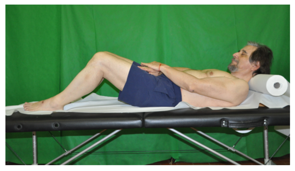
No, I was not willing to use charcoal. But some years ago I used Nutella chocolate/hazel nut spread – a crude, rough-and-ready imprinting medium-  showing that  the Shroud’s ‘spindly fingers’, far from being evidence of imaging  via internally-generated soft x-rays (thank you for that Dr. August Accetta) were explainable by imprinting, where a stronger more intense image is obtained from flesh that overlies the slimmer non-compressible central bone!

So how would Nutella perform on my own face (later easily washed off) ? Would the result be barely recognizable as a face, with no 3D-response whatsoever in ImageJ or other 3D-rendering software?

Here’s the result, dear reader.  Judge (initially) for yourselves. I’ll be back tomorrow with my own interpreation and evaluation.

nutella face before v after inversion and 3D for BLOG

Left: initial  imprint of my own face; sorry about the excess of Nutella! Right: after light/dark inversion in ImageJ, followed by 3D-enhancement. Note the prominently imaged, albeit flattened nose and nostrils and discernible lips.

Late addition (October 10): I have just imprinted all 4 fingers of my left hand onto dry v wet linen using powdered charcoal. The result, both before and after light/dark inversion and 3D rendering is truly spectacular.  It shows how effective a fine powder can be as imprinting medium.  I’ll display the result if anyone’s interested, but I mean GENUINELY INTERESTED, not merely trying to score pro-authenticity points.  (I’m only here for the experimental modelling, i.e. the science, not to respond to sniping and point-scoring).

What the pro-authenticity brand of sindonology, beginning with STURP,  has done is to enclose contact-imprinting  within a  barbed-wire-enclosed firing range, labelled “ENTER AT YOUR PERIL, EXPECT TO  BE SHOT ON SIGHT”.

And its present-day chief spokesman has the nerve to tell us that STURP represented science at its very best, a model for us Johnny-come-latelys to emulate.

Did it heck!

STURP was many things, some creditworthy, some not, depending on which of its 30+ participants you choose to select.

The notion that, overall, STURP represented science at its best could not be further from the truth.

STURP was infected from the word go with  starry-eyed pro-authenticity bias , one that wasted no time in attemptinmg to sideline or wrongfoot  the perceived opposition.

STURP, 40 years ago,  and even today, displays the unacceptable face of agenda-driven American free-enterprise…

make america sane again

Newsflash (October 8, 2018)

We interrupt this programme to bring you this newsflash (OK,  let’s not go wild: newsglimmer maybe). Here’s a cut-and-paste :

It has just appeared on shroud.com’s commemorative issue  marking the  40th anniversary of STURP. See under Internet.

[Editor’s Note: I received an e-mail from avowed Shroud skeptic Colin Berry on May 30, 2018, which included a link to a compilation web page of his research on the Shroud. Frankly, I did not respond to his e-mail nor did I include the link in our June 21, 2018 website update. Shortly thereafter, I received a comment from and had a written exchange with David Goulet, one of our viewers on our Facebook page. With his permission, I am reprinting it below, since it explains why I was initially hesitant to include the link to Colin’s web page.]

  • David Goulet – Robust update! However I would like to recommend that, perhaps at next update, you give a nod to Colin Berry’s website and ongoing experiments that provide a possible man-made narrative for the Shroud. I know Colin is not the most popular Shroud investigator but his research is compelling. His is, imo, the one non-authentic hypothesis that bears serious consideration. If reason is to serve faith, then we must challenge our assumptions and Colin’s site is a place to do that. To ignore the incredible amount of scientific modelling and research he has undertaken would be a disservice to the Shroud.

  • STERA, Inc. – I will certainly consider it for our next update. However, Colin didn’t win himself any friends by launching unprovoked ad hominem personal attacks against other researchers (including me) on a regular basis when Dan Porter’s blog was still active. Disagreeing with a researcher’s conclusions or results is how science advances and is perfectly acceptable, but personal attacks, particularly on deceased researchers who are no longer alive to defend themselves, crosses the line. Sadly, Colin crossed that line regularly.

  • David Goulet – Acknowledged and I appreciate the reticence given his antagonism. My main concern though is that regardless of Colin’s demeanor his science modelling continues to be compelling and innovative. There may be aspects of his work that may even provide insights for pro-authentic researchers – for those with the patience to sift through his site and deal with his truculence.

  • STERA, Inc. – Fair enough. May I quote this exchange? You made a convincing argument and I’d like to publish it with the link.

  • David Goulet – Of course. Thx.
  • Shroud of Turin Without All the Hype – This is the link to Colin’s web page.
Posted October 8, 2018

I’ll say no more for now, except to remind Mr.Barrie M.Schwortz that one cannot go suppressing criticism of what one perceives as faulty, far less hugely misleading so-called science including in some instances  leading figures in STURP simply because they are no longer with us. None of us are immortal. Mortality is a fact of life,  a terminal feature of the so-called “human condition”…

Criticizing their hasty conclusions and/or prognostications  in no way  constitutes what BS describes as “ad hominem” attacks. Indeed it’s arguably an ad hominem  attack upon myself  from BS to claim I’m the one guilty of making ad hominem attacks!

BS needs to look in a mirror! See  for example the way he refers to Professor Luigi Garlaschelli, spotlighting his areligious  (“atheist”) take on  life and the Universe, one that is shared by hundreds of million others on the planet!  I too, btw,  regard myself as a (closet) atheist, but consider that largely irrelevant when science is contantly challenged to account for the “mystery”, the “enigma” of the Turin Shroud!   (I say the Shroud is a simulated sweat imprint: no, not a real 1st century sweat imprint, but a 14th century SIMULATED sweat imprint,  that being a simple science-based message that even now, sindonologists for the most part attempt to stifle or suppress). It’s science and its alleged limitations that is the issue – at least for me. Which is why 7 years of being largely ignored and/or shunned by those ‘challengers of science’ is especially disreputable, showing their true colours some might think, using the TS (partly) as a means of taking a swipe at science and scientists. 

PS: thanks to  Canada-based David Goulet (keen sindonology observer as well as  gifted writer – being author of the interesting funeral parlour-focused “Looney Tombs” ) for his positive take on my approx. 7 year program of  Shroud research.  

Now back to, er,  my critique of Mark Antonacci’s critique (of imprinting-by-contact).  More to follow.

Yes, returning to Antonacci (still Page 63 of his 2001 book)…

“STURP scientists Jackson, Jumper and Ercoline attempted to reproduce direct-contact models capable of matching the image characteristics found on the Shroud (ref). They used a plaster mold of a face that was treated with different combinations of liquids and oils at different temperatures and draped with linen representing the Shroud. The experiment identified identified several weaknesses in the direct-contact theory. When the cloth was draped over the face mold that had been coated with in, two different types of shading effects were produced. An image was imprinted only where the cloth and face made contact; no impression was left if the cloth and face were separated by space. Yes, as discussed in Chapter 3, the Shroud body image was imprinted even where there must have been some distance between the cloth and body (for example the sides of the nose).”

The last-but-one sentence is 100% CORRECT! Yes, whether using a real face OR  that plaster model one cannot expect to get an image UNLESS there is physical contact.  One cannot imprint across air gaps. That is common sense, thus far acknowledged by Antonacci in a modelled system We now move onto the final sentence – kindly fasten your seat belts…

Repeat:  “the Shroud body image was imprinted even where there must have been some distance between the cloth and body (for example the sides of the nose”.

Really? How can you be so certain, Mr.Antonacci?  Have you tried imprinting off a real face by direct-contact, either with your charcoal, or as did above with Nutella spread?

When I say “imprinting”, I don’t mean simply laying a sheet of linen on top, the default position so beloved of pro-authenticists. I mean imprinting in a medieval context, where the linen is FORCIBLY applied to the face or other parts of the body, to be certain of getting a WELL-DEFINED image ( a scenario you briefly consider in your next paragraph).  Under applied pressure you DO get imprinting of the sides of the nose. Why?  Answer: the nose FLATTENS under applied pressure, or veers to one or other side, bringing  one or both sides into contact with the linen. But there’s a price to pay .. . one gets  a somewhat distorted image of the nose, being either flattened or pushed to one side, one or other side of the fairly rigid nasal septum.

But hold on a minute. Haven’t we read something about the nose of the Man on the Shroud looking not quite right? Where was that now?

The ‘flat’ nose in a 3D-enhanced image from Shroud Scope aroused interest on Dan Porter’s site way back. See this link. 

But there was an earlier reference to a distorted nose, from a coroner/pathologist no less – STURP’s celebrated if somewhat over-theatrical Robert Bucklin MD (who performed mock-autopsies, dressed in mortuary gear –  on TS photographs – see David Rolfe’s ‘Silent Witness’ documentary (googleable).   Let’s look out his exact words, shall we? Here they are, not from Bucklin’s 1997 autopsy report (about which the less said the better!) but from the earlier report which John Heller quote on Pages 2 and 3 of his 1983 book:

“The man has been beaten about the face, there is a swelling over one cheek, and he undoubtedly has a black eye. His nose tip is abraded, as would occur from a fall, and it appears that the nasal cartilage may have separated from the bone.”

Well, well, well!  The image of the man on the face IS distorted we were told, way back in 1983, possibly earlier by the authenticity-promoting Robert Bucklin MD. (You ain’t seen nothing yet – read his 1997 “autopsy”, performed as if on a real person, or even a photograph thereof, as distinct from an image of unknown means of production, with blood, or “blood” but no unequivocal imaging of wounds, not even in the so-called “scourge marks”. !

But Bucklin’s true-believer interpretation needless to say centred on pre-Crucifixion beating, without a single thought being given to a medieval forgery scenario, one in which linen was pressed up against the nose and face, distorting and flattening the nose, and maybe other facial features too.

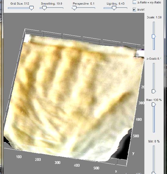
Far from being an insuperable problem where imprinting-by-contact is concerned, the nose provides us  with a tell-tale forensic signature of a MODELLED pressure-imprinting scenario! But not one using a rigid plaster cast! Oh no, it has to be a real DEFORMABLE face, a real deformable NOSE!  So forget all the (overhasty?) claims from Luigi Garlaschelli, Hugh Farey and others that the nose and/or other angular features of the face make imprinting off a real face too difficult, nay impossible. Not so, as I showed back in 2014, using Model 10 (flour imprinting) and relying on nothing more than photoediting software (MS Office Picture Manager!) to intensify the faint natural yellowish-brown  tinge of white flour:

new 3D highly cropped

Yes, white flour  slurry beats Nutella as imprinting agent any day (or powdered flour onto wet linen as an alternative – discussed earlier on this site). Note the slight distortion of the nose, a signature of contact-imprinting under strong applied pressure.

We now get to the part of the Antonacci take on contact-imprinting where the waters get well and truly muddied. How?  By a mixing up of “3D response” and “image distortion”, aspects which in my view should have been kept, at least initially in two entirely separate watertight compartments, failure to do which has done a huge amount of damage to the case for non-authenticity/medieval provenance. To say this investigator is severely rattled by the misinformation, started by John Jackson, further perpetuated by any number of commentators, in and outside of STURP, would be an understatement to say the least. Future historians could do a lot worse than look closely at what follows…

The starting point is this picture from Jackson et al, one which Antonacci displays on Page 64 of his book:

getImage lateral distortion used by antonacci CROPPED

Fig 41, Page 64, “The Resurrection of the Shroud” by Mark Antonacci, 2000,

Here’s Antonacci’s accompanying text on Page 63:

“When the investigators pressed the cloth onto those surface points where contact was not made during the natural draping over the face mold, the resulting image was grossly distorted (see fig.41).” 

That refers to the image on the left, prior to attempted 3D-rendering.

That passage is followed by this one, referring to the image on the right:

The VP-8 analysis of the direct-contact photographs yielded even more pronounded image distortions (fig.42) which means that direct-contact models cannot produce the correct three-dimensional information.

Gulp!  More to follow…  much more. It’s not so much what it says, as what IT DOESN’T SAY! Sorry, but science (unlike legal advocacy) does not take kindly to truncated arguments that omit crucial information. It’s just one more symptom/manifestation  of agenda-driven pseudoscience!

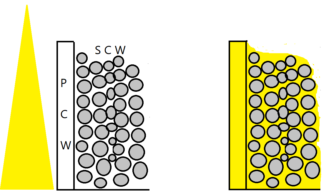
So what does it fail to say? Answer:  it omits to mention that part of a 3D rendering, whether from a face or plaster mold, that is called the SIDES!   It omits to mention “lateral distortion” by name, it omits to mention that lateral distortion is entirely avoidable by a simple expedient – at least in a  medieval simulation of a 13 centuries old sweat imprint: don’t imprint the sides, that way you avoid lateral distortion!

Are the sides of the face or body visible on the body image of the TS? Answer – NO! A resounding NO!

So let’s be absolutely clear shall we about why that last quoted passage from Antonacci  is wrong- spectacularly so. Yes, there is image distortion? And why? It displays lateral distortion? Why? Because the fabric was (a) allowed to make contact with the sides of the mold and (b) the sides of the mold transferred the imprinting agent onto the linen. Result – a distorted image when the imprinted linen was laid flat. But is that the same as saying that the imprinted image failed to respond to the 3D-rendering software? Answer: NO. Compare the image on the right with that on the left and one sees that, despite the lateral distortion, there WAS a 3D response! Look especially at the “hair” on the right, and what does one see? One sees a mountain range in miniature.

It’s not just Mark Antonacci who conflated 3D with lateral distortion. John Heller did exactly the same in his book. Go to the page of photos facing Page 83, and what does one see? One sees a photo with the following caption:

“A VP-8 of a photo of William Ercoline. Note the gross distortion of all the features and the two-dimensional quality of the VP-8 – both characteristics of a VP-8 taken from a 2-D surface. The only exception isthe Shroud.”

Wrong, wrong, WRONG!

Yes, the photo of William Ercoline does show distortion, but it also shows a positive response to the 3-D rendering software.

Why? Because any image with variations in image intensity will respond to 3D software, because that’s what the software does – it promotes 2D image intensity wherever it finds it to apparent 3D, simply by creating an imaginary third (z axis)  to initial x and y axes  and creating a needle-forest of height bars in place of 2D pixels. (The forest is later smoothed out, given artificial shadowing etc).

Why the distortion?  Because photos, paintings etc already contain an impression of 3D by means of angled light illumination, real or imagined by the artist, in the form of shadowing. But the software has no means of distingushing between image and shadow – both get elevated on account of their additional image intensity. Forget all the semantic nonsense that intrudes by use of the term “encoded information” Yes, the software may have a computer at its heart in order to process the multitude of pixel intensity information, but it’s not there to decode, merely to re-display in a new re-mapped form with that third imaginary z axis  (aka coordinate), one that merely takes what it finds with no attempt at  “decoding” far less  intelligent “interpretation”.

So, to summarise: image distortion in 2D renderings, 3D or both, can take at least one or both of two different forms (there may be more).

The first is from shadowing in photographs and paintings becoming elevated as if image, when it’s not. Solution: avoid photographs and paintings. Use IMPRINTS instead (and I say the TS body image is an imprint, not a photograph – or radiation-generated proto-photograph – and certainly not a painting.

The second is from lateral distortion, from attempting to imprint off the sides as well as the flatter frontal planes of face and body. Solution? Don’t. Either keep the linen clear of the sides, or apply one’s imprinting medium to the frontal planes only, keeping the sides uncoated. It then doesn’t matter if the linen makes contact with the sides.

How to ensure that frontal planes only receive imprinting medium? Answer: this investigator discovered two ways. The first, used that flour imorint of my face above, was to make a slurry of flour in water, and paint it onto the parts one wants imaged.

The second, more subtle, is to sprinkle  dry powdered flour  from ABOVE the recumbent subject as imprinting medium (maybe smearing the subject first with oil to act as weak adhesive) such that flour settles on the frontal (more or less horizontal) planes only, failing to settle on the more vertical sides. Then imprint onto WET linen. Each method has its pros and cons (about which more later).

So what are the prerequisites of an image that renders it responsive to 3D software?  Does it require imaging from a real life 3D entity (regardless of mechanism?).

As long ago as Feb 2012, when this investigator was evaluating imaging via direct scorching (from hot metal template) he found that simple items with scarcely any 3D relief (an aluminium pencil sharpener and a metal African bas relief trinket) gave a pronounced response with ImageJ.

pencil sharpener, ghana trinket scorch imprint, pre post 3D

“Encoded” 3D, items uniquely responsive to 3D software? Oops, no, the Turin Shroud body image claims that title! Mustn’t muscle in…

What about input images that have no 3D history whatsoever? Do they respond to 3D-rendering software? Surely not…

1. stars with increasing brown      stars optimized 3D in imagej

Still 2D – a graphic with no 3D history whatsoever?

No, it’s now gloriously 3D, and for very simple reasons. The 3D-rendering software converts image intensity to height on a new imaginary vertical axis. Any input with variable image intensity does likewise. No “encoded 3D information” is needed. No decoding of “encoded 3D information” is needed.

Yet as recently as that Pasco conference last year, we were being told how the TS body image was “uniquely responsive” to the VP-8 image-remapping software. No, it’s not, and it’s high time that bit of misinformation ceased being put about, year after year, long after the basic proposition was conclusively disproved, by myself and others.

See the response to one of my postings on the Porter site, the one where I showed that a Model 10 flour imprint responded much the same to ImageJ software as the TS body image from Shroud Scope. Talk about galloping mumbo-jumbo!

Question: how do the results of  3D-rendering compare if computer-generated  graphics are compared side by side with imprints from bas relief templates or fully 3D ones?

Answer: it may be there somewhere in my 7 years (approx) of archives. But what’s the point of experimenting further when one is a non-person where pro-authenticity promoting sindonology is concerned? Why waste more time that I have already.

No, I shan’t. Instead I’ll  take a leaf from that same body of opinion, going briefly  into full-speculation mode, not bothering with anything so tedious as experimental modelling.

Can flour imprinting (my Model 10) deliver  a degree of subtlety that is maybe superior to those alternatives lacking any 3D history?  Yes, I believe it can, at least in theory, and here’s how. It’s that ability to capture an image of the nose (prominent) AND an image of lower relief  (forehead, lips etc) contrary to received wisdom that provided a clue.

More to follow…

Right then, white flour imprinting agent is superior to Nutella. Why?  There are several factors that could be listed. Like how easy is it to spread an evenly  thin layer over the subject to be imprinted.

(Variations in thickness, if translated into random differences in transfer onto linen would clearly make a nonsense of 3D-rendering, given the latter depends critically on variations of image density that reflect the subject’s  real 3D relief).

White flour can be used to give a thin even layer, whether painted on as a slurry (and spread out evenly) or, better still, coated with sprinkled flour, the excess then being shaken off.

Now let’s move on to the final factor, the one I suspect accounts mainly for the superiority of dry white flour, applied to wet linen. It’s to do with differential pressure.

Try this quickie experiment. Press the palm of your hand across your face, compressing your nose sifficiently to feel hand pressure on cheeks, forehead etc.  Notice anything?

Note that the pressure on the protuberant nose is greater, considerably greater, than that on the lower relief. The answer is obvious. The force needed to compress/flatten the nose reduces the force on the lower relief!

Here we have what I believe to be the explanation for the spuriosu (and totally unscientific) cloth-body distance factor introduced  early on by John Jackson, accepted uncritically by others. It supposed a loosely-draped with air gaps, but apparent imaging across those postulated gaps, leading to the fanciful idea of imaging via some kind of radiant energy. Not so. The cloth was not loosely draped in our medieval scenario. It was firmly pressed against the subject. closing many (but not all) air gaps.

But some relief was better imaged than other, despite physical contact in all cases. How?  By the higher relief making the first contact with the linen-  leaving  a more intense imprint than lower relief, the latter partially protected from application pressure by the higher relief.

In short we have a contact-only imprint model, but one that incorporates the notion of differential application pressure (and subsequent efficiency/inefficiency of medium transfer) due to increasing difficulty to apply pressure to progressively lower relief.

One needs a shorthand to summarise the proposed phenomenon, one of graduated protection with depth from applied manual pressure, creating subtle differences in image intensity, ones that reflect the subject’s own 3D relief, while not preventing a basal 3D imprint as might be seen with  simple, shallow bas relief.  As I say – subtle, not all or nothing as might be expected from a contact-imprinting model, but one that is nuanced, highly nuanced.

Here’s superlonghand for starters (well, one has to start somewhere):

Contact-only imprinting, but pressure-variable transfer of medium, due to difficulties of access to lower relief on account of subject’s linen-impeding higher 3D relief.

Shorter hand:

Partially obstructed, pressure-modulating contact-only imprinting.

Alternative shorthand?

Contact-only imprinting, but pressure-sensitive for both voluntary and unavoidable anatomical reasons.

Alternative shorthand?

Pressure (not distance) dependent, image-density-variable/obligatory-contact  imprinting (no air gaps).

Or:  Contact-only imprinting, with pressure and image intensity attenuation arising from template-variable physical 3D-hindrance.

Or:  Template 3D-induced pressure-variable image attenuation in direct contact    imprinting. 

Or:  Pressure-variable contact imprinting, with imprint-intensity nullified or attenuated – by template-specific 3D geometry

More to follow…

Image intensity is the same for frontal and dorsal surfaces (cited by pro-authenticity camp as supporting imaging via radiation.  Imaging by contact, we are told, would make the dorsal side image more intense – if imprnting-by-contact where the mechanism of imaging).

There’s a simple answer to that argument, cited several times before on this site. TWO volunteers were used for the imprinting, both recumbent, head to head, one face up, the other face down. Both were ‘floured-up’, then covered simultaneously by the same single sheet of wet linen. Both had the linen manually pressed DOWN onto their bodies, yo generate the frontal and dorsal images simultaneously.

Why have one face down? Why not face up, and press the volunteer’s body down into the linen? Answer: in that configuration, previously called ‘LUWU’ on this site – Linen Underneath With Underlay – there is no opportunity to exercise fine manual control over the imprinting process – it becomes entirely passive, with everything out-of-sight. Better to deploy the  ‘LOTTO‘ confhguration for both frontal and dorsal imprinting – Linen On Top, Then Overlay.  (Overlay optional with LOTTO, less so with LUWU ). It’s also easier to get the two images properly aligned when there are two cooperative individuals, following instructions to edge this way or that until both are perfectly aligned on the long axis.

More to follow

Tuesday October 9

So how should STURP have set about its self-appointed task, it wishing to be seen as scientific, deploying all the 13 process skills of true science (as distinct from merely accruing data with no defined goals or hypotheses worth speaking of?)

First, it should have paid scant attention to that “just a painting” write-off. That can and should have been excluded largely on the basis of the negative tone-reversed body image. Artists do not paint negative images, unless deliberately wanting to portray the ‘look’ of an imprint, in which case they might just have well imprinted rather than painted (especially given the pointers to the “real” Joseph of Arimathea linen, with full-sie naked human body, front v back, no sides, realistic-looking bloodstains in ‘all the right places’  etc etc).

Properly thought through, the aim should have been to set up an alternative credible hypothesis if wishing to face sceptics square-on : not “just a painting” but “just an imprint”. Ay, there’s the rub, as Shakespeare put it.

STURP’s team leader John Jackson  wasted no time in interpreting, some might say explanation-pre-empting  the image characteristics as those produced not by contact-imprinting, but via some kind of mysterious hitherto-unknown-to-science proto-photographic imaging across air gaps, via undefined collimated, gravity-aligned electromagnetic radiation.  (Yeah right, call that science, John Jackson PhD?  Is that what they taught you with at that doctorate-awarding naval academy?) Sceptics were immediately faced with the near-impossible task, not of systemtically seeking evidence to clinch an imprinting mechanism, but of  near-impossible evidence to DISPROVE Jackson’s fanciful religion-inspired thinking!  To think that STERA’s President holds up the STURP enterprise as  model for good science!  Methinks you should have stuck to the documenting photography, Mr. Barrie M.Schwortz, instead of telling modern day scientists how to do their job. We don’t tell you how to take your photographs?

Is there anything STURP could have done, or indeed did so, to make the best of a bad job – to get the real  and RELEVANT hypothesis-driven science on the road, if only tentatively? Answer: YES, in both cases. A start was made, one that is much neglected indeed largely overlooked in so much of the current sindonological literature. And guess what – it used photography – not documenting photography but scientific photography.  It was a hugely promising start, given what it revealed about the Shroud body image – at the microscopic level! Thank you STURP’s Vernon D.Miller and fellow “Scientific Photographers”.  It could have been used as a basis for scientific modelling, to be done both before  (especiallly BEFORE!) or after the actual 5 days spent by STURP in Turin. It can even be done today, once we clear out sindonology’s  accumulated clutter of “just a painting” or “supernatural radiation” notions built on their subsiding foundations of sand over 40 odd years.

More to follow  tomorrow – with concrete proposals for that much-needed MODELLING of the peculiar Shroud image characteristics – the so-called ‘half-tone effect’, the “image discontinuities”, the “striations”, the ‘second face’ effect, the image-fibre fragility, the identification of the image chromophore et etc etc.

Expect to see a proposed central role for “radiochemical markers’  for both linen AND non-linen components, final destinations tracked by means of autoradiography!!!!

PS:  have so far merely hinted at the major (?) proposition being launched, namely that what previously has been seen as a all-embracing cloth-body distance factor is in fact something entirely different that was overlooked by Jackson and others  namely a  resistance or obstruction  to lower relief by first encountered higher relief. That then impacts not only on the map of 2D-imprinted image intensity, but on any subsequent attempt at 3D-rendering

Is there a way of testing that proposition experimentally?

Yes, I do believe there is.  Hopefully,  MS Paint and ImageJ between them might supply an answer (albeit provisional for the time being). Time now to charge up an ancient largely-retired laptop in the spare room with its downloaded Image J software, MS Office photoediting (for brightness/contrast control) etc. Hopefully there will be something to show for my labours tomorrow.

Be afraid, John Jackson. Be very afraid.  Well, mildly discombobulated anyway, given that largely-impenetrable thick skin, nay carapace of yours.  (No, we don’t mince our words on this site) .

Science (real  ‘tell-it-the-way-it-is-science’ that is ) works via targeted and systematic discombobulation of those folk, scientifically qualified or otherwise, who stick stubbornly and rigidly  year in, year out, decade in, decade out – to their quaint outdated notions as to how the real  (allegedly miracle- interrupted) world operates.

Yes, more tomorrow…  Comments as ever welcome…

Wed October 10th 2018

On second thoughts I think it better to end this posting here, and keep the subtleties of pressure-sensitive/body contour responsive contact-only imprinting for another occasion.

(That’s imprinting with white flour onto wet linen – my Model 10 – NOT with super-sticky Nutella spread onto dry linen I hasten to add)!

Hopefully I’ve said enough to make clear that the air-gap invoking cloth-body distance model of Jackson and others in its countless guises is not by any means the only show in town, and indeed should have been run out of town decades ago. Why?  For being shamelessly and outlandishly unscientific. Raymond Rogers, STURP’s chemical team leader, said as much…

Pro-authenticity sindonology is currently raising my blood pressure, as might already have become apparent.

three sindonologists

Look carefully:  if you’re very observant, you might just be able to spot the three sindonologists in this picture

Time now for me to take an extended break from its incessant undermining of science as I, a retired experimental, model-building, model-testing scientist, understand the term (see that link cited earlier to science’s  13 process skills!).

Science, correction, pesudoscience, ought never to be deployed as a propaganda weapon, used to promote this or that ideology… It  cheapens and debases science.

Au revoir (but assuredly not adieu).

Concluding message to the President of the Shroud of Turin (so-called) Education and Research Association from what he refers to as this  ‘avowed shroud sceptic’ :

The Shroud of Turin is simply a medieval attempt to mimic the kind of body imprint (sweat and blood) that might have been left by the crucified Jesus on Joseph of Arimathea’s ‘fine linen’ en route from cross to tomb.

Where the take-away message is concerned, nothing more needs to be said. Everything else is detail.

The Shroud of Turin is simply a medieval ‘fake’ memento  of something that the Bible states took place some 13 centuries earlier. It’s a ‘faked’ souvenir, no more, no less.

Now then, what was the real purpose of Stonehenge and Silbury Hill (returning to  what was this investigator’s secondary, now primary interest)?

No, I won’t supply a link, not being in the business of self-promotion.This retired scientist is merely attempting to quash fatuous speculation, establshing the real facts, such as are presently available.

Message to Vatican:  Time now to invite a STURP Mark 2 (40 years post STURP Mark 1) –  with more scientists, fewer technologists.

I’d be happy to be part of the team…

Appendix

  1. Screen grab of the following 2014 Abstract added today, Nov 4, 2018.

G Fanti 2014 Dozen years of SSG

It’s needed to supplement the comment I placed on the end of this posting yesterday regarding the somewhat narrow focus when analysed in terms of word counts.

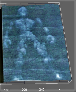
2. Site banner: see how a simulated sweat imprint (my wet hand pressed down onto dark fabric) responds magnificently to 3D-rendering computer software (ImageJ) before and after tone-reversal (negative back to positive image). Remind you of anything? Like those supposedly “unique”  and “encoded” 3D-properties of the Shroud of Turin body image?

For a more realistic aged/yellowed sweat imprint, see the many postings on this site since 2014 obtained with the aid of my Model 10 (imprinting off  parts, notably head and hands, of a real body (mine!) onto linen with white wheaten flour, followed by heat-development of the image to generate carbon-based and thus bleachable straw-coloured melanoidins via Maillard reactions between wheat proteins and reducing sugars).

Postscript (added Dec 20, 2018)

Here’s a photo I took a few yards from our hotel two weeks ago on the Maipo river valley,  western-fringe-of-Andes,  approx. 1 hour drive SE from Santiago, capital of Chile. Delicious scenery, wot?

IMG_5310.JPG


Important postscript (added Dec 27, 2018)

As flagged up several times these last few months, this long-term investigator of the Shroud (7 years anniversary in 3 days’ time ) has been holding off from posting new material these last few months (let’s not dwell on the reasons!). Suffice it to say I’ve been deliberating at length on how best to convey the message that has formed, nay crystallized,  in my mind these last 7 years, starting with my Model 1 (“thermostencilling” with charcoal) posted on my sciencebuzz site on Dec 30, 2011.

Back in October, I suddenly realized what I’d overlooked to do, back in 2011 (see  “Late addition, October 10”   this posting,  highlighted with red font). Had I done it, there’s a real possibility I could have jumped straight from Model 1 to current Model 10.   Drat! I should have IMPRINTED with charcoal (NOT painted!).

I now have (finally!) a handle, not only on resolving the enduring  ‘enigma’ of the  Shroud in research terms, but conveying the essence of the oh-so-simple solution! Expect a posting (maybe preliminary) on the 7th anniversary  of my baptism-by-charcoal this coming Sunday (Dec 30, 2018). In the meantime, here’s the key image that will be displayed prominently:


charcoal imprint - dry v wet linen l v r 10 oct 2018

The key buzzword? Why,  POWDER (as in powder imprint) of course!

Probable title of my next posting:

“Turin Shroud: simply a one-off medieval powder imprint. ( So, please, let’s now draw a line under decades of pseudoscience.)”


Further reading:  http://colinb-sciencebuzz.blogspot.com/2019/08/re-that-misnamed-so-called-shroud-of.html


Posted in Shroud of Turin | Tagged , , | 8 Comments