Site banner: see how a simulated sweat imprint (my wet hand pressed down onto dark fabric) responds magnificently to 3D-rendering computer software (ImageJ) before and after tone-reversal (negative back to positive image). Remind you of anything? Like those supposedly “unique” and “encoded” 3D-properties of the Shroud of Turin body image? For a more realistic aged/yellowed sweat imprint, see the many postings on this site since 2014 obtained with the aid of my Model 10 (imprinting off parts, notably head and hands, of a real body (mine!) onto linen with white wheaten flour, followed by heat-development of the image to generate carbon-based and thus bleachable straw-coloured melanoidins via Maillard reactions between wheat proteins and reducing sugars).
Summary: added Wednesday 12th July
See this image, taken yesterday, Tuesday 11th July (yes, for me a RED LETTER DAY) through my new stereomicroscope (sadly lacking inbuilt image capture hardware) with a hand-held camera.

What’s so special about it? See final entry on this posting for why it’s very, VERY special, indeed, probably unique.
Clue: it shows how a very distinctive feature of the Turin Shroud body image, indeed one that has been described as “enigmatic” can be simply reproduced in the home using nothing more than a convenient portion of your anatomy to serve as body-imprinting template (try using the back of your hand for starters), a bag of white flour, a flour sieve, a square of wet linen and a hot oven. It shows coloured fibres congregated on a superficial (air-facing) side of linen threads! But it’s NOT the side of the linen that received the imprint but the REVERSE side! Now how could that happen, one might ask? How can colour get from one side of the linen, the side that received the flour imprint, to the other? What was happening in the hot oven that allowed transport to occur via just SOME of the fibres within linen threads, arriving on the opposite side in the more superficial fibres only? I say we have a key clue as to the nature of the Turin Shroud body image, and more importantly, how it was made using simple (albeit somewhat quirky customised one-off) medieval technology.
Start of original posting (by way of an experimental diary, as indeed has been the previous 400+ postings from this retired scientist/Shroud investigator).
Models 1-9 were developed over an approx 3.5 year period between Dec 2011 and Aug 2015.
The final Model 10 (yes, FINAL!) which I now firmly believe explains the Shroud body image appeared in Aug 2015, first reported here and a little earlier on Dan Porter’s pro-authenticity site, since closed, (where, needless to say, it received scant attention).
The last two years or so have been spent patiently, laboriously and systematically addressing the details, ticking off the relevant boxes one by one. (This long-running project, reported in real time, has been largely ignored by wider ‘sindonology’, but curiously not attacked as were my earlier models – notably direct scorching off a hot metal template (Model 2) now replaced by real human anatomy. Make of that what you will, dear reader).
The ticked-off boxes were as follows:
1. Yellow-brown, negative, i.e. tone-reversed image
2. Fuzzy image, no defined outline
3. Positive response of body image to 3D-rendering software, notably ImageJ
3. Heat and water-resistance, longevity
4. Superficial image, inasmuch as colour is concentrated on crown (loop-over) threads, though not exclusive to those locations
5. Bleachability (by domestic bleach) indicative of carbon-based chemical structure, matching diimide bleachabilty reported by Heller and Adler
6. Curious microscopic properties, namely the so-called ‘half-tone’ effect and abrupt image-discontinuities on single fibres.
I have now successfully ticked the crucial final box, arguably the trickiest of all, namely to account for
7. The so-called ‘second face’ aka reverse side faint, scarcely if-at-all visible image.
Yes, that has been the trickiest of all to explain. I advanced a theoretical explanation two postings ago in response to articulate Canadian commenter Matt, but was unable to provide experimental evidence to support that theory. That evidence is now available.
This posting will set out the latest evidence. It will be delivered in bite-size instalments, starting with the principle by which Model 10 (flour-imprinting) operates in conjunction with an input of classical thermal energy currently using a fan oven as a poor substitute for what was probably a medieval (14th century) bed of glowing charcoal embers, and how a minor change in experimental technique is able to promote or repress reverse-side imaging. Clue to answer: geometry – whether of not the imprint -or reverse side- directly faces the source of thermal energy or not…
Why important? It’s to do with the speed of evaporation of water from the capillary channels between the fibres in each linen thread. Chromophore (liquid thermal exudate) cannot penetrate those capillary channels, migrating across the weave, unless or until the water in the initially wet linen has been driven off as steam. Suspension configuration of linen in oven produces unequal evaporation of water in imprint versus reverse side.
More to follow.
Sunday July 2
First, some light (?) relief: this appeared on The Times of London leader page yesterday – a reference to – guess what? Yes, the Turin Shroud, though hardly flattering as regards the quality of the ‘science’ that accompanies at least one of what seems a never-ending series of ‘headline-grabbing’ and invariably unsubstantiated claims:

Sorry about the image quality (a rush job). It begins as follows:
“There was only one problem with Alberto Carpinteri’s revelation that the image of Jesus imprinted on the Shroud of Turin was put there by neutron radiation emitted by an earthquake soon after the Messiah’s death in AD33. It was the same problem as the one afflicting a paper published in Science that claimed face-to-face conversation with gay canvassers could be relied upon to change a traditionalist’s mind on the subject of gay marriage. Both “discoveries” were no such thing and had to be retracted. One explanation for such bad science is that it is produced by bad scientists who value publicity and their own advancement over knowledge …”
Surely not! Isn’t sindonological “science” as pure as the driven snow?
That depends of course on what’s driving the snow – currents of clean air or goal-directed bulldozers!
Back now to the plodding science, in this instance the non-headline-grabbing warts ‘n’ all variety:

The imprinting technology in this initial experiment could not have been simpler. Vegetable oil was dispensed with altogether. Flour was simply sprinkled from a sieve held a few cm above the back of left hand. The hand was then turned over and given a violent shake so as to detach all but a thin dusting of flour. Wet linen was draped on top, then a towel, the two layers being firmly pressed to transfer a flour imprint to the linen. The latter was then suspended vertically in a fan oven, with the first of two separate imprints facing outwards, i.e. towards the glass door, the second being the other way round, facing the fan/hot electric element. The two sheets with developed images were removed when the temperature reached approx. 190 degrees C.
After photography each sheet was then divided into two longitudinally and one half washed vigorously with soap and water so as to detach surface encrustation, leaving just the faint, fuzzy Shroud-like image.
More to follow
Monday July 3
So why have I finally squared up to the ‘second face’ ‘enigma’ using an oil-free experimental test, given that for two years I have (after brief initial deliberation) routinely coated skin, plastic mannequins etc with vegetable oil before dusting with flour (the reasons for which can be returned to later in this posting)? Answer: respect for Occam’s Razor. Desist wherever possible from multipling entities needlessly. In other words, try to restrict the number of variables. If nothing else, it reduces the temptation to go introducing qualifying assumptions into any new experimental model.
So what’s the take-away message so far from the oil-free system as regards the second face? Answer: the issue could have been dodged merely by making the oil-free system the default one. Why? Because as will be seen shortly, the absence of oil produces a much fainter heat-developed imprint on the primary contact side, and, hardly surprisingly, scarcely any visible image worth speaking of on the opposite side! But that opens one up to the charge of loading the odds in favour of one’s flour-imprinting model. This investigator is not in the business of window-dressing his data. Better to look at worst-case scenarios initially, albeit opening cans of worms along the way, optimistically seeking reasonable means of making the results less worse.
So let’s move on now to see why vegetable oil was made an obligatory part of my standard imprinting procedure, and then look closely at the knock-on effects where reverse-side imaging is concerned, and then address the factors, practical, theoretical or both that might operate to promote or reduce reverse side imaging in my default oil-supplemented system.
More to follow
Here’s an experiment which included an oil/no oil comparison (plus a second variable – let’s ignore for the moment).

Yes, the fingers only were smeared with oil before dusting with white flour.

Here’s the result immediately after oven-roasting. As can be seen, a pre-coating of oil HUGELY assists image development (top half). This finding, when made some 2 years ago, was a major factor in deciding to include a pre-coat with oil in the standard operating procedure, but was not the only consideration (more about that later).
Why the longitudinal bisections? As indicated, a second variabe was investigated in this test and found to be almost as important for image development – namely whether the flour imprints were dried before placing in oven (left of vertical bisection lines) or whether they went into the oven without drying. The possible reasons for that difference are probably best left for another posting.
Note the sizeable image on the opposite (non-imprinted) side of the linen when oil-pre-coating is/was used. At first sight, that might argue for elimination of oil, so as to more closely match the Shroud image with its exceedingly faint reverse side image (mainly face and hands we’re told). Alternatively, one can use the intensity or otherwise of the reverse side image as a marker for likely relevance/non-relevance of alternative modes of imprinting technique, maybe, hopefully, uncovering new insights into how those 14th century artisans deployed flour plus or minus oil as the putative means of generating a faux imprint in sweat (and blood) of the crucified Jesus onto an equally faux Joseph of Arimathea-supplied length of fine linen.
More to follow
The flour-imprinting technique is in principle simple – absurdly simple (“inelegant” according to a commentator on another site). But it’s also complex, both in theory and in practice when one begins to appreciate the plethora of different processes that operate to generate the final image, either on the contact side of the linen, the opposite side or both. How does one cope? One handy ploy is to step aside and seek a second opinion, as I did recently with the outcome of a particular experiment shown below. What you see are the opposite sides of flour-imprinted linen, using small or large amounts of flour, with the samples facing towards or away from the oven heater/fan and before/after washing. Let’s not bother with definitive labelling for now. They are simply designated A through to H. I asked someone to look at the 8 specimens and say which they thought had the weakest image. Perhaps you too dear reader would care to do likewise:

Response? “C” was selected, to which I replied “Close, but not quite the answer I wanted”. Why not? Firstly, C is the opposite side of oil/flour imprinted linen where the imprint itself faced the door of the oven, to the heat source. (There was also a light loading of white flour, a subsidiary variable under test, in contrast to the 4 samples E,F,G and H.). But there’s a problem with choosing C. Why, because D which follows it is C AFTER washing, so has to be fainter than C, which I believe it is and was. So I asked my respondent for reasons in referring C to D. D I was told has a prominent dark line down on of the fingers. Yes, it happens from time to time that I get dark lines down some of the imprints for reasons that are not entirely clear, which I suspect in this case is due to pressing linen too hard against a digit with hard, non-compressible underlying bone. With that one glitch I believe my respondent selected essentially the correct answer, one that increases confidence in one of the hypotheses under test, namely that a flour imprint that is turned towards a directional heat source, with the opposite side receiving thermal energy at a slower rate through being partially protected by a thickness of initially damp linen will yield a fainter less conspicuous reverse side image.
Full labelling of A -H will follow later today.
Later has arrived:
Important: all images are those on the reverse/opposite side of linen from the primary imprint. (The latter are not shown, but are available on request.)
Key to photographs on reverse-side imprinted linens:
A versus B: a comparison of UNWASHED versus WASHED reverse-side images respectively, having used a light dusting of flour onto a pre-coating of skin with vegetable oil. The images shown were developed in the fan oven facing AWAY from the source of heat (rotating fan, incandescent element on back wall of oven).

Schematic diagram: modern-day fan oven

Direction of airflow from fan/heating element.
( Please excuse and ignore the roof and floor looped elements which were not activated in this study, only the fan and integral hot element being used).
Key (continued) :C versus D: a comparison of UNWASHED versus WASHED respectively, again with light dusting with flour onto oil-smeared skin. This time, however, the imprint faced TOWARDS the source of heat.
E versus F: Same as A/B, but with a heavy loading with flour onto oil-smeared skin (surplus flour was NOT shaken off before imprinting onto wet linen).
G versus H: same as C/D but as with E/F, using a thick coating of flour instead of light dusting.
More to follow (tomorrow)
Tuesday July 4
To those of you who have braved it this far (with zero assistance thus far from the perverse and, I believe, commercially and ideologically-biased Google – don’t ask!), be now prepared for a surprise result. Well, I was surprised, nay gob-smacked, when viewing the results of the recent experiment, one that was initially conceived as merely a systematic dotting of i’s, crossing of t’s).
Here’s been my standard hand-imprinting routine these last two years:

Step 1: smear hand with vegetable oil
Step 2: sprinkle flour from above through a fine sieve
Step 3: invert hand, shake of excess flour
Step 4: restore hand to original position, drape with wet linen, press to imprint, oven-roast.
Why shake off the excess flour? Answer: because the aim of the exercise has been to simulate the Shroud body image, which we all know is exceedingly faint with a tiny hint of reverse-side imaging. It would make no sense (right?) to deploy a large excess of flour?
But what if one did, if only as a box-ticking exercise? What would one expect to happen? Had I asked that question, I guess I’d have predicted a much bolder image on the imprinted side, probably an increase in reverse-side imaging too though not as intense as the imprinted side, with the final soap/water resulting in loss of the thick encrusted imprint, but essentially maintenance of the status quo (i.e. surviving imprint image still darker than reverse side).
As I say, be prepared for a surprise, one that I believe helps give a powerful clue as to nature of any reverse-side image, whether faint or strong.
More to follow shortly. Much more…
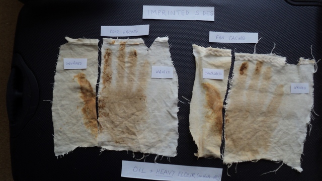
Sorry about the faintness of the labels (I may substitute an edited graphic later). That’s an door-facing high-flour hand-imprint on the left, with thumb separated to serve as control on washing (4 fingers), compared with a fan-facing high-flour imprint on the right, similarly divided unequally to test washing.
(Note in passing that the washing was not 100% efficient – deliberately so – since it reduces the risk of confusing the two sides (a trace of surviving encrustation immediately distinguishing the post-wash contact side).
There were no surprises when viewing the contact sides, regardless of suspension geometry in the fan oven, regardless of whether the linen was washed or unwashed. The surprise came in what follows – viewing the opposite, non-contact side with those ‘enigmatic’ reverse side image.
..

More to follow shortly. (I’ll also be explaining the intrusion of that abrasive black emery board and the rolls of sticky tape).
Still July 4, now 2:45 pm local time
I flagged up a while ago that I had a new means of probing image superficiality. NO, it’s not just sticky tape (as per Ray Rogers). It’s application of an abrasive emery board ( as used to file nails, calluses on thick toe skin etc), then followed by harvesting of the abraded fibres with sticky tape.
Think of it if you will as Ray Rogers delicate, minimally invasive sampling of the real Shroud – with sticky tape alone – on STEROIDS, as permitted in model systems being investigated a 1000 miles or so from Turin. Yes, we’re talking about my current flour-imprints onto local charity shop linen. (Thank you btw you faceless unknown charitable ladies for your discarded oh-so-last year summery white linen trousers!).

Yes, the unexpectedly high-intensity reverse-side image on the hotter fan-facing source of oven fan/inbuilt electric element has been abraded lightly with an emery stick (blue arrow points towards abraded fibres). Note the ( truly remarkably) abraded pale patch on the abraded top corner of the linen, yellow arrow, suggesting that image superficiality is not restricted solely to the imprinted side of the linen, as might be predicted, but to the opposite side too if – or when, as here – there’s a reverse side image.
Now why might that be?
More to come tomorrow!
Wednesday July 5
Before showing the individual abraded fibres at the microscopic level, let’s start with some low magnification pix of each of the two sides of entire imprinted fabric, given that their relative image intensities were the opposite to what might have been expected. That is one amazing paradox, would you not agree dear reader?
The first step was to examine under my new stereomicroscope (max magnification x100).

Incidentally, am I the only one to think that stereomicroscope is something of a misnomer. Stereo- short range binoculars would seem a more appropriate description, given the large distance between specimen and optics!
Unfortunately, I can’t easily share the result, given there’s no image capture facility on the stereoscope. Please be content for now with this description in words (to follow shortly).
Well, all I can say is that what one sees is truly, TRULY astonishing. If one didn’t know which side was which one would conclude that it was the opposite side that had been imprinted then oven-roasted. Not only is the opposite side much, much more intensely coloured, but it looks for all the world like the description of the Turin Shroud body image with colour concentrated mainly on the crowns of the threads, i.e. the highest points. In contrast one sees scarcely any colour, IF AT ALL, on the imprinted side of the WASHED linen.
How can that be one might ask?
An out-of-the-box idea is starting to form inside my head, one that might explain why the Turin Shroud has had that sewn-on Holland backing cloth since the 1532 fire, and maybe had something similar even before the fire too (?). Which side of the linen might the putative roasting-crew of medieval artisans have been viewing to judge the progress of thermal image development? Might it have been the NON-imprinted side if it had been THAT “opposite” side they were primarily interested in? When we look at the Turin Shroud, and hypothesize, nay surmise, that it was made in principle, and indeed in practice, using my Model 10, then which side are we viewing as “image side” – imprinted or non-imprinted side? Might some of what is described as the subtle, enigmatic Shroud body image be explained by it being a ‘bleed-through ‘ coloration of the ‘opposite’ non-imprinted side?
But let’s not get ahead of ourselves. Let’s complete the microscopy first at thread and fibre level before speculating on how similarly unidirectional heat may have been applied to a flour imprint in the mid-14th century, before there were fan ovens.
There have been no surprises thus far from the stereoscope, viewing first the intact fabric then excised threads. Rotating the threads reveals the following pattern, shown here in a highly schematic diagram:

So one has one of two choices. If one wants a reasonably visible image to remain on the imprinted side after washing, with a faint or near-invisible image on the opposite side, one presents the imprinted side to the source of heat. But if one wants a more intense image, one directs the source of heat onto the non-imprinted side: after washing it’s that non-imprinted side that has the bolder image, the imprinted side having a much weaker one (after washing).

Here’s a x100 view, top illumination (new compound microscope, supplemented with hand-held LED torch see above!) of those emery-abraded fibres, first from the lighter washed imprint side, second from the darker non-contact side, corresponding with the above diagram in terms of heat source direction ….


More to follow…
More microscopy? I think not. Having flagged up that I have invested in two new microscopes, I’ll keep further results to myself, unless challenged to back up this or that claim that might require recourse to microscopy. Why? Because bitter experience has taught me that photomicrographs provide a easy route for hostile commentators to claim one’s an amateur, not knowing how to use a microscope if there’s so much as a hint of blurring in one’s images of (3D) fibres. Sorry, I have no time for these obnoxious amateurs, posturing as grand old men of science. Nothing more need be said on that score.
Next step? Dispense for a while with the fan oven. Try developing the flour imprints over the incandescent electric elements of a ceramic hob as a closer model to a medieval bed of hot charcoal. As the summer progresses I may even try a barbecue, once the sausages, kebabs etc have been removed.
Yup, it’s a 5 minute job to demonstrate ‘opposite-side scorching’ with a ceramic hob. Simply make an imprint of one’s hand or fingers onto wet linen, having first coated with vegetable oil and a heavy coating of flour, then hold the imprinted linen horizontally over the incandescent element with the imprinted side UP.
As soon as one starts to see the imprint turn yellow then brown, examine the underside at frequent intervals. Watch it go a dark chestnut brown rapidly. One can later wash the linen to compare both sides.
So, chromophore, or its precursors, rapidly migrates across the thickness of the fabric from the imprint to opposite side, that transport being favoured by an initial temperature gradient that keeps the opposite side at a somewhat higher temperature than the imprinted one. See my earlier posting from April this year for a more detailed consideration of the theory.
Comment promoted: what are we to make of the second face on the reverse side of the Turin Shroud?
.
.
Thursday July 6
Speaking of links, I have a favour to ask of visitors to this posting. If you think it worthy of a wider readership (regardless of whether you agree with my current or past thinking) then please place this link on the other relevant sites you visit:
It shouldn’t be necessary to make this request if the creepy Californian control freak that calls itself the “world’s favorite search engine’ were functioning as it should to disseminate new ideas. But the increasingly Kremlinesque Google now actively curates what we write deciding which parts of our thinking to suppress. It also banishes us from “Any Time” listing under a (shroud of Turin) search, restricting us to Past Week, Past Month etc where few general searchers will find us. Google is currently preventing searchers knowing the subject of this current posting, indeed making this site virtually invisible AND anonymous.

The few words of description one sees currently have nothing to do with this 5 day old posting, being Google’s carefully selected/ curated line from the previous one I did back in April.
I repeat: if you care about the world of ideas, please foil Google in its despicable ideas-stifling/suppression mode, and provide your friends, relatives, forum associates etc with a DIRECT link to this site.
Thanking you in advance.
I’ll be back later today with what I consider was the probable methodology used to thermally develop a flour imprint in such a way as to monitor and optimize the final image for public exhibition while minimizing the arguably authenticity-compromising one on the reverse side, and then proceed to put those ideas to an experimental test.
Back again: there are no fewer than 5 key variables that need to tested alongside each other:
(a) presence versus absence of oil binder
(b) light versus heavy coating with flour
(c) time/temperature of thermal development (“roasting”) in oven
(d) orientation of linen in oven – flour imprint facing towards/away from fan-heater source
(e) appearance before v after washing
The question is: how does one compare all 5 in the fewest number of tests so as to make for valid comparisons?
I have a plan – a cunning plan- one that requires just 2 independent oven-heating steps from cold, and just 1 piece of linen for each, with a total of just 4 hand imprints, 2 left, 2 right!
I’ll be back shortly with a diagram showing the proposed experimental protocol.
… and here it is (sorry, rush job):

As can be seen, oil will be smeared on one half of each hand only, and the left hand then sprinkled with a light coating of flour over both oiled/non-oiled areas,, shaking off the excess, while a heavy coating of flour will be tested on the right. At various times during the oven-heating stage, horizontal strips will be cut off (see red lines) and removed for photography and for testing water-washing.
There will be two of the above imprinted sheets of linen, set up identically, or as nearly so as possible, one for heating in the oven either facing towards or away from the fan. Hey presto – 5 variables tested with just 2 runs, one single sheet of linen for each. Assembling, correction, reassembling the pieces jigsaw style at the end for re-photography should be fun, and hopefully instructive.
I hope to do the experiment later this afternoon, and will report results as soon as the washed samples are dry and re-photographed.
Friday July 7
Well, the 5-variable experiment has been done, with some of the sample strips (from higher temperatures) washed, the others non-washed.
Here’s a photo of the imprinted sides (the reverse non-imprinted ones will come later).

There’s much to take in and interpret before I comment further. Expect something in the next 24-48 hours.
Back again: it took a little while to appreciate the patterns in a multi-variate experiment, with cross-checking both sides of each linen sheet, and between the two sheets. Rather than detain you longer than is absolutely necessary dear reader (close-up photos and detailed interpretation can come later) I shall summarise the experiment simply and truthfully as follows. Surplus flour gives an intense image on both sides of the linen, with a pre-coating of oil making little or no difference. Minimal flour – with excess shaken off- gives a much fainter image, a little bolder when there’s a pre-coating of oil. But here’s the fly in the ointment where my Model 10 is concerned: when there’s a visible image on the imprinted side that remains after washing, there’s generally an image of much the same intensity on the opposite side too! The ‘ideal’ result for me would have been a much weaker reverse side image, better still a reverse side image that largely disappeared on washing, but not totally (so as to match the Shroud characteristics). Had that been the case, one could have proposed that our medieval artisans turned the flour imprint towards the source of heat and used the opposite side to monitor image development. As soon as the opposite side showed colour, they could have stopped heating and proceeded to the final washing step, leaving an image almost but not exclusively on the imprinted side.
But that outcome was not to be! So where does that leave Model 10? In the dustbin of history? Maybe. But there’s an ‘out’. Formation of the reverse side image depends on capillary migration from imprinted to opposite side of the fabric via the narrow channels between fibres within each thread. That’s a very short journey with my linen, which is a simple 1:1 weave. But the Shroud linen has a 3:1 herringbone weave. Liquid thermal exudate has on average much further to travel in order to reach the opposite side.

(Flour particles, shown as solid yellow spheres from which liquid chromophore is released at high temperature, are shown greatly magnified relative to fibres (solid black in cross-section). Think in terms of AVERAGES when considering amount of colour per flour particle able to reach the opposite side via capillary migration.)
So herringbone weave may tend to give a much weaker and microscopically patchier (?) reverse side image. That’s my excuse (for now) and I’m sticking to it. But it does mean I now have to search out and purchase some herringbone weave linen which is not to be found secondhand in my local charity shops ( as is the case with the ladies white summer trousers I have relied upon so far ). Herringbone linen will probably have to be bought in new, maybe an entire roll of the stuff.
Saturday July 8th
See (or better still, don’t) this latest Fanti et al bit of fantisy masquerading as analytical chemistry:
Atomic resolution studies detect new biologic evidences on the Turin Shroud
Sindonological pseudoscience does not get much worse than this. Which referees on Plos One allowed this paper through? Name them!
As for my own plodding version of REAL science, studiously ignored for the most part by the authenticity-fixated world of sindonology, I’m realizing that I should be more relaxed about seeing reverse side images that are TOO intense, regardless of explanation. The fact is that Model 10 with its central role for a liquid thermal exudate explains why the Shroud has that hint of an opposite-side image. Can the same be said for any of the currently fashionable theophysical hypotheses (nuclear radiation, corona discharges etc ) from authenticity- chasing sindonologists (the kind assembling in Washington State in two weeks time)? What of the claim/assumption that there’s image on both sides of the fabric, albeit one of them exceedingly weak, with nothing in between? Did they tease apart the threads to examine individual fibres from the deep interior of threads? Had they done so, my model says they would have discovered colour in the interior of threads – running out of sight, at least to the casual observer in the microscopic channels BETWEEN the fibres that serve as the capillary conduits chromophore-carrying liquid between imprint and non-imprint side. My model is not defective in principle, quite the contrary in fact. It demonstrates the transfer of colour across the thickness of the weave if anything TOO WELL while providing what I consider a simple straightforward explanation. Model 10 lives to fight another day. Shame there are no challengers prepared to take it on. But that’s a reflection on blinkered sindonology if you ask me, pursuing its own obsessive will o’the wisps into deep marshland, not on my own tell-it-the-way-it-is, feet-on-the-ground science.
There’s an alternative DIY means of obtaining a 3-1 herringbone weave, starting with a 1-1.

I experimented with it briefly, after finding it was harder than I imagined to find a supplier of herringbone linen weave online!
Nope, life’s too short for that DIY approach (to say nothing of the strains it imposes on eyesight and manual dexterity).
Later (still today):
Sudden thought. Do I really need to obtain 3:1 herringbone weave in order to show that chromophore (or potential chromophore) is crossing from one side of the weave to the other via capillary action, shooting along the spaces BETWEEN fibres, being a LIQUID generated at high temperature (“Maillard thermal cocktail”)?
Answer? No! Why not work with a SINGLE thread that has been coated then heated with flour, and see whether colour can be transported beyond the immediate flour-coated region?
Here’s the initial experimental design, using a linen thread that has been laid horizontally across a microscope glass slide, then exposed partially by careful placing of two glass cover slips. The exposed portion of thread can then be wetted with water, dusted with flour, then placed in an oven.
Here’s the appearance before going into the oven:

Both cover slips have been given 4 dabs of blue from a marker pen to make them more visible. Note the short length of linen thread between each cover slip. Note the sprinkling of flour over the exposed portion of thread. Less obvious: note the intrusion of water under the cover slips, left side especially, the result of dripping water onto the exposed portion of thread before adding flour.
I have a preliminary finding from this experiment, obtained just an hour ago, observed after oven-heating under my new stereomicroscope which is very, VERY interesting. OK, so it needs duplication/confirmation with additional experiments, thus the delay. Let’s just say I am hugely, HUGELY heartened by the result, especially as I continue to operate as a persona non grata, thanks to closed-shop tunnel-vision sindonology, interested only in data (real, imagined or contrived) that backs up its pro-authenticity preconceptions.
Sunday July 9th
Things are proceeding apace with my new single-thread system. Please bear with me before reporting the results of the liquid-generating oven-roasted flour (controls have still be completed). In the meantime here’s a quickie model system in which uses diluted INK at room temperature to demonstrate the remarkable ability of linen threads to transport liquid via capillary channels between the fibres. Why not try it for yourselves at home and seen whether you obtain the same result as that in these three pictures ( say you will!).
The first thing you have to do is to strip out a single linen thread from whole fabric using tweezers. Then spear the thread at its midpoint with a fine darning needle, then rotate the needle between thumb and forefinger, pushing or pulling it gently along the thread so as to part the fibres. Continue spearing and separating the fibres until most have been separated from their neighbours (though you probably won’t succeed in breaking up all the bundles).
Then lay the thread between two glass slides such that the damaged region forms a bridge without touching the underlying surface. Then add a drop of diluted ink to intact thread on one of the slides, and watch what happens. Don’t blink – because the ink moves FAST!!!!

Yes the ink shot across the initially intact thread but slowed down abruptly when it met the frayed region. But there were still one or two ‘sub-bundles’ of fibres which provided capillary channels. No capillary channels no transport!

After several minutes of stalled progress, sufficient ink has traversed that awkward bridge, and the ink then continues on its way, staining most of the fibres in the intact thread, except for the untidy few that stick out from the sides.

This is the view of the critical bridge region using my stereomicroscope at lowest magnification. As stated earlier, there is no image-capture facility, so I have had to hold my hand-held camera to one of the two binocular eye pieces, angling it until just the right moment to get a picture:
See how the ink was able to use a few undisturbed bundles of fibre with intact capillary channels.
The next step is to try and reproduce the above design with ‘frayed’ fibre bridge, substituting white flour on wetted linen for ink, and using a domestic fan oven to generate the requisite temperatures (typically 160 -190 degrees C) at which a thermal LIQUID exudate is generated and then rapidly wicked away through those capillary channels, maybe reaching the opposite side of the fabric, maybe not, depending on a number of factors.
More to come (apols for the length of this posting, but it’s an unavoidable consequence of using the internet to report research findings in real time, focusing especially on simple experiments that folk can perform and hopefully confirm in their own homes).
It’s now 13:00 hours UK time, and I’ve completed 3 new ‘single thread’ experiments which will shortly be examined under my two new microscopes. But only 7 vists to this site so far today!
I reckon I’m on the home run to solving the mystery of the Turin Shroud, yet despite reporting on the internet for some 5 years and more via this blog (and my science buzz site) still seem to be trapped within a bubble. Now why is that?
I could ask for answers on a postcard. But here’s my hunch for what it’s worth. What we’re seeing is an unholy alliance between sindonology (mainly but not exclusively Stateside) and the world’s so-called favourite search engine, i.e. the increasingly sinister and Kremlinesque Google).
To which my answer is: the truth will out. And when it does, I will not just assert and re-assert my claims forcibly regarding the nature of the Turin Shroud, but point a finger at those modern-day institutions that attempt to “protect” the online community from the truth. Indeed, those self-appointed guardians might be said to have become a bigger issue for this blogger/investigator than the Turin Shroud. Decades of one’s early life were spent watching the gradual grinding down and defeat of the once almighty Soviet Union – and for what? To see a sizeable propaganda machine now at work, taking its place, using the internet to recreate it! Big Brother, mainly control freak Californians, are not just watching you, but attempting to shape and re-shape your thinking every minute, nay second of the day.
Silicon Valley is the pits. It no longer has biological material for brains, but greed- and power-driven silicon semi-conductors. It has become robotic, It is corrupting the human race, undoing the work of centuries, nay millennia of human civilization.
I’m no fan of the EU, and indeed voted “Leave” in our June 23, 2016 Brexit referendum, but might revise my opinion of Brussels if it were to act immediately to stop the insidious and invasive threat posed to the Free World and Free Speech by (largely) creepy, control freak Californians (“internet giants” especially).
Who was it who said the USA was the only nation to have passed from a state of barbarism to one of decadence without an intervening stage of civilization? Replace decadence with control-freakery!
Monday, July 11th
My new stereomicroscope is amazing, simply AMAZING, thanks to its powerful top-illumination and stereoscopic view, showing 3D with superb depth-of-field! New and important detail is being revealed hour-by-hour, indeed minute-by-minute.
As stated earlier, there’s sadly no image-capture facility, but give me a day of two and I may be able to get some passable pix by pointing my camera down one of the two eyepieces.
Hint of what’s to come? Well, I’ve had to drop the idea of flour-exudate travelling via the channels between the fibres.
Nope, it (the presumably liquid exudate – assuming it’s not gaseous!) appears to travel within the BODY of each individual fibre, and that travel occurs close to the periphery of each thread. What’s more, it’s best seen by deploying conditions that generates that otherwise problematical reverse-side image that is more intense than the more obvious contact-side! Who’d have thought that the enigmatic reverse side image could be deployed as an experimental tool?
How do I know the chromophore is in the body of each fibre? Answer: the stereomicroscope allows one to view the cut edges of the fabric, without needing to slice off 1mm or thinner cross-sections. In fact, I’d reported previously the appearance of dark pigmented interiors of image-bearing fibres, viewed in cross-sections through the compound microscope. So the data was already there and hesitatingly reported, needing that controversial Windows 10 Zeke filter to sharpen up the images of fibre cut-ends. Well, it’s now gloriously confirmed in stunning 3D and colour via the steromicroscope – if only for my eyes only!
Please be patient. I’ll provide rough-and-ready captured images from hand-held camera hopefully tomorrow, Wednesday at the latest.
Tuesday 11th July 2017
Yes, it’s a red letter day for this investigator. The snapshot you see next, taken with a hand-held camera down my new stereomicroscope (which allows one to view a a 3D specimen at a distance, without objective lens blocking top-illumination) could said to be the culmination of well over 5 years of fairly continuous research.
Here it is without any photoenhancements:
That’s a cut edge of washed piece of linen bearing an oven-roasted flour imprint of my hand, one where the opposite (non-imprinted side) faced towards the fan heater resulting in a much bolder image on the opposite than imprint side. Note the presence of 3 threads in each of which one sees multiple coloured fibres that are congregated towards one side. The side in question is that ‘opposite’ side, not the imprint side. The blurred brown ‘fog’ that hangs over the upper side is in fact the out-of-focus heavily coloured opposite side of the linen, and this photograph shows why it has so much colour – the result of highly coloured individual fibres that are not evenly distributed throughout the cross-section of each thread, but asymmetrically situated in the sub-population of fibres closest to the face of the linen that has most of the colour.
This result is an experimental realization – probably the first (though I stand to be corrected) – of a schematic diagram that appeared some 7 years ago in a review by Giulio Fanti et al on the microscopic versus macroscopic properties of the Shroud body image. I have taken the liberty of doing a screen grab:

One still has to ask what is the nature of the driving force that can cause the image chromophore to travel inside individual fibres. The concentration of those fibres on the most superficial parts of the thread, and on the hottest threads of all (facing the source of heat, despite being on the opposite side from the flour imprint) must surely provide a big clue. Might it be to do with the effect of heat on what initially is water-soaked linen, gradually raised first to the temperature of boiling water (100 degrees C) and then further still, typically to 190 degrees in my experiments. Maybe we are seeing a heat-pump at work, one that involves not just hot liquid(s) but steam as well, even momentary vacuums too!
…


